Show your cards
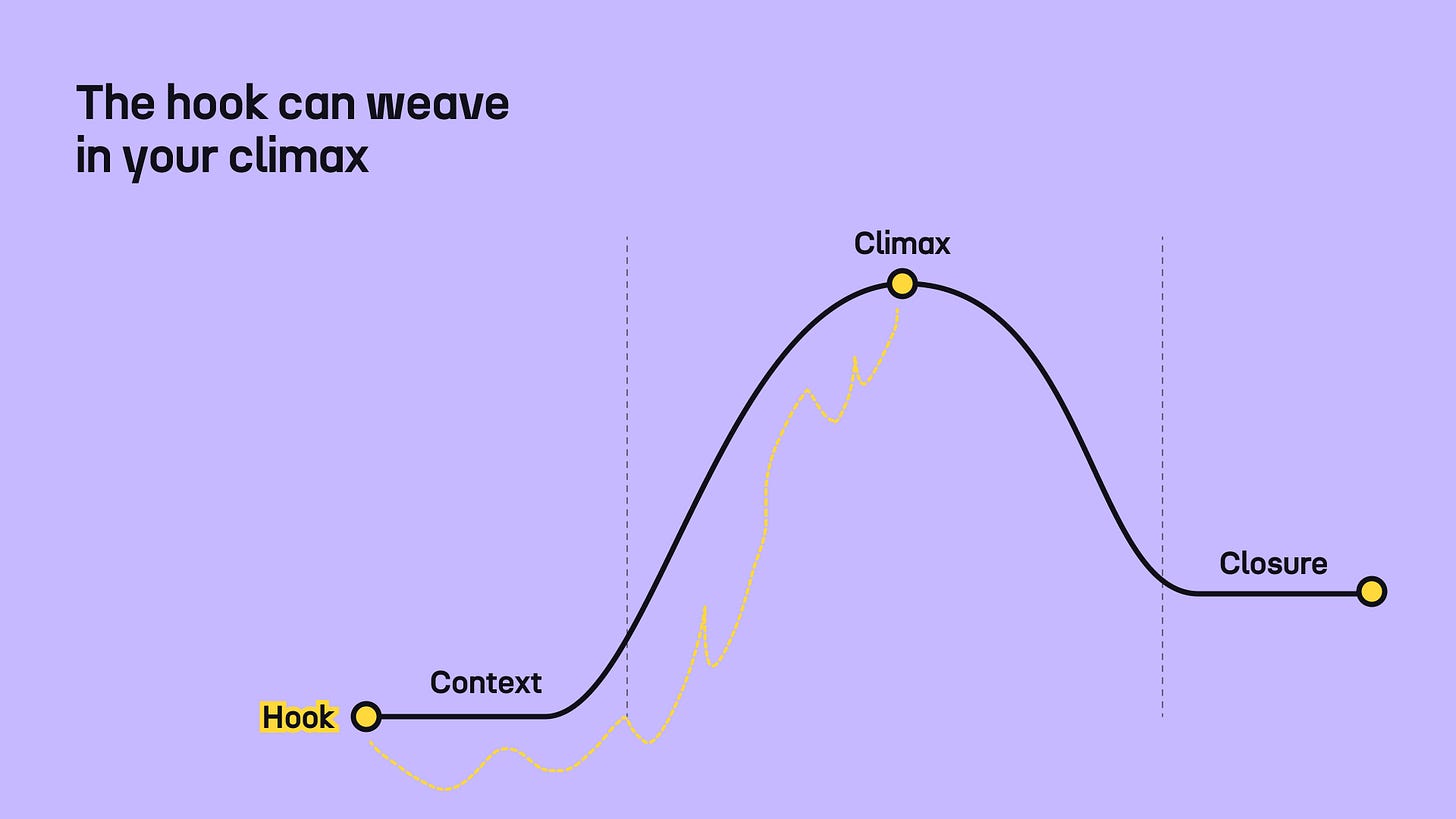
Revealing the key insight as a hook can be an effective storytelling strategy
In his book The Nolan Variations, Tom Shone recalls that when he met Christopher Nolan for the first time, he was reading a magazine at a diner table. When you imagine a man reading in English, you probably see him turning pages and consuming content from left to right. But the opposite was the case: Nolan started at the end, flipping pages backward and forwards continuously.
There’s something fascinating about this seemingly dull scene. Perhaps the explanation is simply that Nolan is left-handed. Or perhaps something bigger is at play. Most of Nolan’s films (or perhaps all of them?) don’t follow a typical, chronological structure we’re used to when telling stories. And his openings are particularly wild.
The Prestige opens with a scene of a magic trick gone awry. Inception opens with a dream of the future. Tenet opens with a shooting scene at a concert. All of these moments capture not the beginning of the story, but its climax, or even ending. If you haven’t seen any of these films, I strongly recommend you do. Some you’ll have to watch multiple times.
But what I want to explore today is this idea of backward storytelling. In a classical data story, we begin with the setup, then build up to the climax, and finally close. Even though this is a great foundational structure, it can be too predictable.
So how can you surprise your readers with your story and keep them engaged throughout? You don’t have to write the entire story backward. You can use a small trick: show a glimpse of the end at the beginning.
In the first few minutes of The Prestige, you hear a voice talking over scenes of a magic trick gone wrong. You see people disappearing, coming back, and drowning. These scenes, you’ll see them all again. In depth. But there’s something so captivating and complex about them that you don’t mind seeing them multiple times. You want to learn more.
What does this look like in data storytelling? Let’s look at two examples.
In the famous Out of Sight, Out of Mind piece by Pitch Interactive, we first learn about the total number of strikes—which could be considered the key insight—before we dive deeper into the how and the who.
In the Dollars to Megabits story by The Markup, you get a quick breakdown of the key figures before any in-depth explanations or regional details.
These kinds of data stories are still relatively rare. After all, who wants to reveal all their cards right away? There are cases when you might want to do just that. Whether you’re communicating data insights orally or in writing, you may be in front of people who don’t necessarily have the patience or the time to listen all the way to the end to get to the good stuff. So it’s your job to show that the data insights are so interesting, so salient, that even though they have just heard them in a nutshell, they need more details.
I’m not saying you should always do it. I’m not even saying you should often do it. But it can be a good trick to have up your sleeve.
For more ideas on potential story hooks, check out this piece from earlier this year.
As always, thanks for reading The Plot 🪄
See you next week,
—Evelina
Weekly gem 🤩
Trust Gap Report. The Human Rights Funders Network has just published this unprecedented report that shines the light on where human rights funding actually goes (spoiler alert: it’s not where you think). It was my absolute pleasure to work with the HRFN team on the design and communication of this crucial publication.


Insightful! I think this is especially useful, in my experience, on video platforms where the consideration span is very short. It’s like, “Look at this interesting thing. Now you can trust me that there’s more interesting things if you keep watching...”
I could definitely have used this structure for a past project of mine… I’ll keep this one in mind, thank you for writing about it!