Less than 30 seconds to hook
How to craft a data story opening that will hook your audience.
The increase in carbon dioxide and other greenhouse gases in our atmosphere is threatening civilisation. Throughout this almanac, you’ll encounter charts, graphs and statistics that highlight and confirm the situation we’re in.
The above paragraph is the opening of the recently released Carbon Almanac — a collection of facts on the current state of energy and the actions that can be taken. It’s an important book on a crucial topic. Sadly, its opening sequence lacks the kind of storytelling that pulls you in.
30 seconds to hook
In the public speaking world, we say that you have about 30 seconds to hook your audience. During this short timespan, you need to peak their curiosity, so that they stay for the rest of the talk. If you don’t, people will quickly pull out their phones and start replying to emails.
This rule applies to data stories as well, and the timespan is probably even tighter. Even though you’re presenting important information, it doesn’t mean people will actually read it. You need to lure them in from the very beginning. So in this third edition of the storytelling series at The Plot, let’s look at five types of effective hooks for a data story.
1. Intrigue
Sometimes you want to make the readers curious, without giving too much away. Last year, I helped Data4Change and Unwanted Witness produce a data story on how your smartphone helps companies track your digital footprint. We open the piece with an intriguing question about one of the most popular apps in Uganda — the King James Bible. While this hook is simple and relatable, it also gives a glimpse into the data we’ll show.

2. Invite
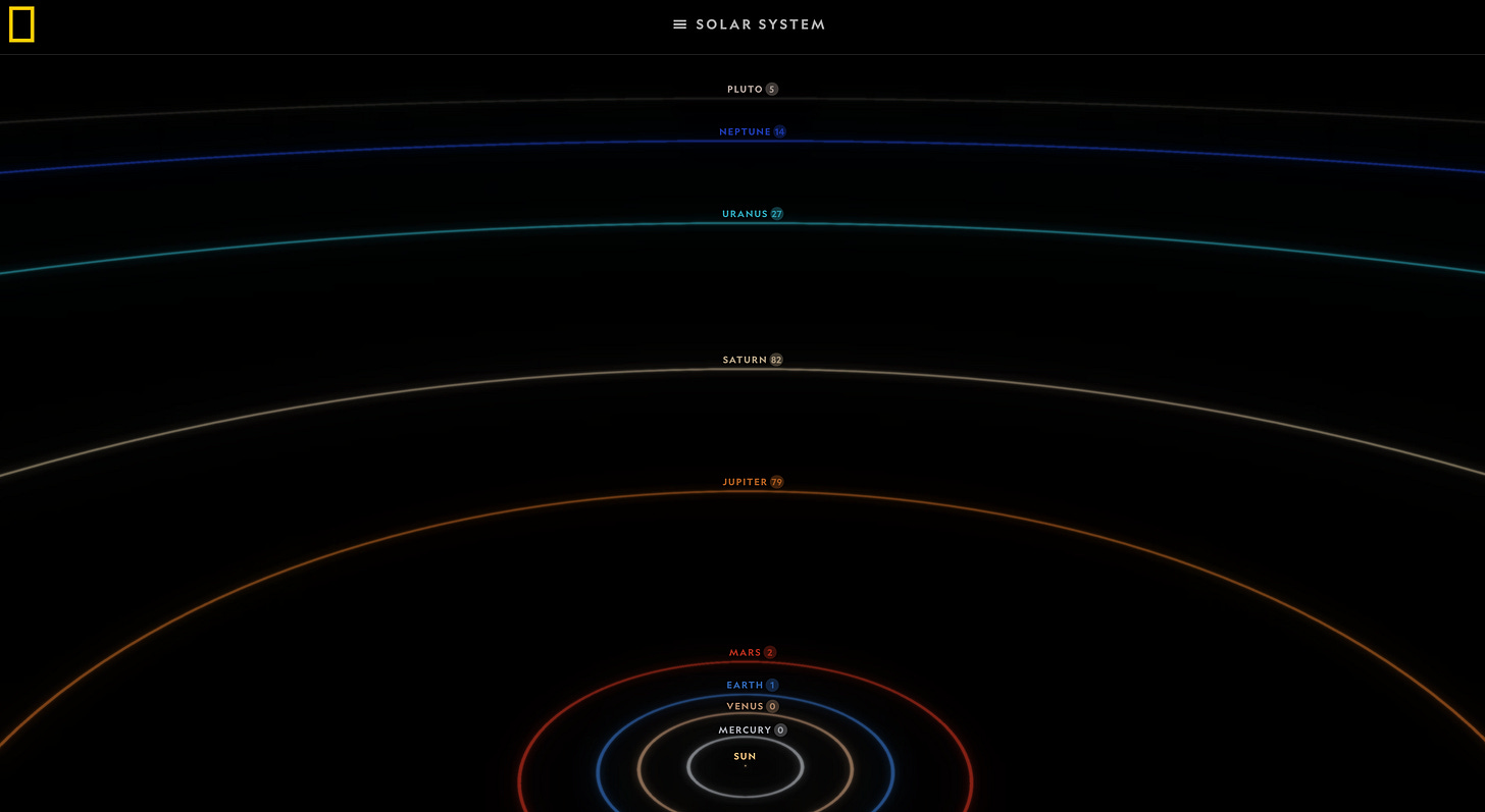
Are you taking your readers on a journey? Ask them to come along! National Geographic created a data story on the moons in our solar system a few years ago. In the introductory sentence of the article, they invite us to take a tour of the major moons in our celestial menagerie. The screen that follows is an image of the solar system, that also acts as a table of contents. Makes you want to explore, doesn’t it?

3. Summarise
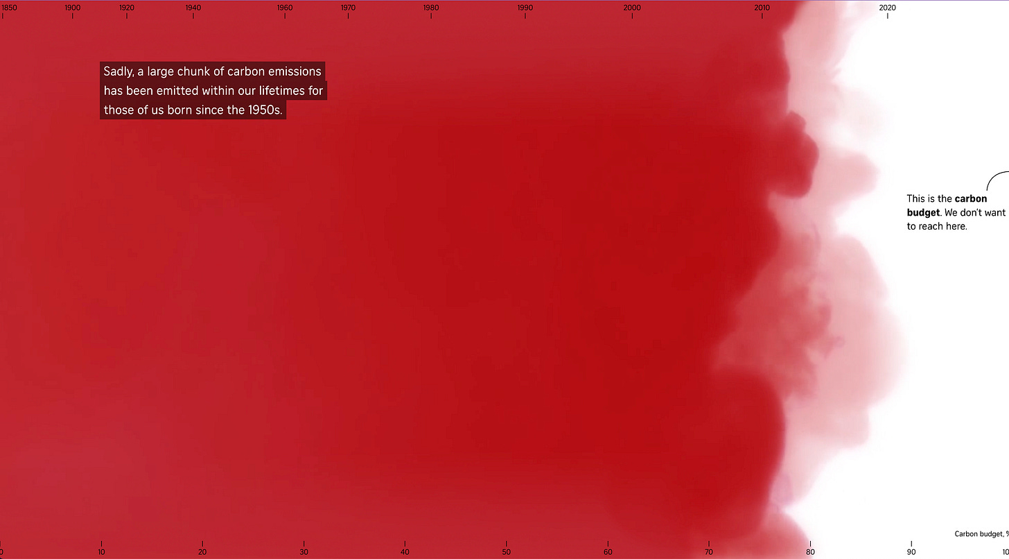
Your hook can also be a summary of the data insights. In an article on carbon emissions by the Straits Times, the authors created an exceptional chart to summarise their research. The smoke-filled area graph is the first thing you see in this story, before you’re provided with detailed text or data. The visual is so strong — both in terms of the design and the data it shows — that you can’t help but read further.

4. Get personal
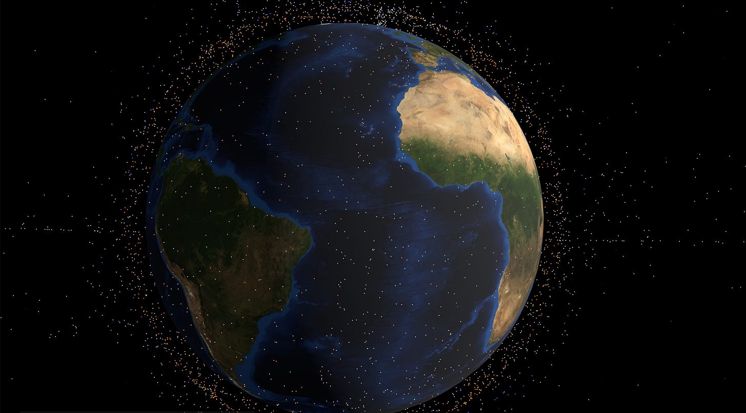
More often than not, you’ll want to introduce a character or a short story to help your data come alive. In an article on space debris, the journalists at the Financial Times hooked the audience with a dramatic story from the life of an astronaut. It’s a great foundation for a heavy piece — it pulls the readers in right away and helps them gauge the relevancy of the issue.

5. Contextualise
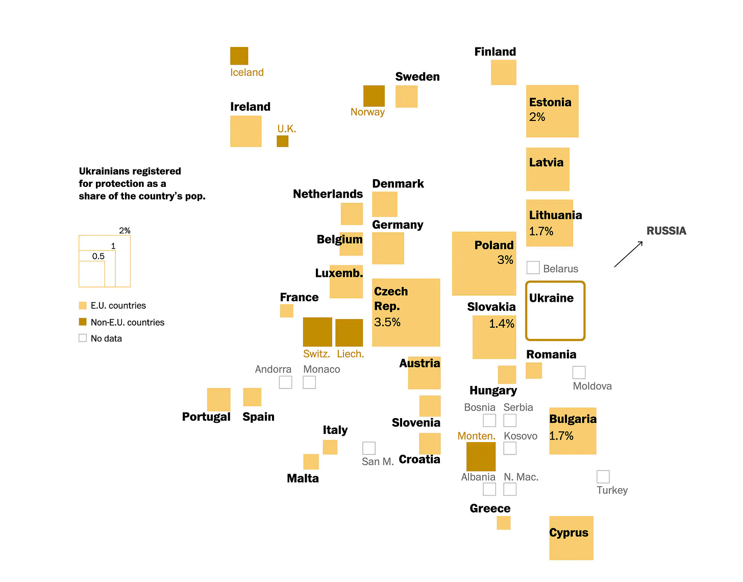
It’s never a bad idea to provide context around your data story. In an article on refugee flows from Ukraine, the journalists at the Washington Post introduce the chronology of the war in parallel to the data. Only after the context is set, they dive deeper into asylum claims and their locations. This helps readers living far way digest information on a complicated topic little by little.

A note on standalone charts and dashboards
The five examples above are based on long-form data stories. I know you don’t always have the luxury of explaining your data at such length. Nonetheless, I’m convinced that any of these five approaches can work just as well for a single graph or a dashboard. Could you intrigue your readers by asking them a question in the title of your chart? Or could you highlight the key insights from your dashboard in a summary callout? Try it out next time you’re making a data visualisation, and let me know how it goes!
Did you like this recent newsletter series on storytelling? Do you think I should write about it more in the future? Hit reply to this email and let me know your thoughts!
Thanks for reading The Plot.
See you in two weeks,
Evelina


