Visualising impact #2
An effective title can increase engagement with your chart
Hi there, fellow data storyteller! Welcome to this week’s edition of The Plot. I’d also like to extend the warmest of welcomes to the few dozen readers who have recently joined us 🤩 There are almost 1,000 of you here now, and I’m very humbled.
Last week, we kicked off a three-part series on lessons learned from impact reports. It received quite a bit of buzz on social media—as always, pie charts are a hot topic of discussion. If you haven’t read the first piece, check it out here.
Today, let’s dive a little deeper into how we visualise data for impact.
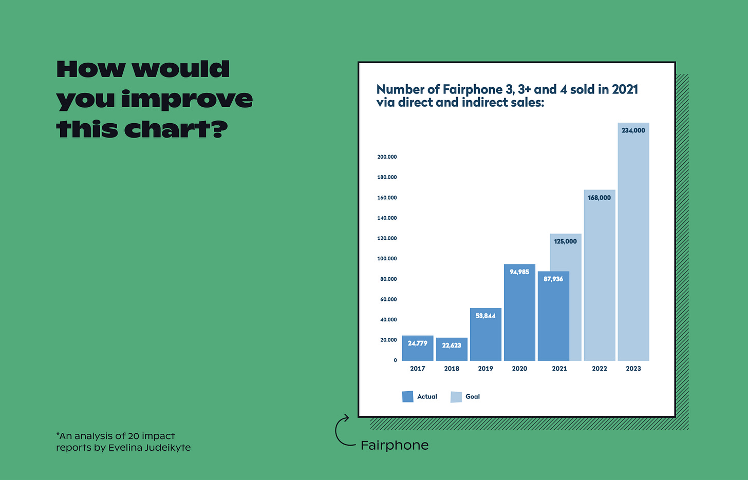
To begin with, take a look at the chart below. Would you change anything in it, given the opportunity?
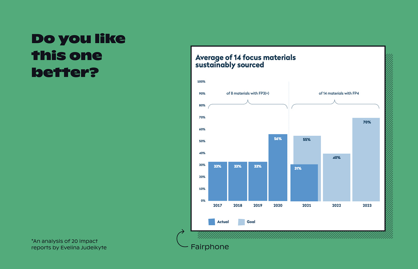
What about the next one? Do you like it better?
The main difference between these two bar graphs is their titles. The first one has a descriptive title: number of phones sold. The second one, on the other hand, is explanatory: it highlights the key figure in the data. So in the first graph, you’re expected to get to conclusions on your own, whereas, in the second one, they’re pre-packaged for you.
Which one do you think is more effective? I’d surely vote for the second one.
In narrative visualisations, a generic title is a missed opportunity. While there’s no guarantee that the chart title will be the first thing the audience reads, it’s quite likely that it will be. This means that the title can often serve as a hook: a small window into the graph. It can grab the audience’s attention because the view seems nice at a first glance. Or, it can deter them from looking closer if they cannot see anything at first.
So how can you write engaging chart titles?
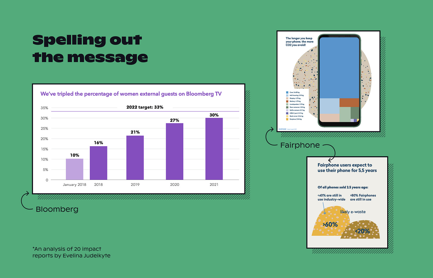
You can go about it in at least two different ways. The first is essentially a statement of the key takeaway. In this scenario, you spell out the message from the data in the title, rather than leaving the audience to figure it out for themselves. So instead of saying “portion of materials sourced sustainably”, you specify that “14 of all materials were sustainably sourced last year”. This creates message redundancy—the main insight is repeated multiple times, which increases the chances of memorability.
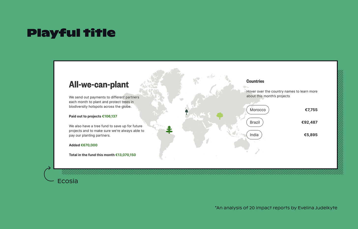
You can also get a little more creative. A catchy title grabs the audience’s attention without telling them what the message is just yet. In this scenario, you can repurpose familiar concepts—often from unrelated spheres of life—in a playful way. For instance, in this map by Ecosia, the designers used the all-you-can-eat descriptor for tree planting.
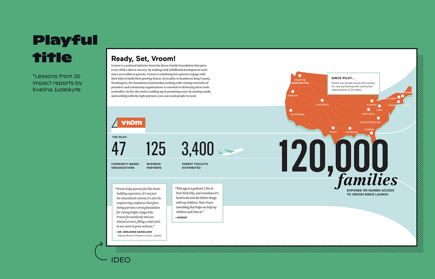
And in this infographic by IDEO, a figure of speech is used: tricolon. A tricolon is a rhetorical device involving three words or groups of words with the same grammatical structure. It’s considered to be one of the most powerful rhetorical figures: apparently, our brain absorbs information more efficiently when it’s packaged in threes. So when you read “Ready, Set, Vroom”, you’re probably much more likely to engage with the infographic than if it were called “The reach of the Vroom foundation”.
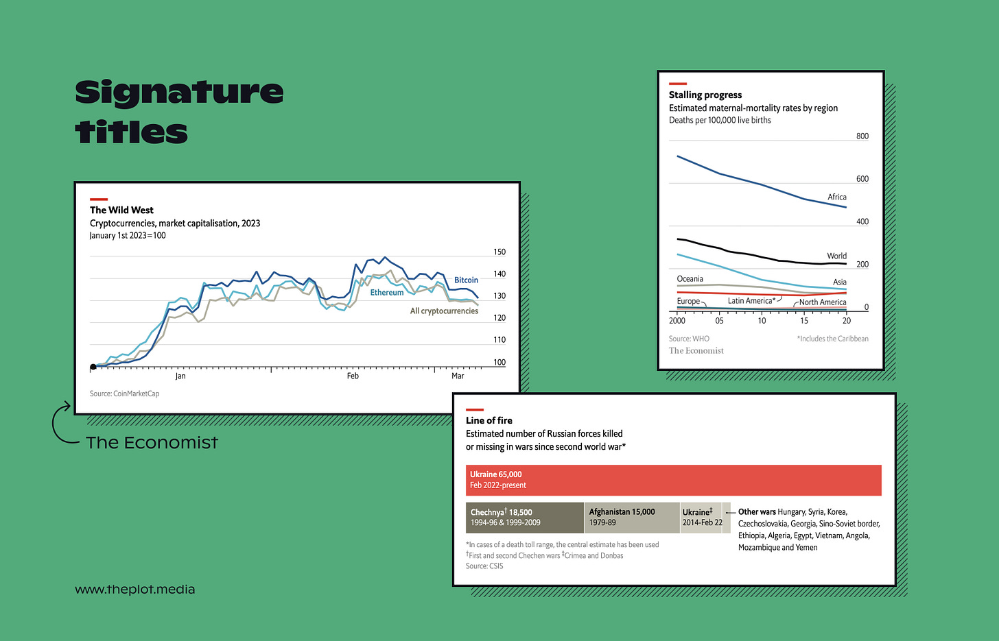
A defined framework for chart titles can also become a recognisable element of your design system. The team at The Economist is known for writing short and sharp titles for their graphics, such as the ones below. That, combined with a consistent design style, gives their work a professional look—more on that in the next newsletter! Notice also how the descriptive version of the title isn’t dropped; it merely becomes a subtitle. You still need to explain what the data metrics are, it just shouldn’t be your hook.
Are you feeling inspired? Next time you design a narrative visualisation, think twice about the title. Can you make it more compelling to increase your chances of grabbing the audience’s attention?
If you need help designing charts with great titles, you can:
Enrol in my upcoming data storytelling masterclass to elevate your dataviz and storytelling game;
Hire me to consult on your impact report (or other graphic endeavours!).
Any questions or comments? Hit reply to this email, and I’ll get back to you within 24 hours.
Thanks for reading The Plot. 📡
‘Til next week,
—Evelina


