Visualising impact #1
Pie charts are delicious, but we shouldn't serve them with every meal
Hi and happy Thursday!
Before we dive into this week’s newsletter, I have a question for you: are you or your team looking to upskill in data storytelling this year? If yes, join me—and an international group of awesome data professionals—for a live data storytelling course at the end of the month. We’ll work on how to craft, design and present data stories that inspire action. You’ll only need 4-6h per week to participate, which should be feasible with your normal work schedule! You can find more details and enrol here. 🚀 If you have any questions, reply to this email or schedule a chat with me.
Now on to today’s piece!
Visualising impact. This is what many designers—including myself—aim to achieve. To communicate an organisation’s impact through engaging data stories. And it’s often done via impact reports.
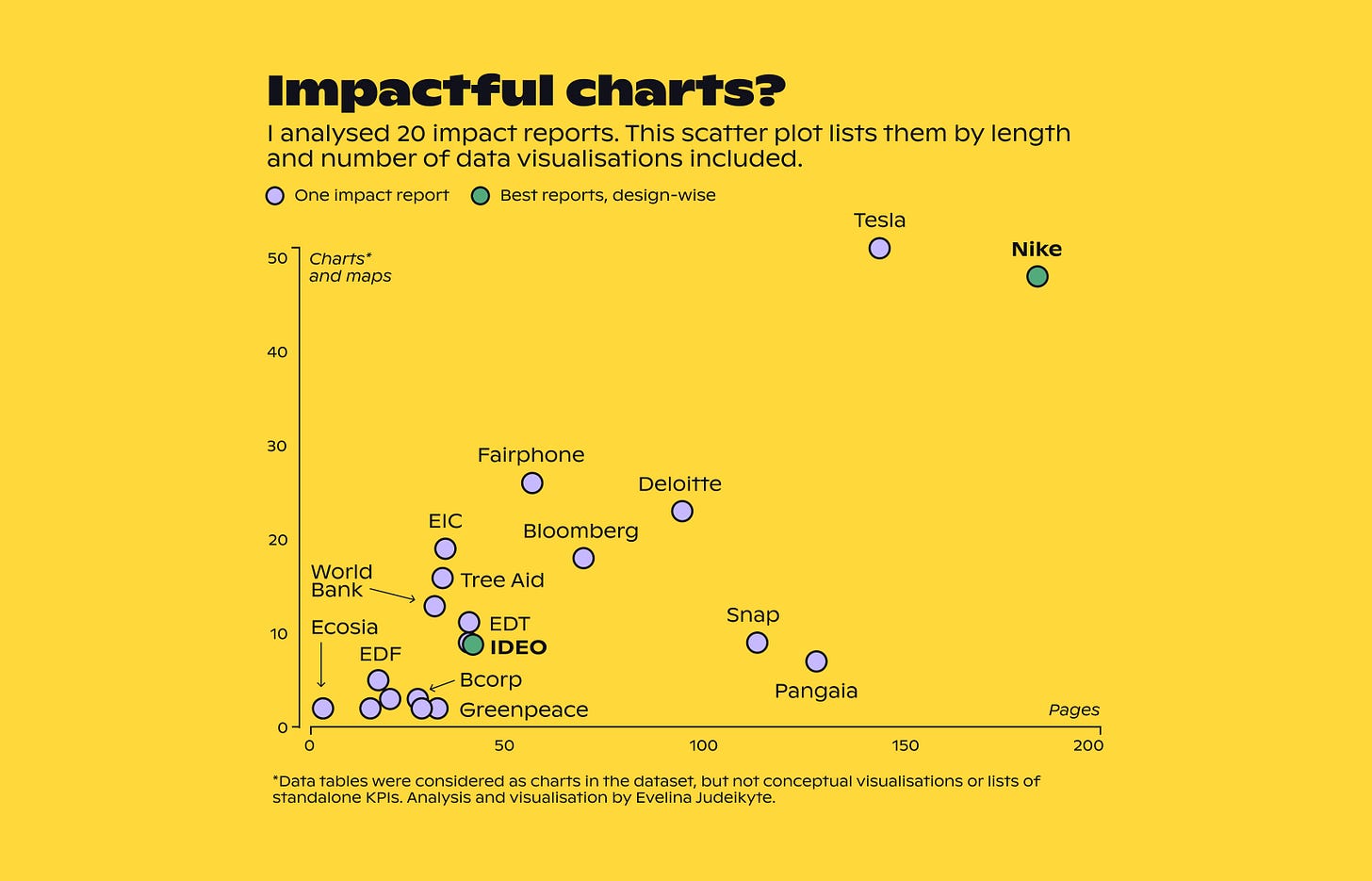
An impact report summarises the effects of a given company’s products and practices on people and the planet. Typically, it’s published once a year as a PDF document. As data visualisation plays a vital role in these reports, I was curious: how impactful are their graphics?
To satisfy my curiosity, I selected a sample of 20 reports to analyse—from companies like Nike and Tesla, and organisations like World Bank and Tree Aid—the list of which you can see below.
While browsing the reports, I observed common patterns that I packaged into learnings for all of us. So over the next three newsletters, I’ll be sharing three data storytelling lessons from impact reports.
Let’s begin this first one with a question: which chart type do you think was the most common in my sample?
You got it.
Pie chart.
Below is a snapshot of about a third of the pies I encountered.
There’s nothing wrong with pie (or donut) charts. I like using them to show how one or two categories relate to their total. It’s a simple and efficient way to show a part-to-whole relationship. Plus, a lot of people simply love a pie. Why wouldn’t they? It’s delicious.
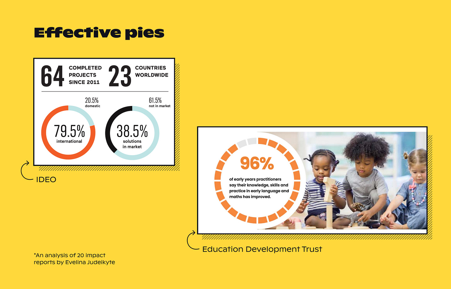
In the 20 reports I analysed, I sure found some effective pie-inspired examples. The donuts from the IDEO report (image below) are super clear: one category is key, and it’s highlighted for you. I also quite like the donut that’s broken down into smaller pieces from the Education Development Trust — I’m not sure I’ve seen this approach before! Although, the number of segments may need to be recalculated 😉
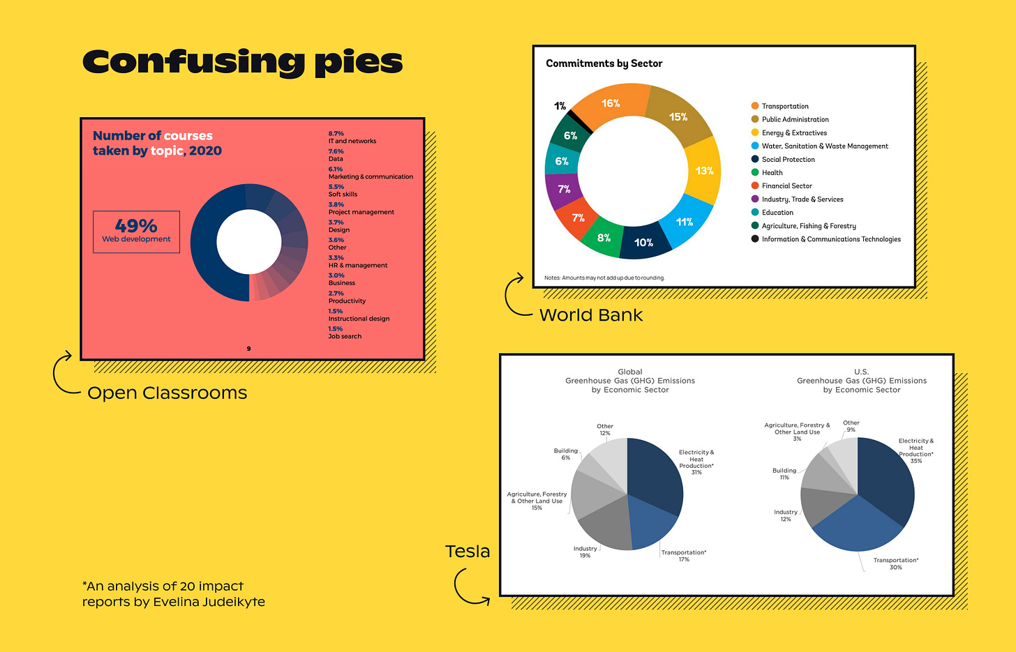
Unfortunately, not all of the examples are tasteful. Pies and donuts can quickly become overwhelming when many categories are shown. Just take a look at the snapshots below — how easy is it to read the information?
Not so much.
On top of the confusion that can overwhelm you when trying to decipher these pies, after seeing them over and over across tens of pages, they become redundant. Perhaps even a little dull. It also makes me wonder — did these organisations hire an actual data visualisation designer to produce the report, who would have suggested a more varied set of chart types?
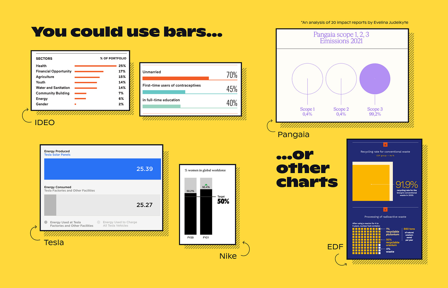
The good news is that you don’t have to be stuck in the pie world. Let’s look at some alternative shapes I discovered in these reports. When the data has many categories with long labels, a bar chart will be difficult to beat. The IDEO team did a great job polishing theirs (image below). You can also get creative with stacked bar charts, the way designers at Tesla and Nike did. And finally, if you have total creative liberty, how about trying out something new, like the circles from the Pangaia report?
I’m not saying that pies are bad. There are already enough people in the dataviz community to tell you they’re evil. I love pies, as do many non-data people. Pies can be delicious. But it’s good to vary what you’re cooking to keep your report—or infographic or dashboard—delicious for the audience. If you were eating a three-course meal, you wouldn’t want it to be all pies, would you? So when you have a long report to design, add some other scrumptious chart types in there.
Thank you for reading The Plot. 🥧
Talk next week,
—Evelina


As you noted, the number of segments may need to be recalculated. The segmented donut from the Education Development Trust has a fatal flaw: The the chart doesn't show the data. It shows 22 of 24 segments in orange. 22/24 is 91.67%, not 96%. If they wanted to round the numbers to only show complete segments they should have used 23 of 24 segments. That would have been 95.83% Better would have been to show 23 and a little sliver to show the remaining 0.04.