Summer musings
Three inspirational readings in dataviz, design, and storytelling
Sun, wind, and a nice view on the horizon. 🌊 As we turn towards nature in the summer months, we often naturally take a step back. How was this first half of the year for you? It was super busy on my end, and I look forward to slowing down a little. While I travel this summer, I plan to take time to reflect on the projects I worked on, what I enjoyed, and what kind of impact I want to create moving forward.
That also means lots of reflective reading (I’m sure you’ve realised by now that I’m a book nerd! 🤓). So in this pre-holiday edition of The Plot, I want to share three summer readings in data visualisation, design, and storytelling that will teach you something new and leave you inspired.
Dataviz
Sometimes we miss what we can’t step back to see; cities grow around us, pollution blows over us, the earth warms underfoot. Sometimes the invisible only appears with the creep of time, as in the gentrification of neighbourhoods or retreats of glaciers. Sometimes, in the case of historical events, the visible becomes invisible with the loss of a generation. The power of data lies in an ability to freeze time at a given moment. And in the same way that photo negatives must be processed before they can be viewed, the patterns hidden in a dataset only truly emerge through maps and graphics. These visualisations give us the power to zoom out, to compare, to remember.
This is the premise behind the book Atlas of the Invisible by James Cheshire and Olivier Uberti: to show hidden patterns in the world around us so that we better understand it. The book is divided into four sections—where we’ve been, who we are, how we’re doing, and what we face. It covers topics from climate to health to migration to so much more.
One of my favourite maps in the book is called Eyewitness Cartography (photographed above). Its hand-drawn illustrations trace the experience of two Holocaust survivors in a beautiful and touching manner. I love this example because it shows how data and humans can have the same importance in visualisation.
Explore this and the other gems in the book to get inspired on how to design for impact.
Design
Design is the controlling of difference. But while working through countless projects, I came to realise that I was weaving meaning not out of the big differences, but out of the first, smallest ones only. That results in a much more delicate tapestry. Particularly with the abundance of colour in the streets, with the ability to freely manipulate hundreds and thousands of colours on paper or on the computer, I’ve grown less enchanted with the easygoing use of colour. When I’m laying out the necessary materials, the colours have fallen into order before I even realise it.
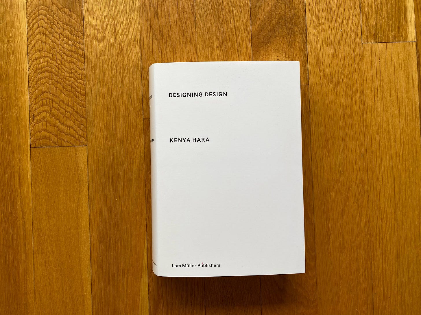
I quote a paragraph on colour from Kenya Hara’s book Designing Design because it’s something I’ve been thinking a lot about recently. The book is about so much more than this topic though. Kenya Hara encourages us to think deeply about what design means and how we could improve our practice to create better products.
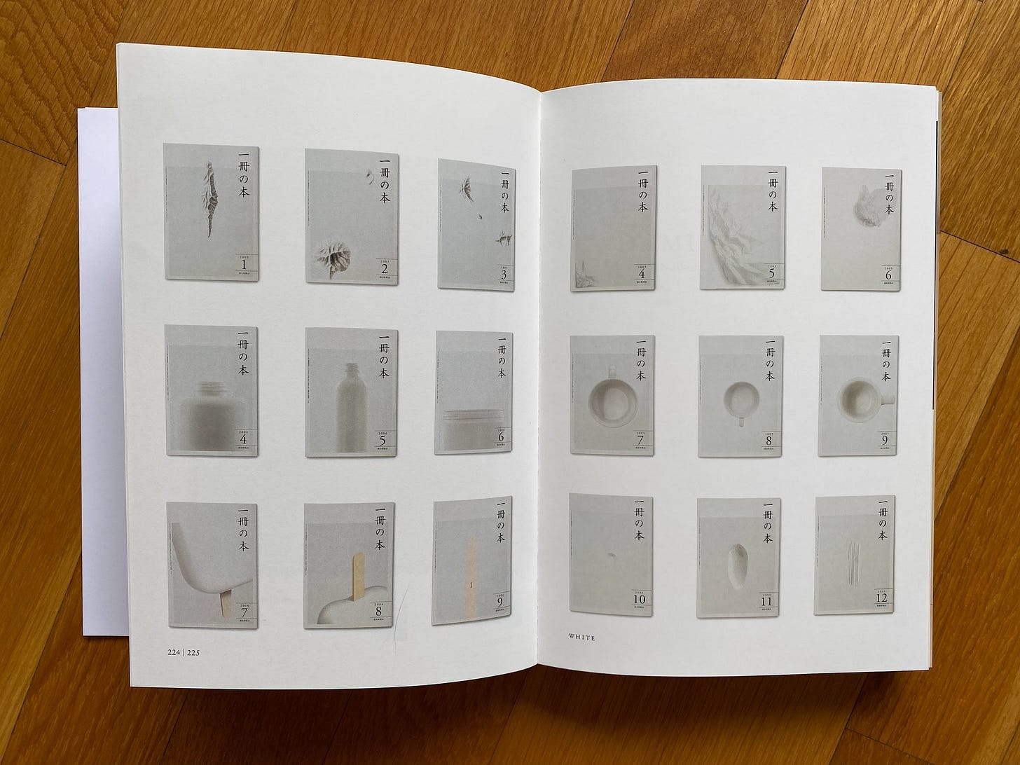
There’s an entire chapter on using white. Yes, you heard that right. White. It’s full of gorgeous images, like the ones above, of how a seemingly dull colour can be novel and powerful. According to Hara, “white is not just a colour; white must be called a design concept.” This book itself is a masterclass in using white—both as a colour and as a way to introduce space.
If you don’t feel like actually reading anything this summer, simply browsing through the pages of Designing Design can be relaxing.
Storytelling
We rarely follow chronological order in our everyday lives. “When you read a newspaper, you read the headline, and then you read the story, and then you read the story the next day, and add to your knowledge, and then the next week. It’s a process of expansion, a filling in of detail, and making connections—not based on chronology, but on the particulars of the story. We don’t tend to have chronological conversations, either; they go all over the place.
Christopher Nolan is one of the storytellers that fascinates me the most. If you’ve ever seen one of his films—perhaps Inception, The Prestige, or Interstellar—you know that feeling of being both captivated by the narrative and also thinking what?!. The Nolan Variations book is a wild deep dive into his mind: how he sees, layers, and sequences stories like no one else. I’m only halfway through this one and will definitely be sharing some storytelling lessons from it later this year.
A little timely bonus: watching Nolan’s latest film—Oppenheimer—after reading this book is a different experience.
If you do end up getting your hands on one of these books, do let me know how you like them! If you need more recommendations, check out my map of dataviz books. I’ll also tell you a secret: at the end of this year, I’ll add a design and storytelling section to this “map”.
Enjoy your summer weeks! I hope you get to take a break and relax. I’ll see you again at the end of August. 🌻
—Evelina
Data storytelling course: new cohort 🚀
Want to learn how to turn data into narratives that inspire action? You can now sign up for the next cohort of my Data Storytelling Bootcamp. This time, we’ll keep the cohort small to ensure that everyone gets plenty of customised feedback, so don’t wait too long to enroll. As a reader of The Plot you get a 10% discount—use the code THEPLOT10 to redeem it. See you in September!


