Constrained colour
The case for mono- and duo-chrome designs
Can you please add more colour? The design looks boring without it.
Have you ever received a similar request? I’d be willing to bet that most of you have. Colour is such a tricky topic. On the one hand, it’s one of the hardest design choices you need to make—colour needs to be meaningful, aesthetically pleasing, and accessible. On the other hand, it’s also personal. Almost everyone has preferences for certain colour hues over others. It rarely leaves people indifferent. And boy it’s not easy to balance these two.
In this edition of The Plot, we’ll explore the case for less colour.
Let’s start at the beginning. When designing with data, you’re often told that you need to pick the right colours. There exist many tools that allow you to choose a palette of multiple hues, adjust it, check its accessibility, etc. When I teach data visualisation, I suggest the participants choose from three types of colour schemes:
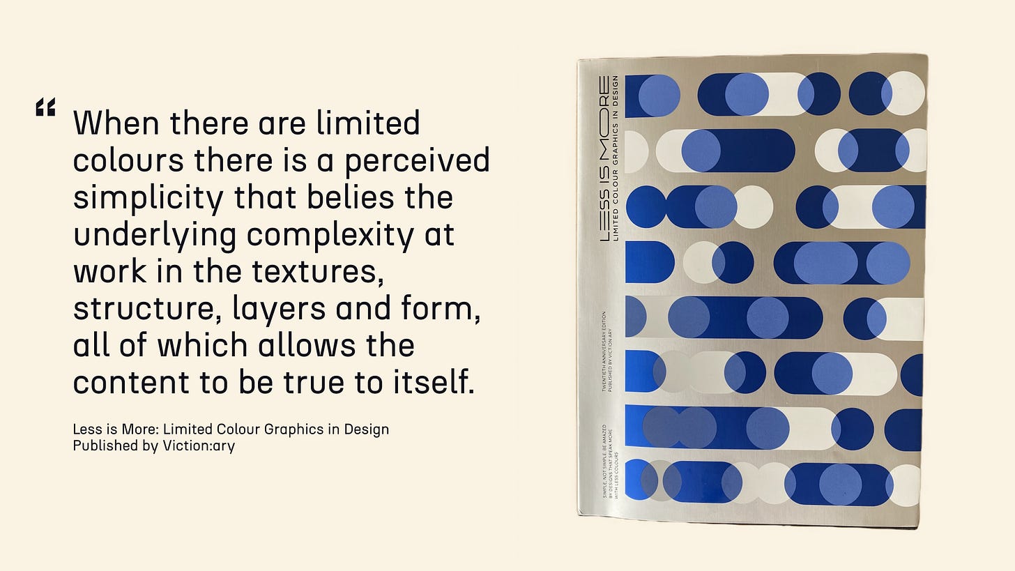
This is a good starting framework for deciding how many hues you’ll need and how they’ll interact with each other. That said, I’ve always been attracted to designs that don’t really fall under any of the above categories. Designs that use very minimal colour. On purpose. The following quote from the book Less is More: Limited Colour Graphics in Design explains the reasoning behind it very eloquently.
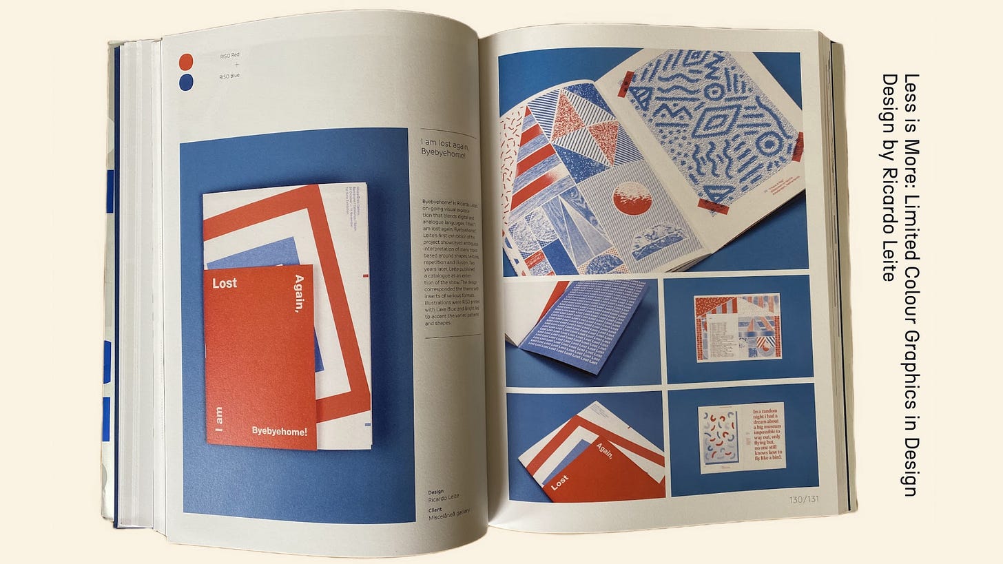
Allowing the content to be true to itself… There’s something relaxing, even soothing about a design in which colours don’t compete with each other. Take a look at the duo-chrome project below: isn’t it gorgeous?
Perhaps I’m biased, but I feel like there’s an emerging trend for mono- and duo-chrome designs. Spotify has recently turned RapCaviar—one of their most listened-to playlists—into a brand with playful posters that only use two colours at a time.
Odd Studio has been playing around with a monochrome purple look for their Instagram feed.
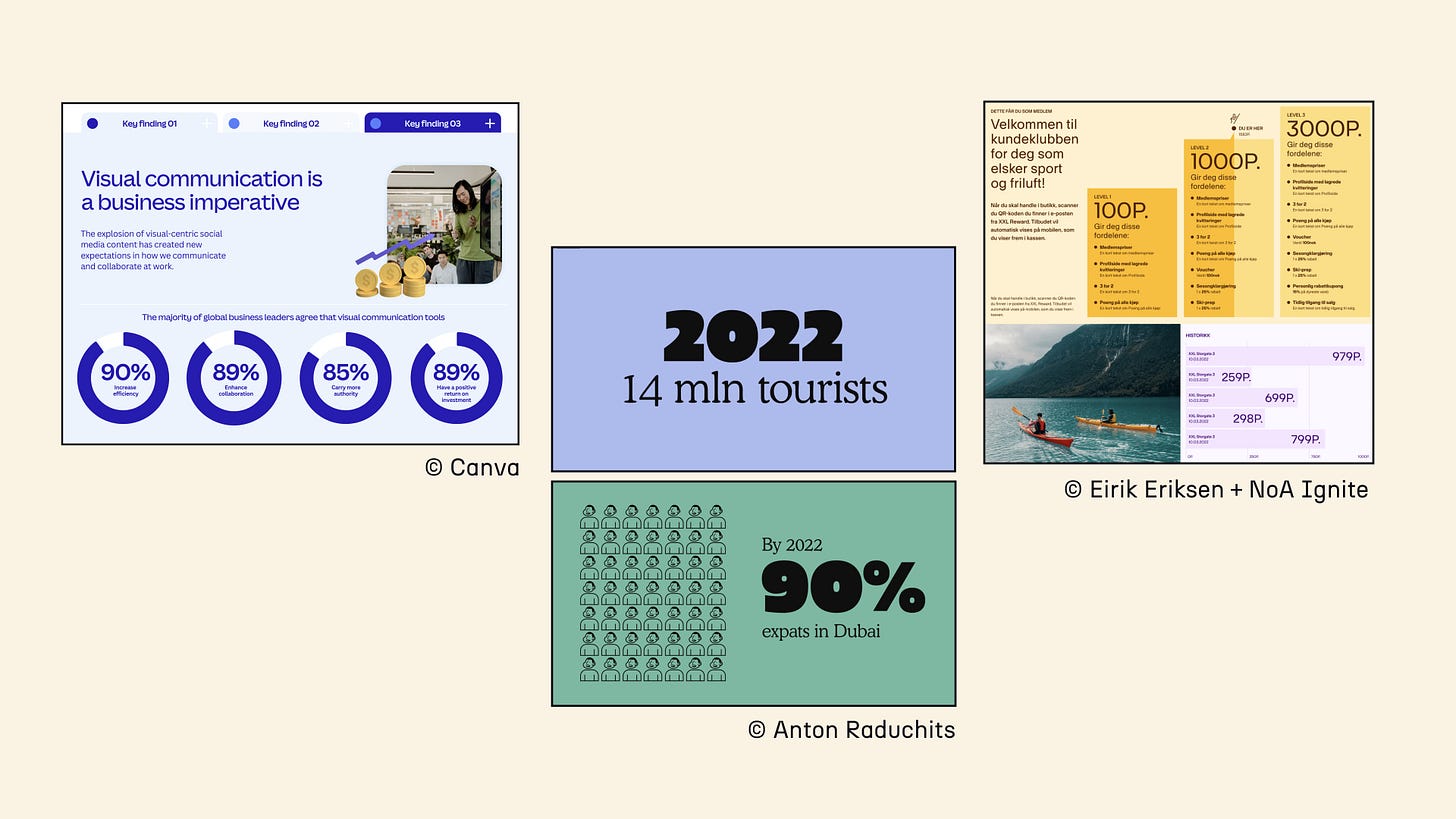
This style is not super widespread for data visualisation just yet, but I do start seeing some examples:
So what now? I know you can’t always choose your colours based entirely on the style you prefer. You need to respect your company’s or client’s brand guidelines, and perhaps even the personal preferences of your stakeholders. I’m also not suggesting the world around us should become entirely monochrome; that would be crazy! But here’s my challenge to you: for your next dataviz endeavour, what if you considered a mono- or duo-chrome colour choice to see if it allows the data to stand out?
I’m currently working on a project with the Human Rights Funders Network doing exactly that. Their brand has four beautiful colour pairings, and I’m aiming to only use two colours at a time to allow white space and numbers to make a statement. I’ll let you know how it goes!
As always, thanks for reading The Plot. 🌈
See you next week,
—Evelina
Data storytelling course 👩🏫
You asked for it, and it’s coming! I’ll be announcing the dates for the next cohort of my Data Storytelling Bootcamp next week. Stay tuned!
Weekly gem 🤩
Ways into Practice podcast. Created and produced by students to provide new and seasoned designers with valuable insights into the design industry. Each episode is an in-depth interview with designers from various fields. Worth a listen!


My former company had brand palette of four vibrant colors. In order for it not to become visually overwhelming everywhere, I set up a series of paired colors, with the idea that the colors would generally be used in pairs only, each time with a primary color + a highlight. It is possible to successfully take an established set of brand colors and minimize how and where the color is used.
Accessibility is definitely a good point I'm glad you mentioned it. I usually tell my students to use ColorBrewer or Coblis to find good color patterns for that. Do you have other tools you like to ensure that visualizations are accessible (especially when you get asked to add more color)?