Data without numbers
Qualitative data can help you tell a story. Here is how to visualise it.
Last month, I had the fun opportunity to lead a series of workshops for a healthcare organisation in the UK. While I've facilitated dozens of data storytelling trainings before, this one had an unusual ingredient: qualitative data analysis and visualisation.
When most of us hear the word data, our minds immediately jump to spreadsheets, charts and numerical analysis. That's quantitative data—the stuff that dominates conversations about data-driven decision making. But what if the numbers only tell part of the story?
The mission of the organisation in question is to monitor and evaluate healthcare providers across the UK. For teams like theirs, qualitative information—patient experiences, testimonials, open-ended survey responses—provides crucial context that numbers alone can't capture.
So how do we harness the qualitative insights? And why should we bother visualising them?
Synthetise complex information
Let's face it—reading through paragraphs of text is mentally taxing. Our brains crave structure and patterns. That's where visualisation comes in, helping us digest complex information at a glance. By extracting key themes from text and transforming them into conceptual graphics, we make information more accessible. A simple Venn diagram can elegantly show how concepts interconnect, creating an immediate aha! moment that paragraphs of text might not achieve.
For more complex scenarios, you might use thematic mapping or sentiment analysis visualisations that preserve nuance while making patterns visible.
Or perhaps your graphic needs to be even more layered, like the heatmap below.
These are just some examples of how systemising qualitative data could help your reader understand it and introduce two layers of reading.
Put faces to numbers
Our brains aren't wired to connect deeply with abstract numbers. We need to feel the data to truly understand it. (I know, it’s not news for those reading this newsletter, but it’s worth repeating every once in a while!)
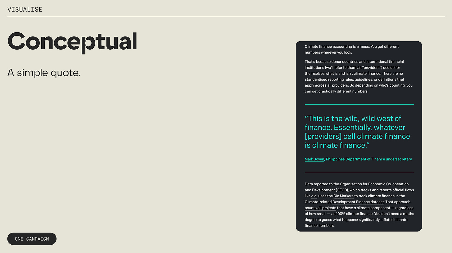
A simple yet effective technique is incorporating direct quotes alongside quantitative charts. Not to replace the numbers, that is, but to illustrate what they mean for real people.
Similarly, pairing data with images and videos of the people affected helps your audience grasp what's at stake. It’s one thing to hear about faraway natural disasters but quite another to feel what it means for families on the ground.
When you let the people behind the data talk, the audience will remember the numbers better. It may seem counterintuitive but that’s how it works.
Create context
The above examples focus on making qualitative data visual, but you can create even more impact when combining quantitative and qualitative information elements. Numbers provide facts, while text offers valuable context for interpretation.
Annotations are your secret weapon here. Like in this fun Axios visualisation, adding concise explanatory notes directly to a chart guides viewers to the key insights and provides explanations around them.
***
As I wrapped up the workshops, I found myself wondering: is the future of data storytelling inherently mixed-method? Will the most effective data communicators be those who skillfully blend quantitative precision with qualitative depth?
What do you think? Have you found creative ways to incorporate qualitative information into your data stories?
Thanks for reading!
See you in two weeks,
—Evelina
📚 If you’re interested in exploring qualitative data visualisation further—including origins and methods—check out Richard Brath’s book Visualising with Text.


