Two layers
How to cater multiple reading styles in long publications
Remember reading books as a kid: what was the process like? When you couldn’t put words together just yet, opening a book meant navigating through images, piecing together stories from visual clues alone. And it worked, didn’t it?
Have our reading habits really changed?
Think of the last time you were in front of a long, detailed report. Did you analyse all the content cover to cover? Or did you find yourself drawn to the graphics and large, bright elements, aka the images? If you’re anything like me, it’s probably the latter.
And you know what? That’s perfectly fine. Normal, in fact. It’s how our visual perception works. Unconsciously, we instantly notice certain elements more than others. This is called preattentive processing: it occurs when some items are so different from their surroundings that they “pop-out” and capture our attention. This process can speed up understanding while minimising effort for the audience.
So how can you use this next time you’re crafting a report?
Structure your information in two distinct layers:
The full content: detailed text, thorough explanations and supporting annexes;
The visual narrative: highlights for readers who need to read quickly.
Let's talk about making that second layer memorable.
Power up with pullout text
Ask yourself: If my reader remembers just one sentence from this page, what should it be? Make that text big and bold.


Don’t snob the standalone numbers
Big, bold statistics are like billboards for your data—they grab attention and stick. And they’re also quick to design.


Spend some time on the graphics
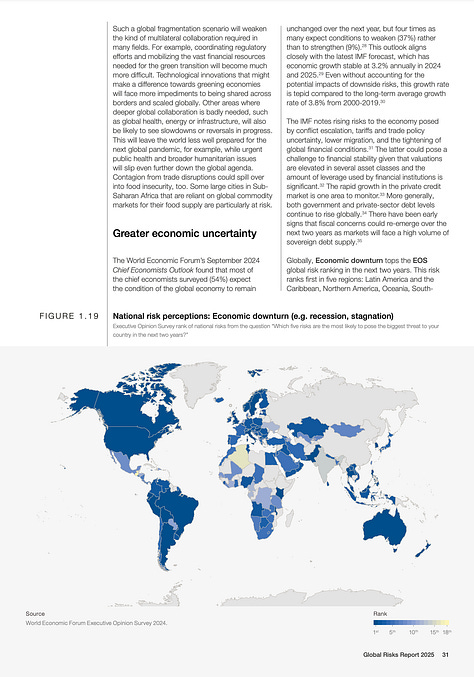
Obvious, I know. But there’s one key consideration to keep in mind for your visuals to work well in this second layer: they need to be self-sufficient. Think of them as tiny, independent stories that convey their message through data and headlines, without the reader having to refer to paragraphs of text. See some inspiration below.


As you craft your next report (or any written product, for that matter), put yourself in your reader's shoes. How will they experience your content if they’re only quickly skimming? What visual assets will guide them to your key messages, just like in a kids book?
Thanks for reading!
See you in two weeks,
—Evelina
Did you know? I lead Parabole Studio—a communications agency specialised in data storytelling and information design. We could help you:
Transform your data into compelling narratives (check out our portfolio for inspiration!);
Upskill your team through hands-on training in data storytelling techniques.
Let's work together—reach out anytime :)


Very good article Evelina. Yes, graphical representation of the data would cater to all audience. Your inputs provide a guidance on what needs to be in the graphics and what should not. Thank You!!