Laugh, cry, remember
How to create an emotional connection with your audience
Make ‘em laugh, make ‘em cry, make ‘em agree.
This is how Sam Leith summarises the concept of pathos in his book called You Talkin’ to Me: Rhetoric from Aristotle to Obama.
Have you ever heard of pathos? If your answer is no or not sure, you’re by far not the only one. Let me refresh your memory. About 2,600 years ago in ancient Greece lived a smart guy by the name of Aristotle. One of his key contributions to society was the study of rhetoric—the art of effective communication. According to Aristotle, any type of rhetoric should be built on three pillars: ethos, logos, and pathos. We spoke about ethos in the very first edition of this newsletter, and logos is almost self-explanatory. So today, let’s explore pathos. What is it and why should you care?
Pathos has a bit of a bad reputation in the modern world. It’s often associated with soapy moments in which someone cries or throws a tantrum. But pathos is so much more than that. It’s the emotional connection with your audience. It's those playful, perhaps even humorous, moments that allow their analytical brain to take a break. Hence pathos is not bad, on the contrary—it’s key for engagement and memorability.
What does that mean for you?
As data design is visual rhetoric, pathos can help make your design more approachable and get your message across. In her book Building Science Graphics, Jen Christiansen calls this a welcoming gesture: a little detail that provides immediate context when used next to a less figurative chart. I can think of four visual ways to make charts more welcoming, each with different levels of implementation difficulty.
Let’s look at these in more detail.
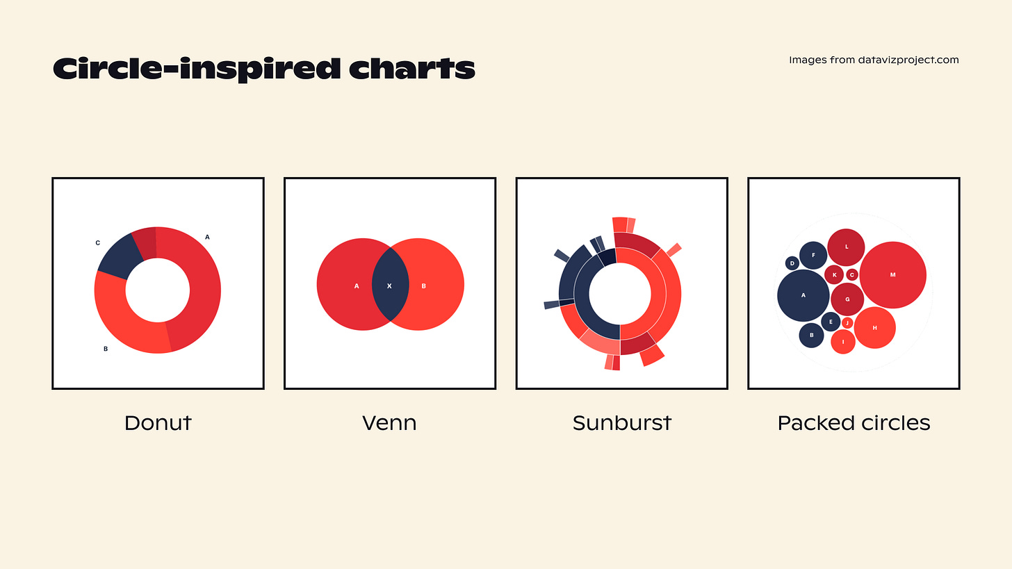
Shape is the easiest one to implement. I hadn’t really given shape much thought until I watched the Pixar course on storytelling on Khan Academy. In it, the creatives talk about how they draw round characters to make them look friendly and approachable. So it got me wondering: is that why people like circle-based charts, even when they don’t offer the most precise representation of data? If making an inviting chart is your goal, perhaps choosing one of the circle-y graphics is the first step towards creating a connection with your audience.
Colour is another way to evoke emotion. Certain colours can feel hopeful and peaceful, while others bring forth danger or fear. I’m sure you know that already. In the mosquito chart below, Nigel Holmes used red to reinforce the feeling of danger. Could the colours you use for your next project have an emotional meaning for your audience too?

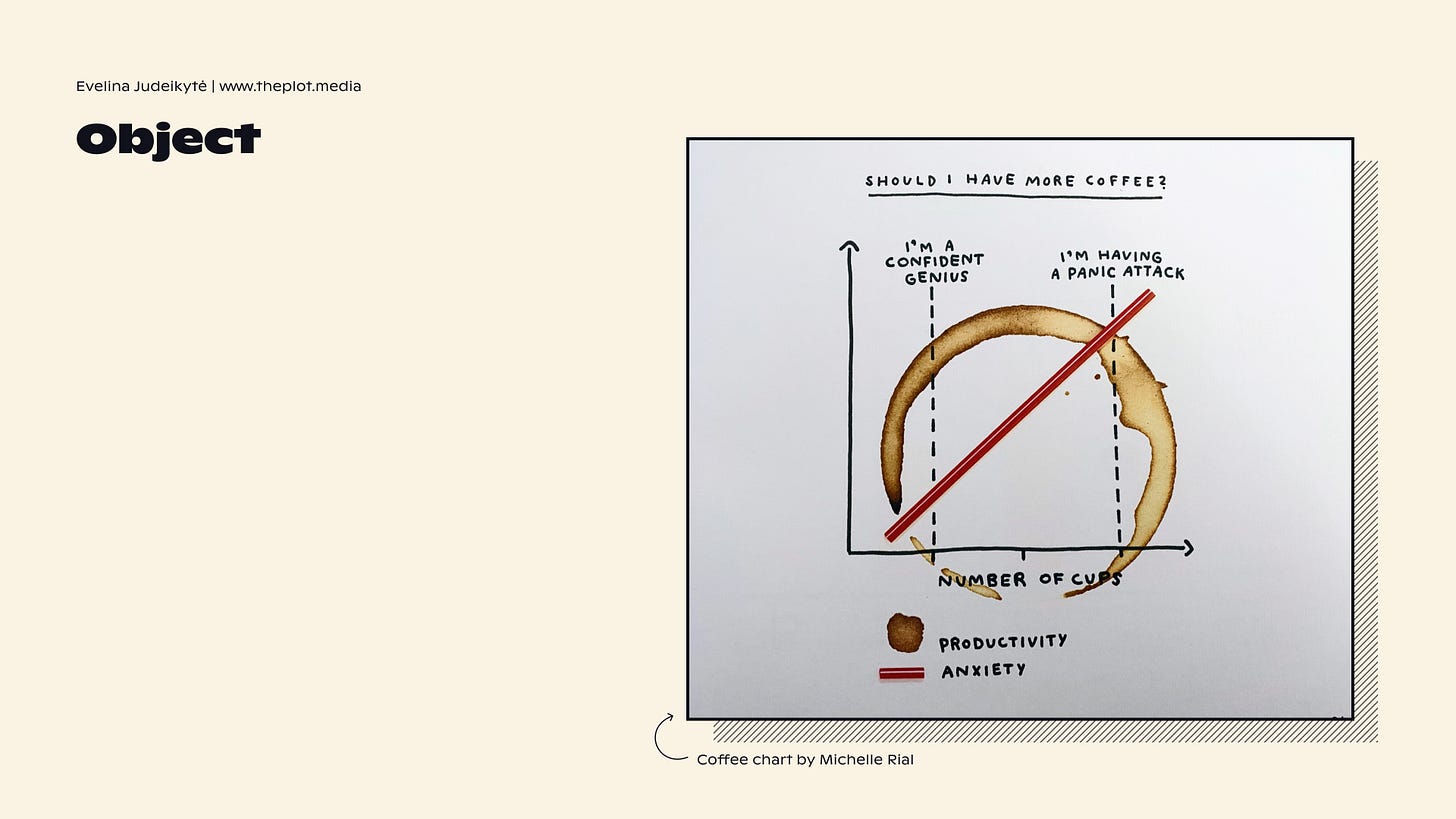
This mosquito chart actually uses another visual means to create pathos. An icon. Icons are pretty common objects in data visualisation design, although making them look elegant is not always easy. And while we’re on the topic of objects, how about making them implicit? Below is one of my favourite fun charts. It yells coffee right away, without showing coffee explicitly.
Shape, colour and objects are little touches to your design that can help you add pathos. But they may not always do the trick. If you have creative liberty, consider using a more elaborate metaphor. If you don’t know what a metaphor could look like in our line of work, check out this piece I wrote on metaphors a while back.
I’m curious: what are your favourite examples of pathos in data visualisation? Which ones have you been able to implement yourself? Let us know in the comments!
As always, many thanks for reading The Plot. 🦟
Next week I’ll be busy with events and trainings, so this newsletter will skip an edition. I’ll be back in two weeks to talk about chart gridlines and axes.
—Evelina
Weekly gem
Storytelling course by Pixar on Khan Academy. I’ve already mentioned it here a few times, and strongly recommend you watch the entire thing. You won’t regret it, I promise.
When you’re ready, you can reach out to me to help you craft and design engaging data stories. I take on design, consulting, and training projects. Hit reply to this email or set up a chat to get started.


Maybe I’m dumb, but what is good about that last coffee plot? I get that it’s trying to be creative with the use of coffee stain, but I couldn’t understand how to read it. Or is that the point? To be more of a modern art than data visualization?
This is something I forgot to ask in your course, but I just read "Joyful Infographics" by Nigel Holmes (🦟), and I think that book is full of examples about Pathos. So, my question is... in terms of Pathos, what's your opinion about to put illustrations in data visualizations?