
Familiar concepts
How to use well-known notions and metaphors for more effective designs

In season 2 episode 1 of the TV series FRIENDS, Monica asks Phoebe to cut her hair. Phoebe is wary at first because of Monica’s picky nature, but finally gives in. In the midst of the cutting session, Monica starts to worry that her hair is getting too short. Turns out, there’s been a misunderstanding: Monica asked for a Demi Moore-like haircut, but Phoebe confused Demi Moore with Dudley Moore. Oops!
Then the funniest scene follows this fiasco. With Monica behind closed doors in her room, Phoebe comes out to report on the situation to their friends. Here is how the dialogue goes:
Rachel: How is she?
Phoebe: It’s too soon to tell. She’s resting, which is a good sign.
Ross: How’s the hair?
Phoebe: I’m not gonna lie to you Ross, it doesn’t look good. I put a clip on one side, which seems to have stopped the curling.
Joey (looking very worried): Can we see her?
Phoebe: You hair looks too good, I think it would upset her. Ross, why don’t you come on in?
You can watch this short clip below.
What happened in this scene that made it so impactful? The situation mixed something new with something familiar. A familiar hospital scene — in which a doctor gives you updates on your loved one — twisted to fit Monica’s hair accident. That’s powerful and funny.
Using familiar concepts for something original engages the audience and increases the effectiveness of your work.
This applies not only to TV, but to data visualisation as well. We often rely on metaphors to achieve a similar effect in design. One of the most-known data visualisations of modern times uses a poppy flower as a metaphor for war. I’m talking — of course — about Poppy Field by Valentina d’Efilippo. In her graphic, poppies are wars in a field of commemoration. The metaphor adds elegance and hidden meaning to the data.

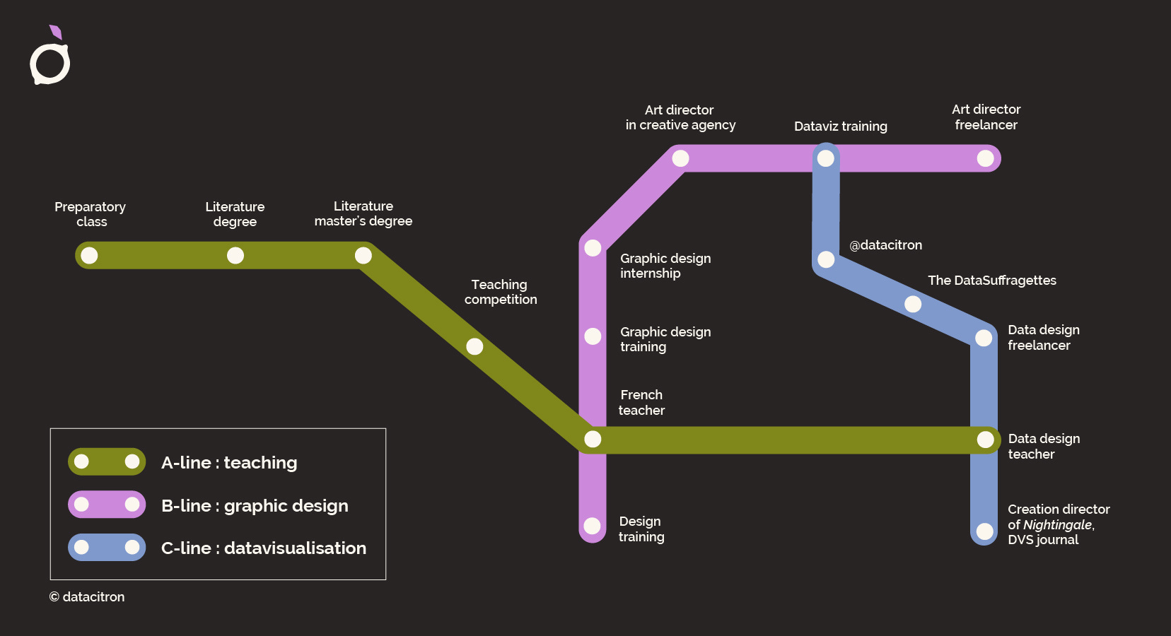
I recently saw Julie Brunet (aka datacitron) present her journey as a data designer and teacher using a metro map. The different lines follow their own path, until they all intersect, going the same direction. Building on the familiar concept of a metro map not only adds originality to the piece, but also reinforces its meaning and effectiveness.
Gabrielle Mérite is also known for using metaphors in this why. She’s recently published graphics that imitate the feeling of a hug and the look of a desert — to name just a few. Each piece brings us a little closer to the data it visualises, making numbers more human and more accessible.


While these examples are quite powerful, often you don’t have the luxury of getting this creative in your work. In those situations, even small details that reinforce the concept of your data can still be effective. Simon Scarr’s visualisation called Iraq’s bloody toll is a great example of this. Looking at the image, we get the feeling of death and war, which the designer achieved by flipping the bars and colouring them in red.

Even a small emoji can have a similar effect — like in the chart below that shows the number of times we unlock our phones each day, taken from Scott Galloway’s latest book.

Finally, words — as opposed to design elements — can have this effect too. The latest newsletter from the Chartr team was called Phone Home. What does that make you think of? Of course, E.T.
So when you start your next project, ask yourself: are there any metaphors or familiar concepts I could use to increase the effectiveness of my design? And if you need a process to get started, Alli Torban has some tips for you in this article.
As always, thanks so much for reading The Plot.
See you next week!
— Evelina
New: data storytelling course
Next month, I’m running my very first data storytelling masterclass open to the public (yay!). We’ll work on how to craft, design and present data stories that inspire action. You can find more details and enrol here! If you have any questions about the course, hit reply to this email or schedule a chat here.