Wants & Needs
A Pixar inspired approach for analysing your target audience
When you start a data project, what is the very first thing you do? Do you open up a spreadsheet, create a few charts, or define preliminary questions to answer with the data? I usually begin with none of the above. Instead, I paint the picture of the key person in the story.
The hero.
Every good story has a hero—the main character who achieves great things. Who is the hero in a data story? It’s not you. Not me either. It’s your audience. They’re the ones you’re communicating with. They’re the ones you want to inform and inspire to take action thanks to your data insights. That’s why it’s good practice to begin crafting your story not by analysing the data or creating charts, but by profiling the audience.
The hero is a term we typically use in classical stories, like books and films. I do think that many concepts from these traditional formats apply to data storytelling, too. That’s why the content of the course that I facilitated these past two weeks included references to screenwriting, and more specifically, the process at Pixar.
We began by answering two questions about our heroes.
Wants
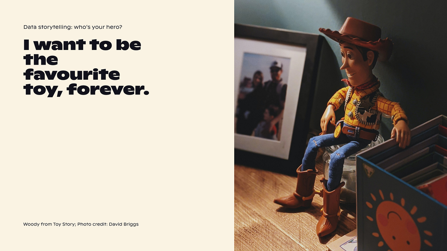
What does your audience want? Who do they wish to become? They may have big dreams, like “I want to be champion or king”, or more down-to-earth ones, like “I want a new car or a new VR machine”. Wants drive the hero to act. In the film Toy Story created by Pixar, Woody wants to be his child’s favourite toy and remain that way. How does this relate to data storytelling?
Let’s look at two examples. First, imagine you’re a marketing manager for a Portugal-based sustainable tableware company. You’ve just launched an Easter promotion campaign to encourage people to buy sets of tableware and silverware at an attractive price. Your job is to communicate the results of the campaign to your VP of Marketing. Before you do anything else, define what your VP of marketing wants. Perhaps they want the company to be renowned worldwide for its beautiful and practical products. Or perhaps they want to improve their own reputation and get a promotion if the campaign is successful?
In the Life Under Curfew data design project I worked on with Data4Change and the Social Justice Centre Working Group, our audience was the local community. People who live in informal settlements in Nairobi and often suffer from police brutality, extortion, and unfair arrests. What do they want? A happier, safer life for their families and themselves.
The wants are your audience’s big, long-term goals. Sometimes, they’re not expressed out loud, so it’s up to you to dig for them. And then define the corresponding needs.
Needs
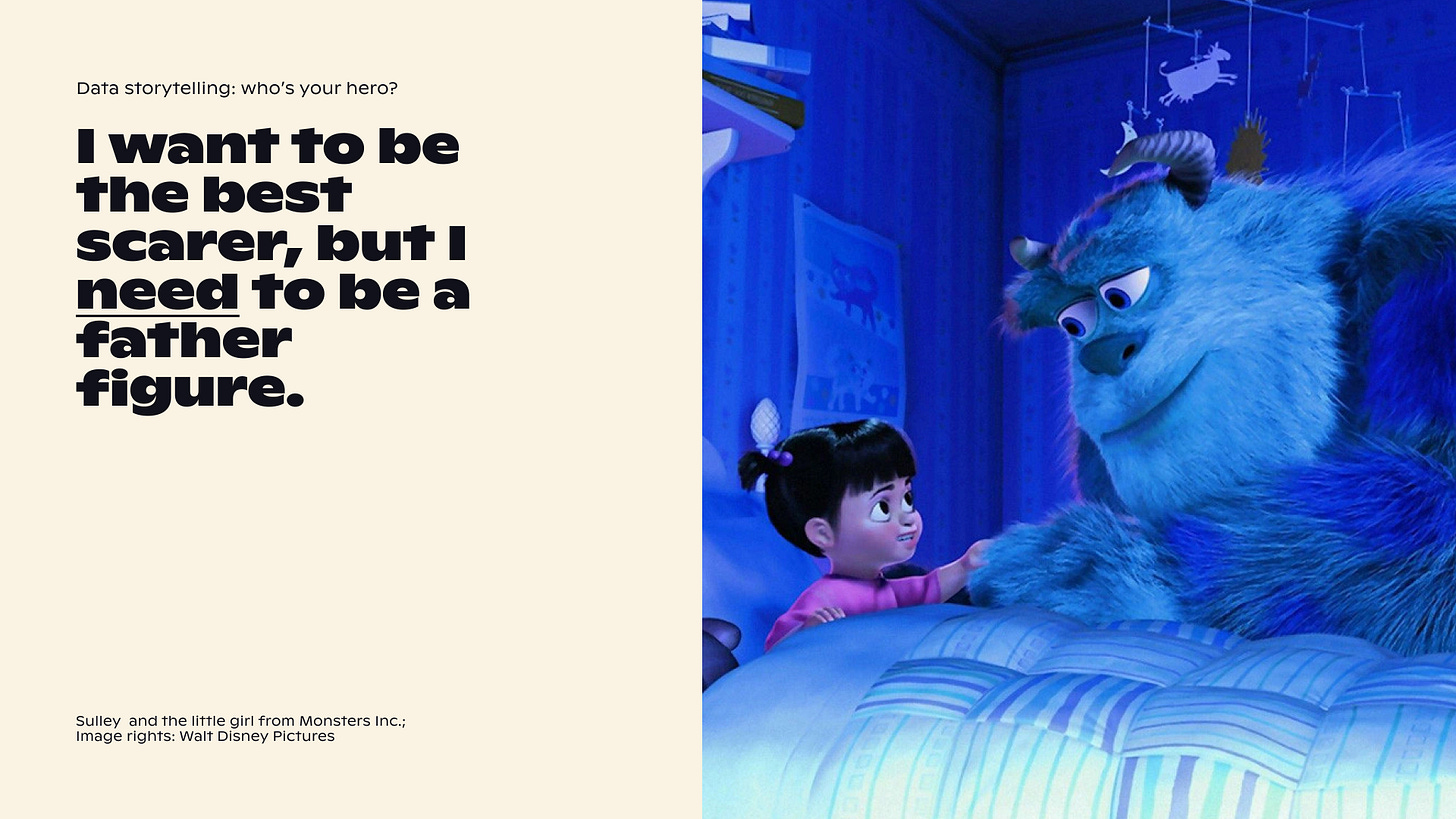
What does your audience need to succeed? The needs are much more down-to-earth than the wants. A need is something you don’t necessarily like admitting. For example, you need to eat your vegetables. That may not always be fun, but in the end, you must eat them to be healthy. In Toy Story, Woody needs to learn to share. In Monsters Inc., Sulley wants to be the best scarer but he needs to be a father figure.
Remember that VP of marketing? What do they need to achieve what they want? For that successful reputation boost—for themselves or the company—they need to track the key performance metrics of the campaign. Perhaps it’s the increase in revenue, the conversion rate, or the awareness of the brand. It will probably be up to you to choose and present the relevant metrics.
In the Life Under Curfew project, most of all, the community needed to raise awareness. This is why they organised a live event in Nairobi for people to meet, understand the data, and even participate in some of the quantitative murals. It was the first step towards a healing process and a good foundation for future advocacy work.
So what?
Analysing the wants and the needs is a simple model that can help you put yourself into your audience’s shoes. It’s a little different from the typical audience analysis frameworks—e.g. user personas—yet quite eye-opening. Perhaps you won’t write down the wants in a publicly-available document, but they can help you see the bigger picture and aim higher than just charting some KPIs. And who knows, perhaps this approach can help you get that promotion, too.
Thanks for reading The Plot. 🦸🏻♀️
See you next week,
—Evelina
Weekly gem
Stealing visuals by Alessia Musio. A beautiful collection of visuals inspired by the outside world. Published every Sunday.
When you’re ready, you can reach out to me to help you craft and design engaging data stories. I take on design, consulting, and training projects. Hit reply to this email or set up a chat to get started. Don’t wait too long though—my schedule for Q2 is almost full!


