Understanding the world through dataviz
Sharing charts and maps to better grasp important issues of our day
On 24 February 2022, Russia invaded Ukraine.
It was a sad day for Europe and the whole world. What’s even more painful is the fact that this war has been going on for an entire year now. An entire year of fear, loss, and hope. Last week, many media outlets across the globe posted stories about the war to mark this one-year anniversary. My dataviz feed on Twitter was flooded with maps, charts, and visuals explaining what happened in the past 12 months and offering a glimpse into what’s yet to come.

I wasn’t surprised to see data visualisations used as a means to explain the conflict. Over the past years, I’ve consumed thousands of graphics. There’s rarely a case today where an important topic reaches my attention without being accompanied by a chart or a map. War and conflict are by far not the only topics presented. So are earthquakes. Abortion laws. Real-estate prices. Eurovision winners. Rain patterns. Wine consumption. And so, so many more.
Increasingly, I see and understand the world through data and visualisation. I bet you do too.
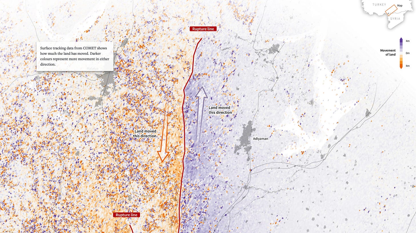
Here are a few more brilliant examples just from the past week. First, a story on the earthquake in Turkey and Syria by the team at Reuters:

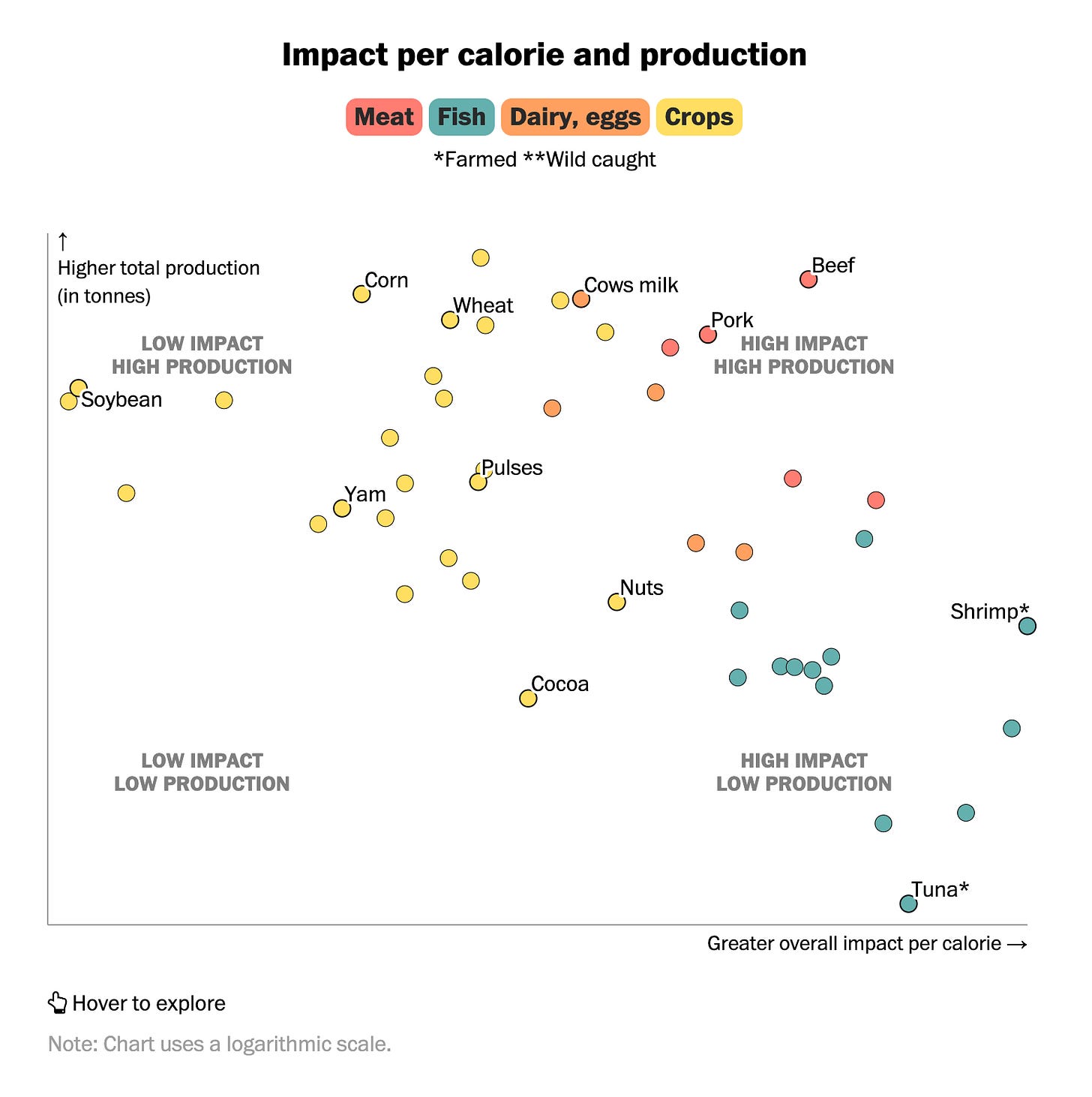
And a piece on the environmental impact of what we eat by the Washington Post:

But why does it matter that dataviz is everywhere? Why should you care?
Graphics help us grasp the extent of the issues we observe around us — good or bad. Think of the number of refugees who left Ukraine or the territories occupied by Russia. Could you remember and cite the numbers to someone without seeing them? If the visual aspect of these stories were omitted, it would be nearly impossible to recall or feel for any of them.
So my call to action to you today — in this short and slightly emotional edition of The Plot — is twofold:
When you stumble upon a good chart, share it with someone who cares about the topic. Chances are, they would never encounter the graph on their own, and you’d be helping them expand their view of the world. My sister jokes that I send her the images from all the articles I read in the media, but I know she secretly likes them all!
Teach data literacy to people around you. With so many charts floating around, it’s easy to be misled. Help your family and friends be vigilant. How can they know if the chart axis has been truncated? What happens if you use absolute values instead of ratios on a choropleth map? Empower them with knowledge.
As always, thank you for reading. 💙💛
Talk next week,
—Evelina
New: data storytelling course ✨
Want to upskill in data storytelling this year? In a little less than four weeks, I’m running my very first data storytelling masterclass open to the public. We’ll work on how to craft, design and present data stories that inspire action. You can find more details and enrol here! If you have any questions about the course, hit reply to this email or schedule a chat here.
If you’re curious about why this course is unique, here’s a little sneak peek!


