Tools talk
An overview of the main dataviz tools and when to use them
Which tools do you create graphics with?
In the past weeks, I had many conversations—both with clients and dataviz community members—on which tool best suits their needs. As our field grows, there seems to be more and more confusion about what software is the most effective and when. So let’s unwrap that together, shall we?

Use BI tools for exploratory analysis.
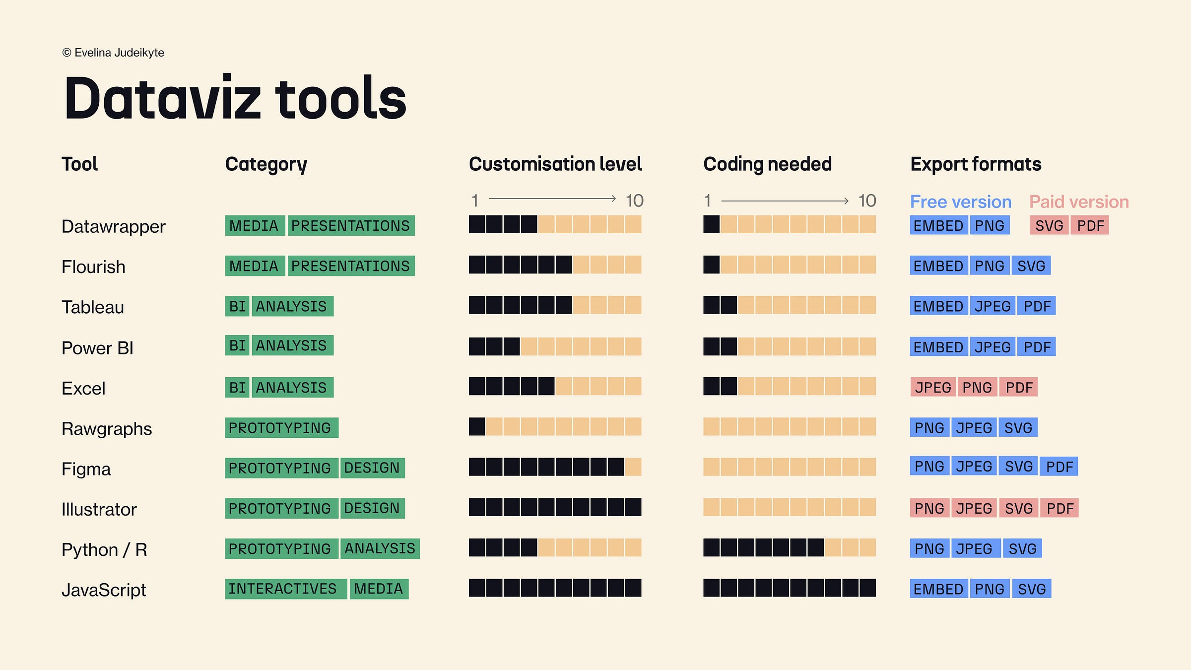
The most known tools are business intelligence behemoths: I’m sure you’ve heard of Tableau, Power BI, and the good old Excel. Since many companies use them, people often think they should, too. But they’re only good for a specific purpose—exploratory visuals. For example, if you want to create an operational dashboard to track your company’s marketing campaigns, Tableau will be awesome at it. But if your objective is to communicate with explanatory charts (aka you have a message to convey), keep reading.
Don’t take screenshots of your charts.
While BI tools are great for a quick overview of your data findings, they’re a little clunky. So if you want to share your charts online or in a presentation and plan to grab screenshots from Tableau or Power BI, please don’t. Use Flourish or Datawrapper to embed standalone charts or short stories on your website. If static images are what you need, get design help from someone who knows how to use Figma or Illustrator. Trust me, the result will be much more professional.
Go down the rabbit hole, if you’re ready.
If you have developers on your team, you may want to give programming a shot. You can create decent charts with R and Python without worrying about the limitations of the drag-and-drop tools. If you need a super custom, interactive, or even exploding solution, JavaScript will be your best shot. The most advanced JS library is called D3.js and boy can it go far. It can give you the dreamy look and feel of a New York Times article, although it will come at a cost.
You needn’t know how to use all the software named above. You should however be able to switch between at least two types of tools—one for analytics and one for presentation design, for example. Make sure you use the best tool for the job—and not the one you hear about the most—to get stellar results.
Hope this helps! 🛠️
See you next week,
—Evelina
Want to learn data storytelling with me?
Here are three upcoming trainings you can join:
🏴 Data storytelling bootcamp online starting January 29. As a reader of The Plot, you get 10% off with the code THEPLOT10. Only a few spots left!
🇫🇷 One-day data storytelling course in Paris on March 26.
🏴 Two-day data storytelling course in Utrecht on April 16-17.
Can’t wait to see you there!


To complement the list, here's a new kid on the block: https://www.datylon.com/.
You can use Datylon to create explanatory charts online, in Illustrator and in Powerpoint. It's not only good for one-off's, but also for report automation or embedded reporting.