Strategic storytelling
An interview with Kat Greenbrook, the author of The Data Storyteller’s Handbook
How many people do you know who specialise in data storytelling? There are not too many of us across the globe and it’s always great to celebrate each other’s work and learn from our respective techniques. That’s why I invited Kat Greenbrook for a chat. I first met Kat when she gave a beautiful talk at Outlier and have been following her ever since. In this edition of The Plot, you get a glimpse into the behind-the-scenes of her workshops and book writing. Enjoy!
Hi! Thank you so much for agreeing to talk to the readers of The Plot. Could you please briefly introduce yourself?
Kia ora! 👋 I’m Kat, a Data Storyteller living in New Zealand. I’m the author of The Data Storyteller’s Handbook and I teach data professionals how to communicate data effectively through storytelling.
How did you end up specialising in data storytelling?
I enjoy data visualisation but have never been content with only making data visual. I’d design a visual and constantly ask myself, “So what…?”. Data storytelling let me evolve my data visuals into more strategic communication tools.
You’ve recently published a book on the very topic. Why did you decide to take on such a time-consuming endeavour? And was it worth it?
Yes, it was worth it. But, yes, it consumed a lot of time 😅
My biggest reason for writing a book was to complement my workshops. I needed something to point to and say, “Everything we’ve talked about today, you can find here”. A book detailing my data storytelling process was also something I could offer to those unable to attend a workshop. Since publishing, my global network has kept expanding, which I’m enjoying!
Everyone has a slightly different definition of data storytelling. Some equate it to data visualisation (which always makes me frown), while others talk about character arcs and subplots. What is your vision of storytelling in the world of data?
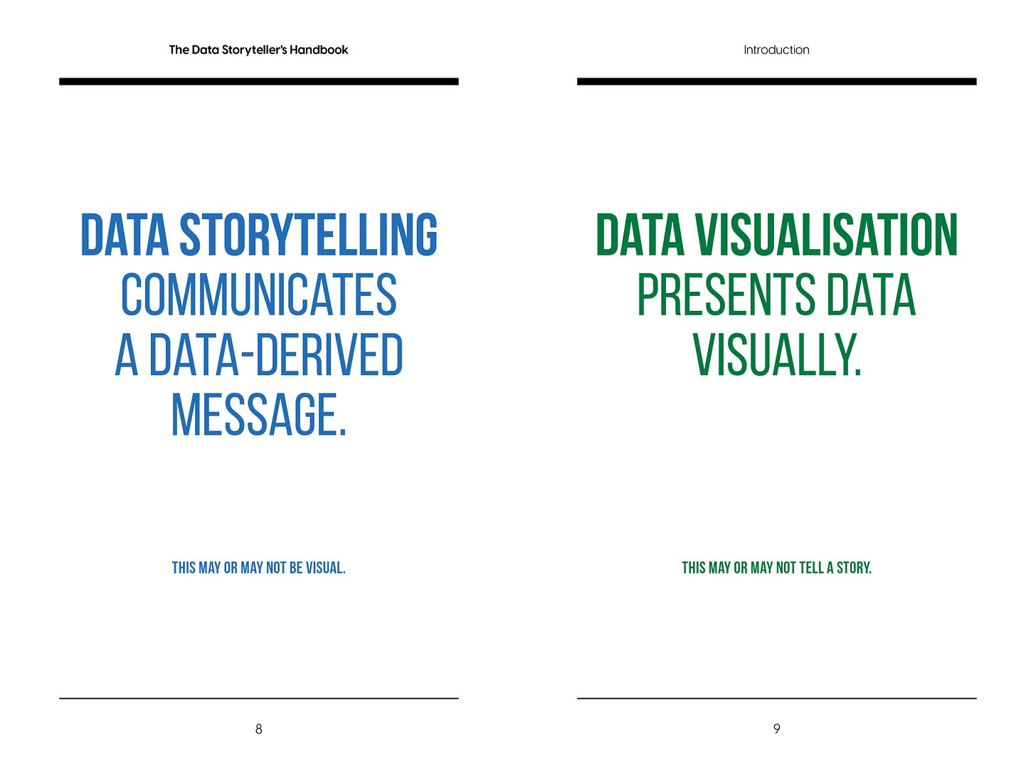
I think this is easier to understand after splitting the term into a “data story” (the message) and then how it’s “told” (the communication). Visualisation is a common way to communicate data, so it often gets confused with data storytelling. But what makes data storytelling different from data visualisation is the presence of a story. A story weaves together data insight with context and meaning to help an audience understand a specific message.
What would you say is the key ingredient for an impactful data story?
An important word here is “impactful” because data stories can be interesting and yet create no impact. I think a key ingredient is strategy — or an understanding of what you want your data storytelling to achieve. If your data story helps achieve a business goal, it’s likely to create a positive impact. It’s harder to create impact if you aren’t aware of these goals and don’t approach the data storytelling process with a strategic mindset.
If your data story helps achieve a business goal, it’s likely to create a positive impact. It’s harder to create impact if you aren’t aware of these goals and don’t approach the data storytelling process with a strategic mindset.
For our readers who love concrete tips: how do you turn an exploratory chart into an explanatory one with limited time?
Sometimes, the same exploratory chart can be made explanatory with a few quick changes. There are also times when creating an effective explanatory chart requires a completely different chart type.
I have a few questions to help with this:
What do you want your audience to learn from your graph? Turn this takeaway into a title.
What data best communicates your takeaway? If you show too much data, you create noise (a distraction from your takeaway). However, if you show too little data, your audience questions the significance of your message.
What is the most appropriate chart type for your data? This might be different from the original exploratory graph.
Would visual contrast help focus a reader on your takeaway? Highlight what’s most important.
Would annotations help to explain further details? An annotated data visual encourages further engagement to learn more.
I know you run many workshops on the topic, so I’m curious: which of the concepts that you teach surprises your audience the most? Is there a framework or idea most of them haven’t heard about?
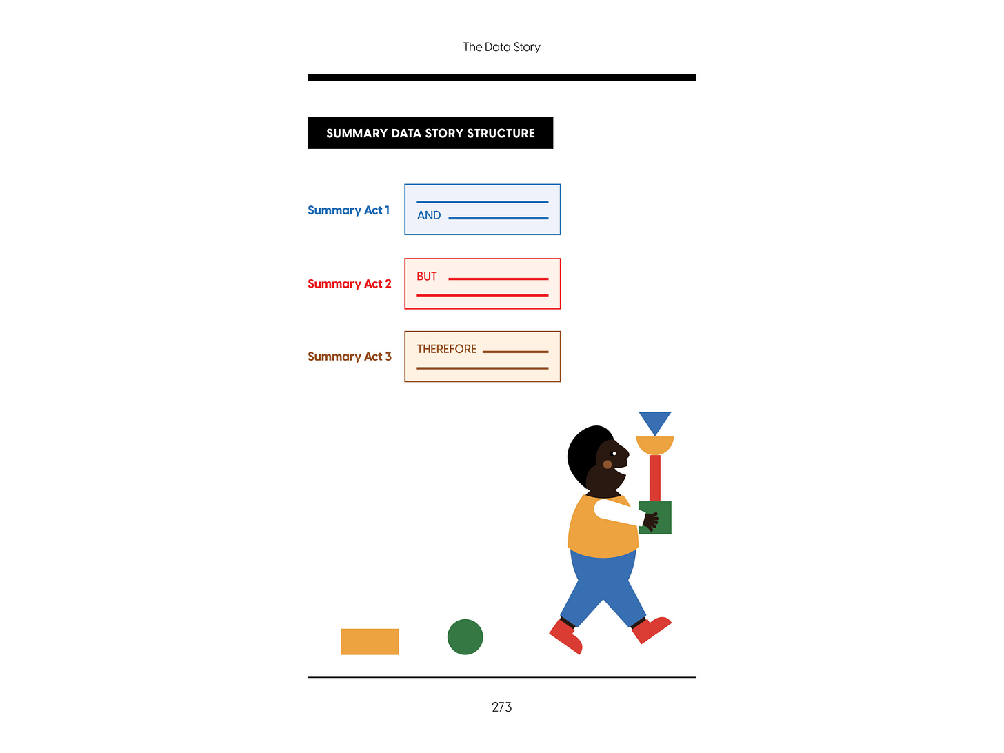
Yes, and it’s usually to do with narrative structure. Many stories follow a three-act structure. This story structure isn't new, it dates back centuries to Aristotle. But an easy way to understand the three-act structure is the And-But-Therefore (ABT) Framework. These three words (and their synonyms) advance a story through its three acts.
For example: "Africa's animal kingdom is ruled by lions, AND Simba is a young lion who will succeed his father (Mufasa) as king. BUT when Simba's uncle Scar murders Mufasa, Simba is tricked into thinking he is responsible and flees his homeland. THEREFORE, Simba needs to overcome his guilt before he can take his rightful place as king.”.
With the right informational building blocks, the same three-act structure can be applied to data storytelling.
What’s your favourite data story example?
I’m a fan of The Side Eye by New Zealander, Toby Morris. His data stories are designed for a general audience so they aren’t heavy on the data, but they communicate the meaning of the numbers effectively.
Where could people connect with you if they wanted to follow your work?
You can find out more about my book and workshops at www.roguepenguin.co.nz. Feel free to connect with me on LinkedIn.
A huge thanks to Kat for such an eloquent interview. I hope you learned something and got inspired to read her beautiful book.
See you next week,
—Evelina
“Great course if you want to learn how to tell better stories from your data. The best part is that you get hands-on experience working with datasets and sharing insights!”
What is this about? My three-week online data storytelling bootcamp! The next cohort starts in early June. Oh, and not to brag, but the bootcamp does have a 4.8/5 ⭐️ rating.
A few spots remain! Use the code THEPLOT10 for your exclusive 10% discount.


Thank you for this piece! I am new in the data visualization/ data storytelling world and this helps a lot learning how to distinguish between terms that seem close for the untrained eye! And finding more people in this field is always great!
Helping distinction between data viz and data storytelling. I often find people use them interchangeably but there’s an important difference and skill set