In defence of stacked bars
Stacked bar graphs can be effective. Here's how.
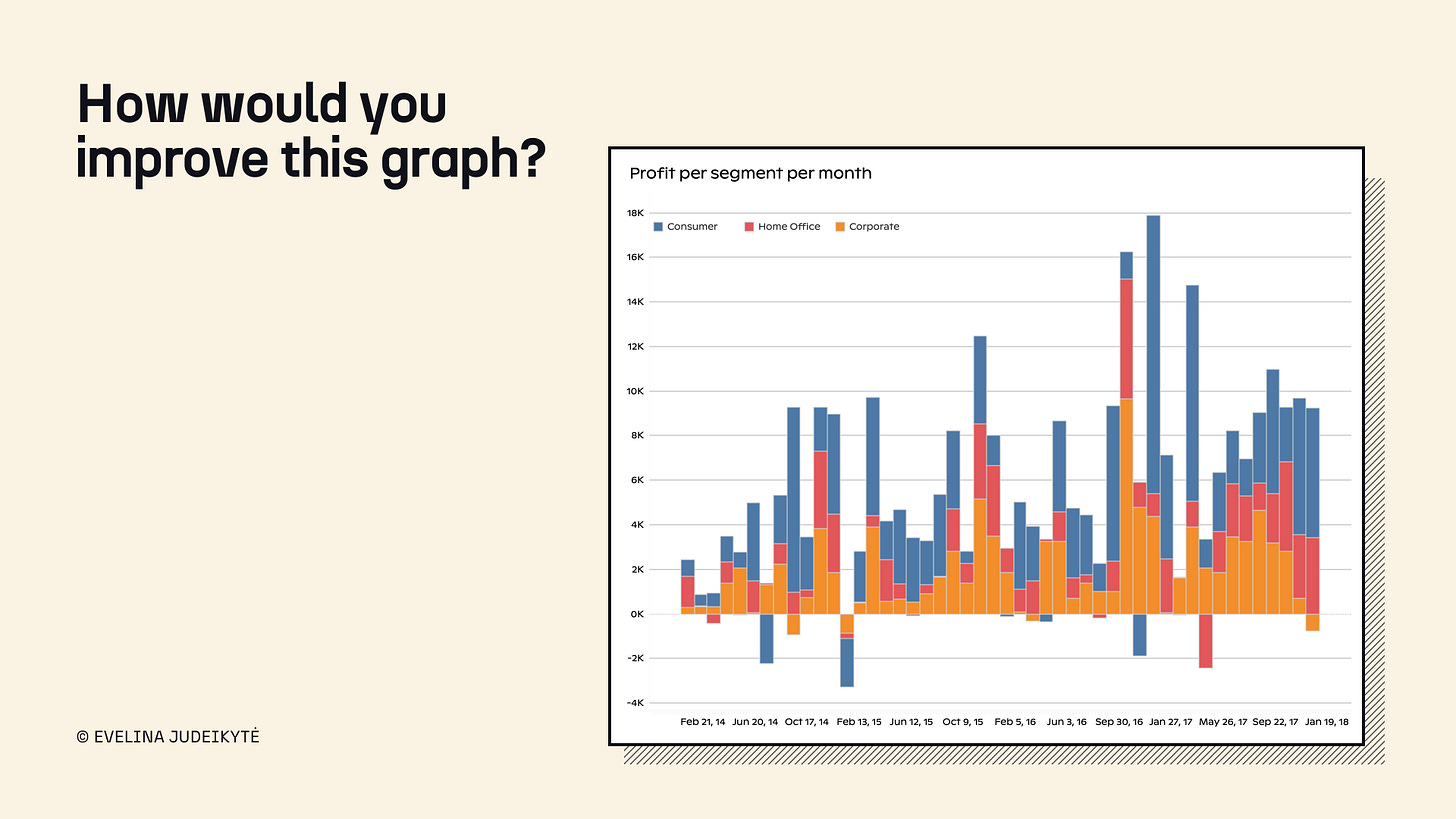
In my data visualisation trainings, we often do makeovers. One of the graphics I show to learners is the colourful stacked bar chart above. When I ask them what they would improve, a lot of people argue for another chart type. Typically, a line. While lines would certainly be neater—or take up less “ink”, if you’re into that kind of thing—the chart would no longer serve the same purpose.
Since there seems to be animosity towards stacked bars, I want to give them some love today. Let’s look at three examples of how this chart type can be made effective.
Example 1: The Markup
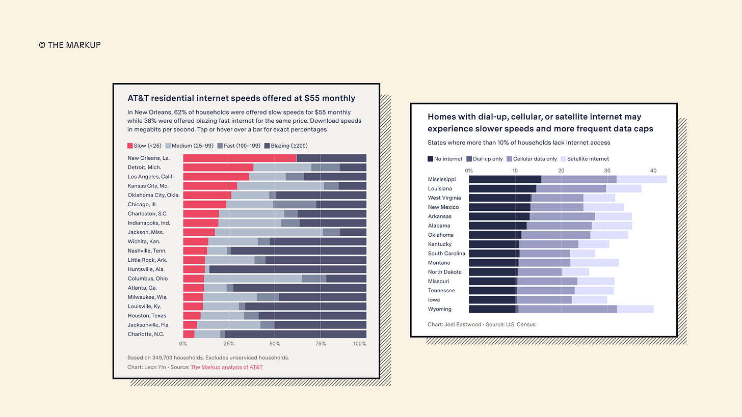
I love both of these charts by The Markup. There is quite a lot of information to digest, but two design choices make our lives much easier:
Pre-attentive attributes. It’s easy to spot what we’re meant to look at first. And what’s fascinating is that no flashy colour is used to achieve this in the second image.
The legend. Notice how the order of items in the colour key follows the order of the categories in the bars? So simple. So effective.
Example 2: The New York Times
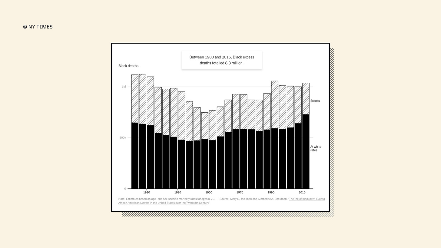
Here, instead of using colour, the designers used a pattern to illustrate the excess category. This entire article by the NY Times is in black-and-white, and it’s beautiful. You don’t always need to colour to get your message across, not even in stacked bars.
Example 3: The Wall Street Journal
The above chart by The Wall Street Journal has some of the attributes I already mentioned—a diverging colour scale that attracts attention and a well-ordered legend. But it also includes a brilliant tiny detail: an explanatory annotation. It’s not easy for you to calculate that half of the sales are homes priced between $250k and $500k, so the authors spell it out for you. And it’s powerful. It’s a brilliant example of how you can turn an inherent chart-type disadvantage—difficulty telling exact values—into something insightful.
Perhaps there is nothing inherently wrong with stacked bars as a graph type. They can be saved, after all. Including the image at the beginning of this post.
Below is a snapshot of how we improved that (not ideal) graph in class. While it’s certainly not as stunning as the examples from The Markup or The NY Times, it still shows that conscious, effective design decisions can make any chart type work. And it can often be done in a short amount of time.
Thank you for reading! 📊 If you’d like to see more chart deep-dives here on The Plot, let me know by clicking on the poll below or replying to this email.
See you next week,
—Evelina
Want to learn data storytelling?
Here are three upcoming trainings you can join:
🏴 Data storytelling bootcamp online starting January 29. As a reader of The Plot, you get 10% off with the code THEPLOT10. Only two spots left!
🇫🇷 One-day data storytelling course in Paris on March 26.
🏴 Two-day data storytelling course in Utrecht on April 16-17.
See you there? If you’re still on the fence, hit reply to this email and we’ll chat!


