Spaghetti cutting
Three ways to make your chart legible when you have (too) many categories
Can you think of a chart named after a food item?
There’s a chance pie chart is the first one that comes to your mind. But have you ever heard of a spaghetti graph?
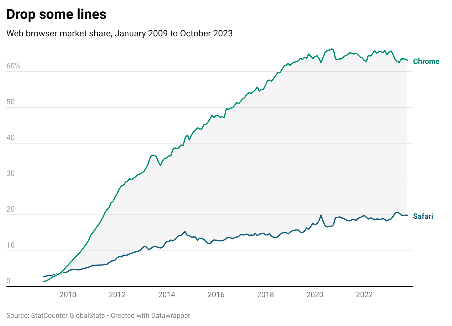
When we speak of spaghetti in data visualisation, we typically mean line charts with an overwhelming amount of categories. In the image above, you see web browser market share over time. Each browser has its own bright colour making it quite difficult (not to say, annoying) to read.
To be fair, Datawrapper’s design is too nice to do the spaghetti chart justice. A quick Google search will show you this graph type in its full glory.
So if you find yourself in front of a bowl of spaghetti, how can you turn it into something edible? You could consider dropping, highlighting or cutting.
Drop
In a spaghetti situation, ask yourself the following: must I really show all the categories? Does my audience need to see all the data to get meaningful insights from the graphic? If the answer is no, you can filter down to key items only. Imagine I’m writing an article on the rise and fall of Apple’s Safari browser. In this case, it could be enough to compare its market share to that of the leader—Google Chrome.
Highlight
If you need all the categories, that’s OK. The next question to ask is: what’s your key message? The answer can help you bring part of the information forward and keep the rest in the background. If I were to focus on Chrome’s overwhelming leadership, I’d highlight that line in a brighter colour and leave the rest blue or gray. It's much better than the initial version, isn’t it?
Cut up
Disclaimer for all my Italian friends reading this: I’m about to suggest some spaghetti cutting! If you need to show all categories and highlighting doesn’t make sense, you can call upon the power of small multiples. Creating a small multiples chart essentially means splitting the initial view into many smaller views with the same baseline. It’s meant to reduce the cognitive load (and look good along the way 💄).
You may be thinking that the small multiples approach makes category comparisons more difficult. And they do sometimes. But no worries: a solution exists! Instead of simply drawing a line for each category, you can leave the other category lines in the background. Smart, isn’t it? See the image below for what that could look like for the web browser example.
A while ago, making these sorts of changes required a custom tool like Illustrator or D3.js. Today, you have many more options: Datawrapper and Flourish allow you to create small multiples, and even Google Sheets now have the highlight functionality. So there’s no excuse for illegible line charts. 🍜
Happy spaghetti cutting!
See you in two weeks,
—Evelina


Glad that Datawrapper added this new capability