
Solutions, not products
How to choose the best output for your project

“I need a dashboard, can you make me one?”
“I need three static infographics to show this data.”
“A website like this one from the New York Times, please”.
How often do stakeholders—external clients or internal coworkers—come to you asking for a specific data output? I’d be willing to bet that it’s more often than you’d like. Is there anything wrong with that?
Possibly, yes.
When the focus from the beginning is on the type of product to be made instead of the best way to solve the problem, that said product may totally miss the target. A dashboard may be good for tracking lots of operational business details, but it would be overkill for someone who needs to see a single figure. A static infographic can be great for sharing via email or social media, but it may not be super engaging when posted on your website.
See what I’m getting at?
Last summer, I worked with Human Rights Funders Network on a human rights funding project (spoiler alert: it doesn’t go where you think). The client was initially looking for someone to design a static, research-rich PDF in English and short summary documents in Spanish and French. And we did indeed produce those. But, after an open, creative discussion, we added another deliverable to the project.
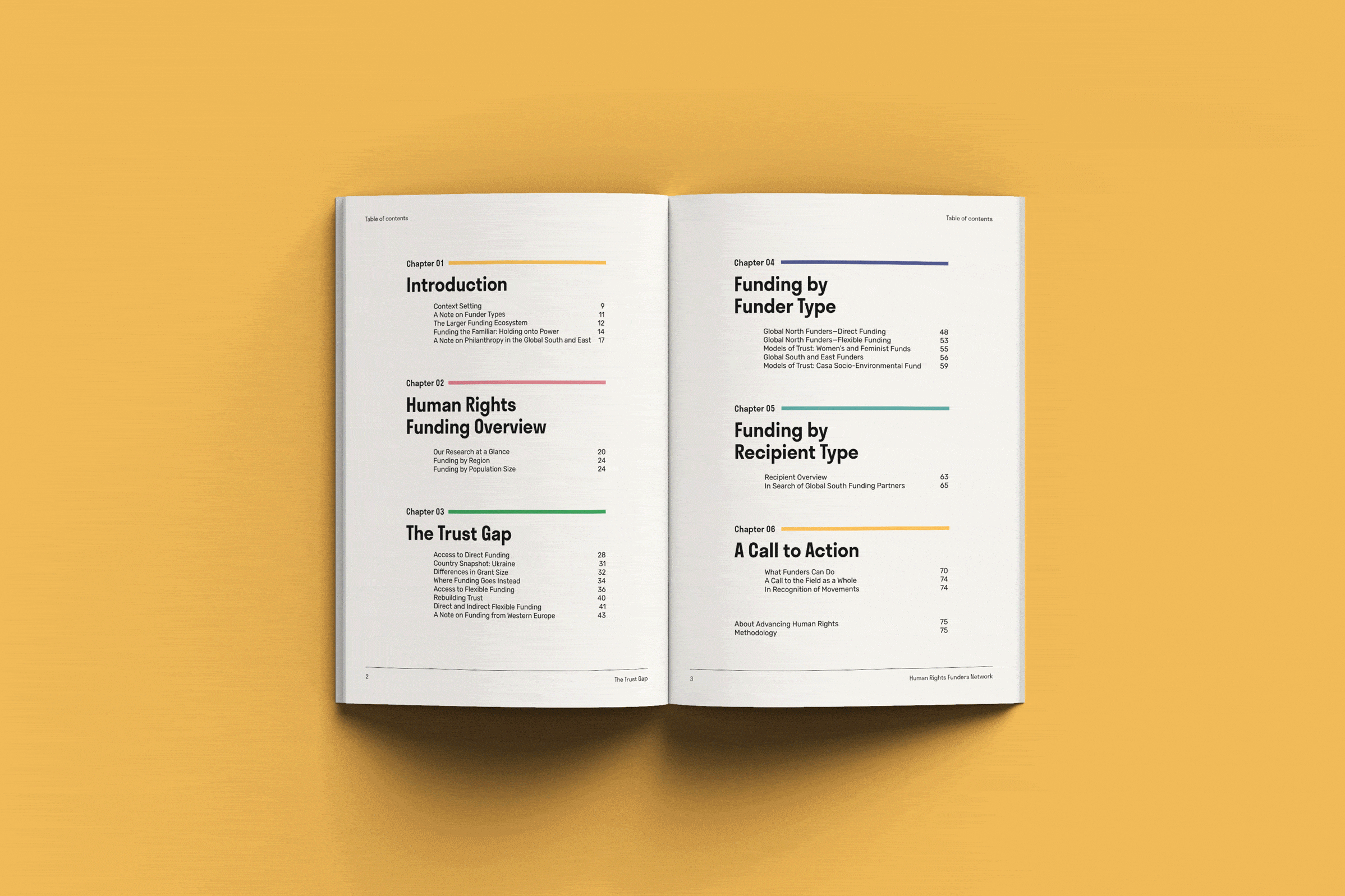
How did that happen? We reconsidered the goals of the campaign and its audience. The objective was to communicate human rights funding data in a clear yet engaging manner. That meant providing people in the field with solid research but also surprising them visually so that they’d want to read the content. We took the time to study all the design options—from the simplest reports to the most complex scrolly-telling pieces.
In the end, we landed somewhere in the middle. We decided to design a traditional PDF report that HRFN’s audience was used to. But we also added a web page with interactive charts to the mix: a new and playful touch to the serious research. We defined a solution to our challenge instead of simply focusing on the types of outputs we could make.
So how can you do the same? Deliberating on the following questions can help:
How does your target audience typically consume content? What’s the best way to get the data to them?
How engaged is your audience already? Will they happily read your insights or do you need to lure them into it?
How long have you been working with the same format? Are there advantages to trying something new? How new can it be? Do you need to innovate gradually or can you go all in?
What are your peers—and even competitors—doing? Are there any inspiring examples in the field you could learn from?
Do you have the time and resources to adapt your output for multiple media (print, social, online, etc.)?
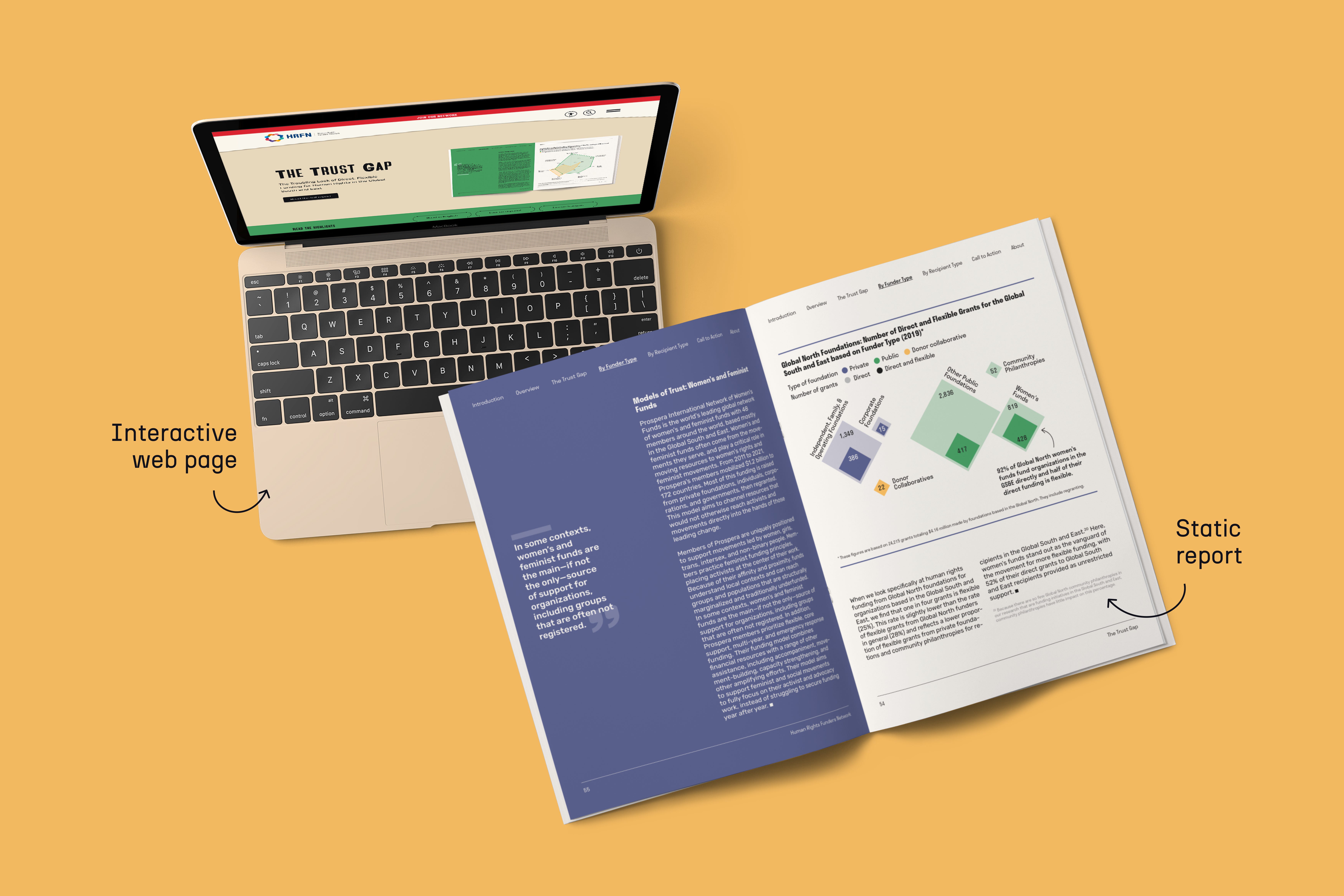
Asking such questions at the start of the project is key. But what’s even more important is your approach to it: you shouldn’t come into this discussion to prove the client wrong or show off your design thinking skills. What you need is an open mind and willingness to consider what’s best for the audience. I don’t take credit for adding an online element to the above project; it was an outcome of an open collaboration with the HRFN team.
Sometimes—or perhaps even often—you’ll land on the initially requested solution. But it will be a solution, not a product.
See you next week,
—Evelina
Data storytelling bootcamp: new cohort
Want to learn how to turn data insights into actionable stories? Join the next cohort of my data storytelling course. It will be an insightful, fun, and interactive experience—rated at 4.8/5 ⭐️. Here’s what Elizabeth, one of the previous cohort participants, had to say about it:
Very insightful and unique course. Evelina's experience, expertise and enthusiasm are so valuable. I loved the structure of the bootcamp, but also the fast-paced rhythm of the live sessions which were completed by extra resources for further learning. It also felt like a truly safe space to share and learn. Very recommended!
The spots are limited so don’t wait to subscribe! Use the code THEPLOT10 for 10% off and secure your seat now.