Sneaky slides
How to make great presentation decks if you’re not a designer
What’s the most difficult format to design for?
Slide decks are surely at the top of the list for me. How do you make them clear yet captivating? How do you ensure there’s enough information without overwhelming the reader? And how do you balance the oral and the written? Finding answers to these questions can be a struggle. Especially if you’re not a designer.
Let’s work on that together, shall we? Here are my three best slide-making tips for non designers.
P.S. None of the below recommendations are affiliate links; I simply think they can be helpful!
Get a proper template.
Unless that’s part of your job, don’t worry about creating the perfect deck yourself. It will take you ages to polish all the details and there’s a chance you still won’t like it (been there!). Instead, get a pre-made template. It will save you time and guarantee an effortless yet awesome look.
I’m not talking about default themes in PowerPoint or Google Slides though. For a much nicer output, you can explore:
The Master slides for simple and efficient templates and even an image gallery;
Circular templates—a lot of their decks focus on brand identity design but they could be adapted for many other use cases;
Katya Kovalenko’s ressources—she has a few Domestika courses with easy-to-use templates, including a brand new one on AI-generated slides.
Make custom dataviz.
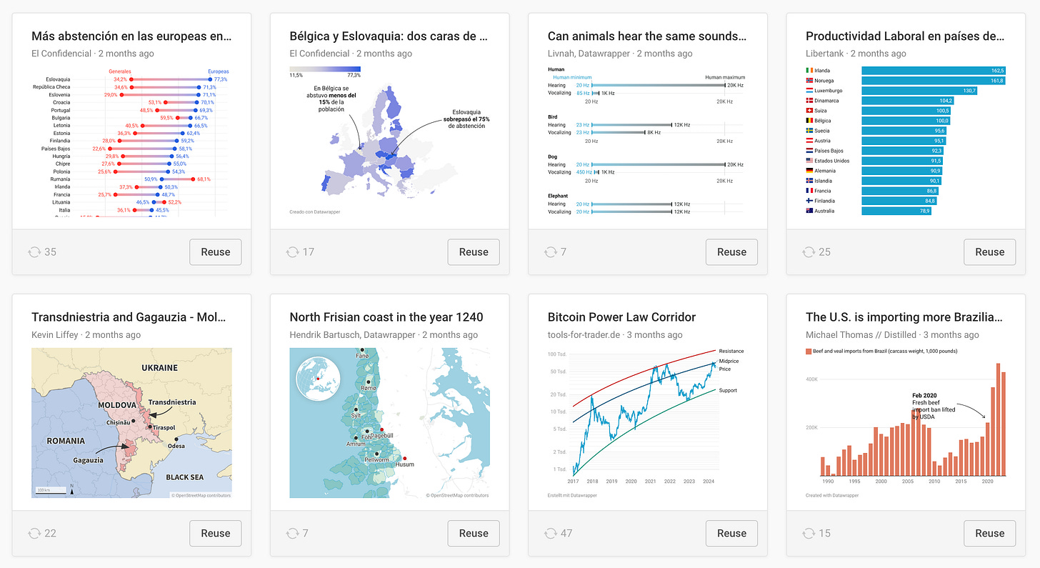
If you want your presentation decks to look professional and crisp, you’ll have to put in a bit of extra work when it comes to charts. Resist the urge of copy-pasting—or worse yet, screenshotting—graphics from other formats, like dashboards (yikes!). Get familiar with a at least one software that will allow you to make high resolution static visualisations. I suggest you try out:
Datawrapper. A user-friendly tool that makes gorgeous graphics in just a few minutes.
Flourish. A similar tool with more chart choices and customisation options, if you need them.
Vizzlo. An unknown little tool I discovered last year that allows to create bespoke graphic types like the Nightingale’s rose.
Keep it simple.
One last tip to change your slide game—clean them up. Busy slides won’t help you make your case. The audience is either listening or reading the text on your slides. They can’t do both. No matter how much they like you.
An unwritten rule in slide-making is to not include more than 12 words on each one. Even though 12 is an arbitrary number (and I no longer have a clue where I heard it), the goal is clear: include just enough information to support what you’re saying. Don’t overwhelm the audience. Like Chris Anderson from TED said a while ago:
“Bullet points belong in the Middle Ages.”
I can hear some of you protesting: but what if I need to send the same slides via email to those who didn’t attend the live presentation? I know. In many organisations, you’ll need both. Both means two different slide decks: one for the oral delivery and one for the written one. In the written version of the deck, you can add back all the commentary you explained out loud.
If it’s in your organisation’s culture to share some material prior to the meeting, perhaps you can hide some data points to peak people’s interest. Chartr does that in their newsletter every week:
I can’t wait for the day when all presentations will be clear and captivating. How about we all contribute to that?
Thanks for reading The Plot!
See you next week,
—Evelina
“Great course if you want to learn how to tell better stories from your data. The best part is that you get hands-on experience working with datasets and sharing insights!”
What are we talking about? My three-week online data storytelling bootcamp! The bootcamp has a 4.8/5 ⭐️ rating and is totally worth your time.
The next cohort starts in early June. Use the code THEPLOT10 for your exclusive 10% discount. Only 5 spots left!


Another great post. Getting students to limit the number of words on a slide can be really challenging. Like your 12 word limit, a long time ago I heard the 5 & 5 rule- no more than 5 words per line & no more than 5 lines of text.
I’m sure there must be some actual studies from psychology/perception researchers on these limits. Anyone come across such studies?
Great recommendations as always 😃... and Katya Kovalenko's courses are highly recommended for presentation design in general and deck design <<chef's kisses 🤌>>