John Wooden was a basketball coach at the University of California in Los Angeles. He’s considered to be one of the greatest teachers of all time. When you hear stories about John’s work, something quirky stands out — he was obsessed with the fundamentals of basketball. He would drill his players over and over on the perfect way to pass, dribble and shoot. Even crazier than that, on the first day of training, he would force each of them to repeatedly practice putting on the socks and tying the shoes.
To those who laughed at this approach, John Wooden said:
I believe in the basics: attention to and perfection of tiny details that might commonly be overlooked. They may seem trivial, perhaps even laughable to those who don’t understand, but they aren’t. They are the difference between champions and near champions.
When I was listening to Wooden’s story on the How to take over the world podcast, it immediately made sense. You need to get the fundamentals of your craft right. Whatever that craft may be, you need to drill, drill and drill, so that you’re able to perform (almost) effortlessly when required. The podcast also got me thinking — what would practicing the basics look like for data storytelling? Two ideas came to mind. These are two concepts the participants of my trainings practice at least a dozen times.
The one-sentence takeaway
What is it you’re trying to show? Can you summarise it in one sentence?
Distilling your key takeaway into one clear and impactful sentence can take a while to do. Hence you need practice, and a method. When I’m working on the key takeaway for a design piece — that one thing I want the audience to remember — I like to use the method of 5Ws. The 5Ws is a tool employed by journalists to frame stories, and consists of answering the following questions: the what, the who, the where, the when and the why.
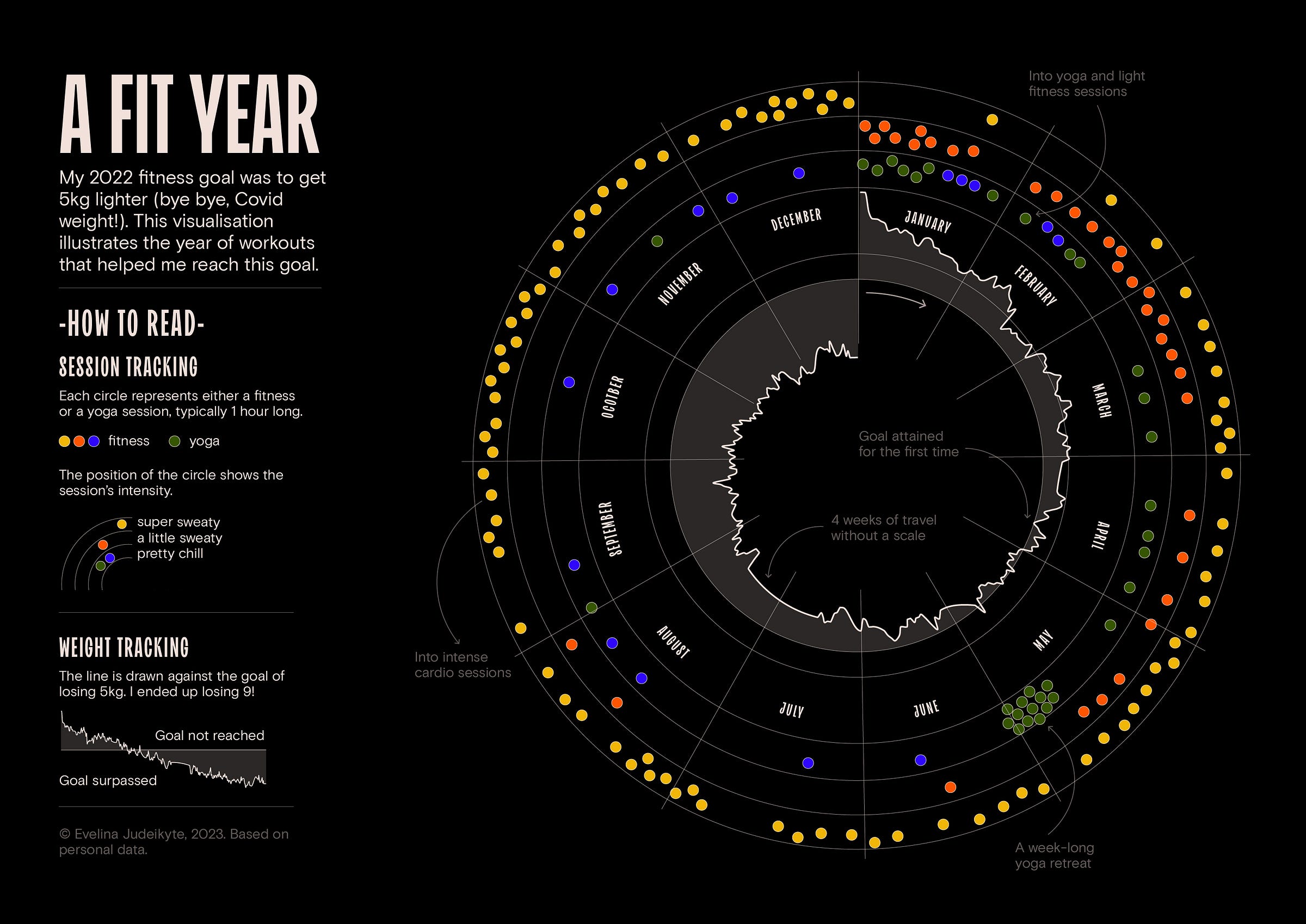
How can this be translated to dataviz? Let’s take a look at an example. Shown below is the last visualisation I created in 2022. And quite a personal one at that! Take a minute to explore it. What do you think its message is?
The one-sentence takeaway I’d write for this would read something like this:
In 2022, I reintroduced a regular fitness regiment into my weekly routine which helped me achieve desirable weight.
Did you notice the 5Ws hidden in the message above? Let’s spell them out:
In 2022 (when), I (who) reintroduced a regular fitness regiment (what) into my weekly routine (what) which helped me achieve desirable weight (why).
Writing a one-sentence core message can be time-consuming and a little strange at first. But practice and method certainly make it easier, and once you’ve mastered the drill, it can help you frame the angle of any design project or talk.
The three-sentence story
What’s the plot?
As I’ve written previously, a story is typically made up of three parts, or acts. At first, we set up the context. Then, we introduce a problem or an opportunity, which we resolve in act three. Just like writing the one-sentence takeaway, clearly framing the story’s plot is no easy task. So when I teach, I ask the participants to practice this many times to get the hang of it.
At first, they have to summarise the story in three sentences only, one sentence per act! This allows them to master the basics and later apply these to stories of any length. Going back to the example above, what do you think the three-sentence story would be? I’d write something like this:
Act 1. At the beginning of 2022, I started going to fitness classes again to lose weight, and the results starting showing super quickly.
Act 2. As I kept attending regular sessions, I was able to move from medium to high-intensity classes in a few months, and reached my weight goal 7 months earlier than planned.
Act 3. The new routine not only helped me lose almost two times more weight than I initially intended, but it also got me addicted to cardio (which is great for my health!).
These are just a couple of ideas on how to practice the basics of storytelling. Would you agree? What would you add? There was another idea I loved in the podcast — the thought that practice doesn’t make perfect; perfect practice makes perfect. So what would perfect practice look like for you?
As always, thanks so much for reading The Plot.
See you next week!
— Evelina
Announcement — a public data storytelling course, coming this spring!
I’ve got big news! This spring, I’ll be running my first public data storytelling masterclass. The course will be cohort-based, and I’m partnering up with Maven to do this! I’m really excited to share all the details with you soon. In the meantime, you can join the waitlist by replying to this super short survey. Once you do, you’ll be informed about the course launch date and the early bird pricing. 🚀
Did you know that I run my own data design studio called Parabole? 📡 If you like The Plot and my approach to data storytelling, do reach out to us for design projects, trainings or consulting services. Just shoot me an email at evelina@parabole.studio and we’ll get things going! See you soon :)


Here's the link to the article:
https://mallahyari.github.io/visualdecode/blog/visualizing-weather-types-and-trends/
Great article! Boy would it be nice if it were possible to share a template for that visual such that anyone could track their reading, yoga, workout, habits! I can certainly tell that exact template would be non-standard to reproduce, but it would be so cool and helpful to have a Flourish template or Tableau that I could just load in my data and get the same cool graphic :)