Let my dataset change your mindset
3 data stories that have changed the world, and what you can learn from them
Once upon a time…
Last week, I gave a talk on data storytelling at the French Ministry of Finance. It was a small event with a few dozen people in the room. My talk was the first keynote of the morning, and when I came up on stage, I observed the audience for a second: some of them were ready to listen, while others were a little distracted, heads in their electronic devices. Then, I started talking. The very first words I uttered were “once upon a time…” and their impact was spectacular.
A man in the first row lifted his glance from his computer to me, and I could see the expression of awe on his face. This is what stories do to us. As soon as our brains hear the magic words once upon a time, something happens. Something clicks. Our attention is caught. We want to listen.
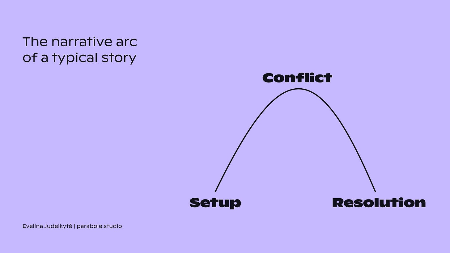
Of course, the goal of such an opening wasn’t just to tell a story. I wanted to remind everyone of the power of storytelling before exploring how this power can be applied to storytelling with data. A traditional story would follow the narrative arc shown below. But what about data stories? How do we turn insights into narrative? In this edition of The Plot, we’ll explore three brilliant examples to start finding answers this question.
Hans Rosling’s presentations
I hope that Hans Rosling’s name needs no introduction, but just in case — he was a Swedish doctor and public health professor. He was also one of the best data storytellers of our time, and the author of the quote let my dataset change your mindset.
Problem. Hans Rosling realised early in his career that most adults around the world knew very little about the quality of life elsewhere. He often asked people — his students at the Karolinska Institute or heads of state at the Davos conference — things like, how many girls in the world go to school, or what is the proportion of poor people on our planet. Very few ever provided answers anywhere near reality. So he took it upon himself to make public data accessible to everyone.
Approach. Hans developed an exceptional way of presenting information. He’d always employ graphs but would never leave the listeners to just decipher them on their own. He’d first walk them through the graph and its ingredients. Then and only then, he’d introduce conclusions and insights. Breaking information down into such manageable chunks reduced the cognitive load for his listeners. This helped them to not only understand but to also remember the data better.

Coronavirus simulation by the Washington Post
The coronavirus is probably not something you want to think about much today. But as dreadful as it was, the Covid-19 pandemic gave birth to some of the best data work ever. So for the sake of learning, let’s travel back to that gloomy beginning of the year 2020.
Problem. When the Covid-19 pandemic first hit us, we had little understanding about it. How does the virus spread? Will we recover? Can social distancing help? What on earth does flatten the curve mean? The journalists at the Washington Post took on the challenge of answering these questions in an accessible way.
Approach. They created a visual simulation on the spread and the consequences of the coronavirus. The piece immediately went viral (pun not intended), and has remained one of the most celebrated Covid-19 explainers. Its genius lied in the simulation. Instead of only showing numbers and charts, the designers of the piece introduced moving circles (aka people) who did or did not get sick and recovered over time. They also presented multiple scenarios — with and without quarantine, with light or strict social distancing, etc. This helped clear up confusion around the spread of the virus and the consequences of our actions — a huge deal at the time!

Carbon emissions calculator by Le Monde
The third and final piece I want us to explore is an example from the French media Le Monde. They’ve recently tackled a burning environmental topic that many of us think about.
Problem. We often talk about carbon emissions. We want to make sure we don’t emit too much. But how can we measure that, exactly? Does flying less help? If yes, by how much? What about meat consumption? Product packaging? The journalists at Le Monde attempted to help us answer these questions.
Approach. They published an article with a customisable visualisation as its centre piece. The graphic shows the proportion each major activity in your life represents in the total carbon emissions you generate. But the visualisation itself is not the greatest part of this piece. The greatest part is the control panel on the left. It allows you to adjust the data input to reflect your current — or target — lifestyle. This article is hence a personalised data story, with infinite possibilities for adaptation. How neat is that?!
You can play around with the visual here. The original article is in French but your browser should be able to translate the page for you.

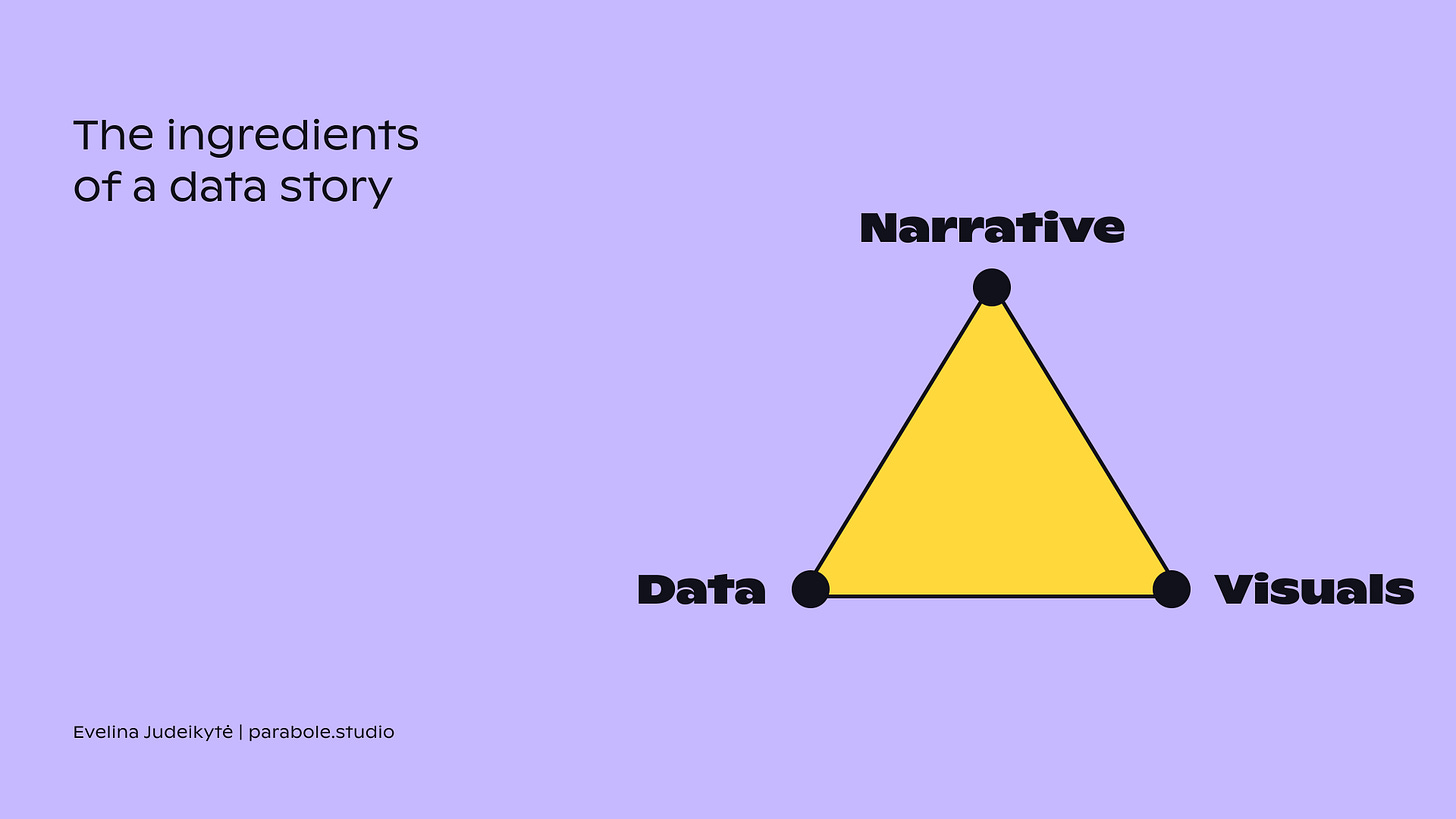
Even though these three stories don’t start with once upon a time, they still follow the narrative arc in its simple form. Each of them start with a setup, then build up to an insight or discovery, and have a conclusion. Can you spot each of these sections in the examples? The sequencing is just one of the three key ingredients for a data-driven story though — it also includes data (of course) and visuals.
Thanks so much for reading! I’ll see you in two weeks for more data storytelling goodness, and for a small surprise before the end of the year. Stay tuned 📡
— Evelina
If you like The Plot and my approach to data storytelling, you can reach out for design or consulting services at evelina@parabole.studio. Parabole Data Studio is the micro-agency I run, in which we help mission-driven organisations communicate their impact through engaging data stories.


Love these examples, Evelina! Hans was the single person who made me shift my entire life toward dataviz!
Could you clarify the connection you’re drawing between “Once upon an time” which opens a traditional story, and these examples you give here? I mean, none of them use “once upon a time” or even explicitly show a character arc.
How do you define story? What would you say to someone who describes your examples simply as “effective data explanations”, not “stories”?
I feel like the term “story” gets overloaded so much, I’m curious when something goes from simply an explanation to a story. I’m sure you have a ton of great thoughts here :)
Thanks so much!