
How much longer?
Helping the audience navigate large amounts of information

Navigating the information maze.
As we work with data, our common goal is to help audiences assimilate information in ways that feel the least overwhelming possible. This can already be a heavy enough task when communicating a single number or a chart, but it becomes even trickier with large amounts of information.
As my design projects keep getting larger, I’ve become a fan of a concept that helps my audience know where they are at all times: navigation. What do I mean by that? Think navigation bar with tabs at the top of a website. It helps you select the different pages, go back and forth, look for content that is of interest, etc. It guides you through the site’s content.
Adding such guides to information design projects can bring tremendous value, too. Below are five examples of exactly that—each with a different style—with notes on concepts and use cases.
Simple tabs
Concept: You show the chapters or sections of your piece as traditional navigation tabs. The current chapter is bolded and underlined, sort of like a link would be.
Possible use cases: This option is super versatile and could work in static reports, presentations, and even dashboards.
Examples: I used this method in this HRFN report and I also like the way it’s designed in Nike’s 2022 impact report.
📝 Click on the images below to see them in full-screen mode.


Highlights
Concept: The design here is similar to the one above as each section gets its own place under the sun. The difference lies in how each of them is brought forward: by using a highlighted background instead of bolded and underlined text.
Possible use cases: This concept could work great for static reports and presentations, but you’ll need to make sure it doesn’t steal attention from the other elements on the page.
Examples: Bloomberg’s impact report for 2021 and USA Facts’ America in Facts report.


Folder-like tabs
Concept: This design idea is also a type of highlight, except that each section is portrayed as a bookmark for a physical document folder.
Possible use cases: Mostly static reports and presentations where you have lots of creative liberty.
Example: Pangaia’s impact report for 2022.

Side navigation
Concept: Instead of small tabs, you can also spell out the chapter names in a navigation pane on the left or right of your page. Each section is highlighted as you scroll through the pages. This can work well when the section names are quite long.
Possible use cases: Pretty much any type of output, as long as you have the space: static reports, presentations, or long-form website articles. I’ve also seen this type of navigation pane in dashboards with multiple tabs.
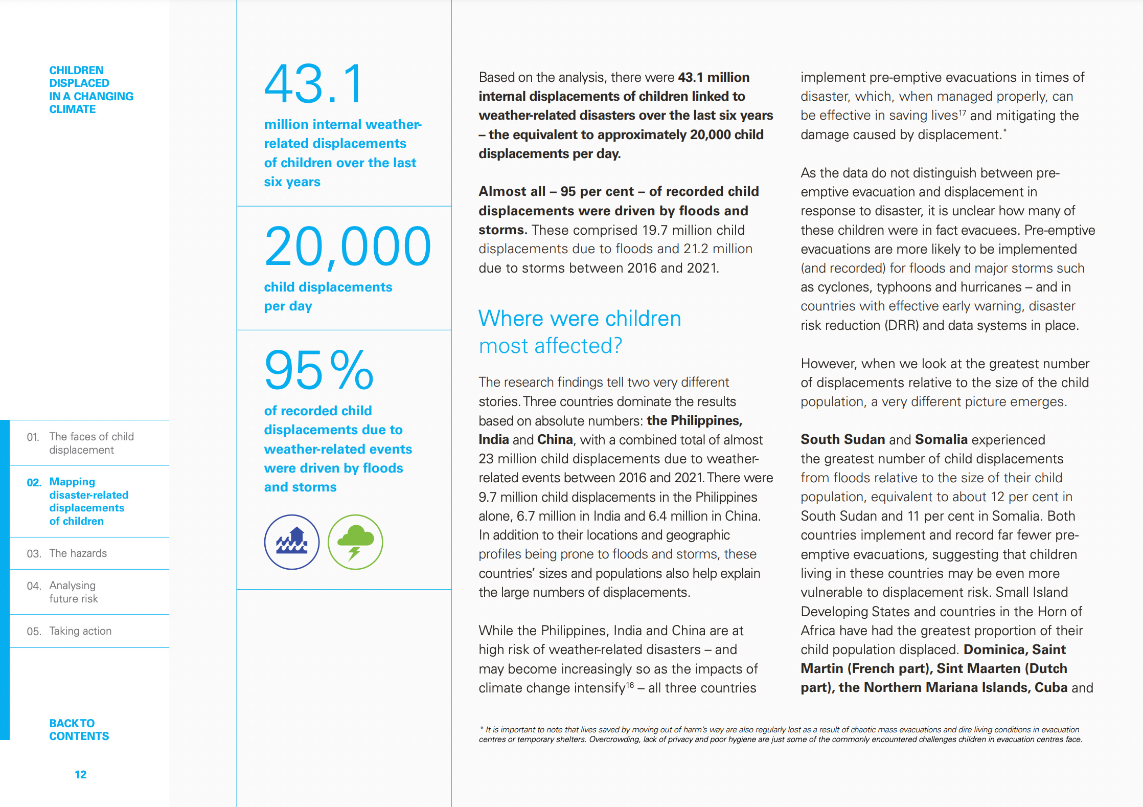
Example: Unicef’s report on displaced children.
Progress bar
Concept: This is probably my favourite way of approaching navigation. The progress bar moves along as you progress through the page(s).
Possible use cases: It’s amazing for interactive pieces—such as websites and long-form data stories—but can also work for static reports and presentations.
Example: I used a progress bar, coupled with simple tabs, in the UN migration report I designed earlier this year. I cannot say that it was fun to adjust the bar on all 200 pages of the PDF, but I do think it was worth it.

***
Whatever the form and style of your report, article, or presentation, consider giving your audience a map of where they are as they read through it. You can see these navigation elements as signposts: they show the reader how the content will unfold and, perhaps most importantly, how much longer it will take. And they’ll thank you for it.
Once you choose the right navigation concept, you’ll have another decision to make: will it be static or interactive?
Let us know how it goes!
Thanks for reading. 📍
See you next week,
—Evelina
Data storytelling bootcamp: new cohort 🚀
Want to learn how to turn data insights into actionable stories? Join the next cohort of my data storytelling course. It will be an insightful, fun, and interactive experience—check out the testimonials from previous participants who have rated the course at 4.8/5 ⭐️. As a reader of The Plot, you get 10% off with the code THEPLOT10. See you there!