Modest makeover
Alternative chart design options for a report by the World Bank
Do you ever feel the urge to redesign charts you encounter in the wild? It happens to me often, probably more than I’d like! A couple of weeks ago I stumbled upon this assessment of the damage and needs in Ukraine published by the World Bank. While I like the overall graphic direction of the report—it’s simple yet elegant—some of the charts don’t live up to the same standard.
So I decided to play around with them. I picked two graphic types repeated throughout the report to see if we could do better. The below makeovers were made in Datawrapper—so no Illustrator sorcery that wouldn’t be accessible to mere mortals!
Let’s dive in, shall we?
Legibility is key.
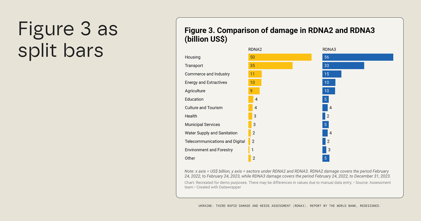
The simplest charts in this report are the ones that need the most love. The first one is a bar chart with many categories and two numerical variables—see the snapshot below. The main issue I have with this graphic is the legibility of the category labels (should I tilt my head?) and the tiny values. As the same design comes back many times in the document, it’s worth taking another shot at it.
So what can we do to improve legibility?
If we were to stick with the bar chart, we could:
Make it horizontal so that the labels are legible;
Group the tiny categories into “others” as they get dwarfed by housing anyway;
Move the legend up so that it’s placed before the data. Or better yet, use split bars which will make the graphic more compact.
See what this could look like below.
I’m also itching for another chart type that could work well here—a range plot. It would make the graphic even more compact while remaining easy to read. It would also only show the axes instead of the exact values, which seems to be the preference in the initial version of the graphic. The caveat is that the range plot is sadly still relatively unknown for some audiences, so you may not be able to use it.
You may have noticed that I didn’t make any changes to:
The colours. While the blue and the yellow aren’t ideal for these charts, they have meaning for Ukraine (i.e. flag colours) and are also sprinkled nicely throughout the rest of the report. We should hence keep them.
The title. While I’d love to give the title more character, I left it unchanged because I know some organisations have guidelines for this kind of thing. It may be customary at the World Bank to write descriptive rather than explanatory titles, and it’s not my place to alter that here.
A pie might make a mess.
Another chart type that is used a lot in the report is a pie (more specifically, a donut). While there’s nothing inherently wrong with this visual representation, it can get overwhelming with many categories. In the example below, there are not only over a dozen labels but they also have groupings—see colours—by sector.
So what could we change here?
Chart type. Keeping in mind that legibility is key, this data could be better represented in a bar chart. No more arrows and labels flying around in space.
Grouping. A bar chart would also allow for better grouping—see how I named each sector in the snapshot below. That would be very hard to do elegantly in a pie.
Colours. Now that we have sector names next to each category, we no longer need as many colour hues. We could instead use blue as the basis and highlight some categories in yellow. I chose to bring forward the housing, transport, and commerce categories that are mentioned in the text surrounding this graphic.
What do you think?
Before we wrap up, there’s an important note to be added.
I didn’t write this post to point the finger at anyone or say the designers haven’t done a good job. I realise not all teams have data visualisation skills or the resources to hire a specialised designer for each project. So I hope that by sharing better examples—made in 15 minutes in an accessible tool—we can all, collectively, develop a better understanding of what a good chart looks like.
Thanks for reading!
See you next week,
—Evelina
“This course is necessary for those willing to acquire the newly valuable skills sought in the labour market: organise, illustrate, and visualise data to build stories that will serve your cause.”
What is this about? My three-week online data storytelling bootcamp! The next cohort starts in early June. Oh, and not to brag, but the bootcamp does have a 4.8/5 ⭐️ rating.
A few spots remain! Use the code THEPLOT10 for your exclusive 10% discount.


