Dubious mistakes
Do the common dataviz "rules" always make sense?
Don’t show the values twice.
Place your legend close to the data.
Don’t cut off the axis.
…
Do any of these sound familiar?
They’re just some of the rules that you encounter in the data visualisation world. If you want to be a respected data professional, you should never make these mistakes. But do they really express undeniable truths that we should abide by at all times?
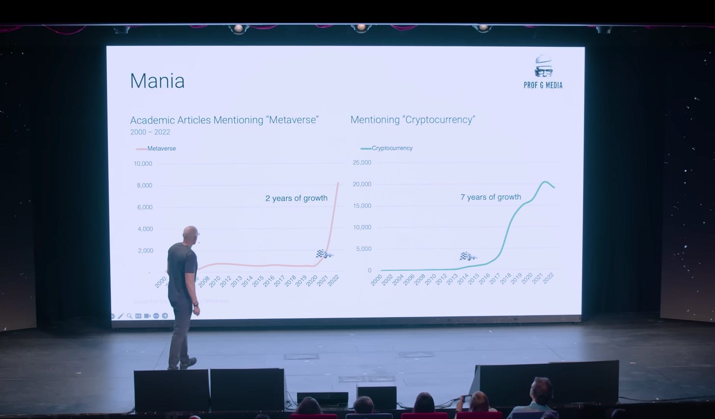
I asked myself this question when watching Scott Galloway’s keynote at the Summit 2023. He shared at least two dozen charts during this 60-minute talk and some of them included the so-called mistakes we shouldn’t be making. I’m curious to hear what you think, so let’s do a quick quiz 🤓
You’ll find five chart snapshots below. Score each of them on a scale from 0 to 1. 0 if you think the mistake doesn’t matter, and 1 if you think it truly hinders your interpretation of the data.
Ready?
Here we go.
#1 Space: the distance between two bars should equal half the width of one bar.
#2 Axis: in small multiples, the vertical axes should be of the same scale.
#3 Legend: you should place the category labels next to the data instead of using a legend.
#4 Scale: you cannot scale oddly shaped objects as their surface is difficult to calculate.
#5 Order: your data should be sorted in ascending or descending order.
So, what’s your score? Mine is 1.5. Yes, I cheated a little and counted one of the examples as half of a mistake. Let’s unpack these in a bit more detail:
Space. I’m almost surprised to say that the spacing between bars doesn’t bother me that much. I certainly wouldn’t design a bar graph this way, but for this slide, it kind of works. Especially since category labels are logos—if the bars were closer to each other, it might feel too crowded.
Axis. This is the one I feel strongest about. The difference in Y-axis values makes it look like the number of articles for metaverse and cryptocurrency is the same around 2022, whereas that’s not the case at all. I know that, technically, it’s shown in the axes ticks, but can you say that you always read those in detail?
Legend. I like placing line category labels next to them when I can: it makes the chart look elegant. In this example, however, it’s not a deal-breaker. Perhaps it’s because the lines are so thick that it makes it easy to spot which category is which.
Scale. There’s a high chance that the scale of these money bags is not mathematically correct. But does it hinder my understanding of the data? Most likely, not. As long as I, as the audience member, am only looking to quickly grasp the difference between the top 1% and the bottom 50%, it’s fine.
Order. The sorting in this bar chart has me perplexed: Why is Japan at the bottom? I can’t wrap my head around the why, but I’m also not totally sure it hinders me from understanding the data. That’s why I’d give this one a 0.5 score.
Having reviewed these, do you think we should be more lenient around best practices, or rules, in data visualisation?
In my work, I pay a lot of attention to detail. I can spend hours polishing the little things to make sure the charts are as crisp and as easy to read as possible. And I certainly try to respect best practices. But for those of us who don’t always have the luxury of making pixel-perfect visuals, we could allow a bit more leeway. I was recently listening to a podcast with Dr. Ellen Langer, known as the mother of mindfulness. She suggested we switch our language from “this is how things work” to something like “it may be better this way” or “it appears that this solution often works”.
Something to ponder to make the dataviz field less strict.
As always, thanks so much for reading The Plot 📐
See you next week,
—Evelina
Data storytelling course: new cohort 🚀
Want to learn how to turn data into narratives that inspire action? You can still sign up for the next cohort of my Data Storytelling Bootcamp. Only 4 spots remain, so grab yours quickly! As a reader of The Plot you get a 10% discount—use the code THEPLOT10 to redeem it. See you in two weeks!


You ended with the perfect sentiment. The "rules" became rules because they often work, but the reason they work can quickly get lost in an ecosystem of dataviz experts who find it easier to say what to do and what not to do instead of taking the time to explain the problems audiences may encounter. As you walked through why each of these rule-breaking charts work or not, it's ultimately about whether the takeaway is effectively communicated. A 3D exploding pie chart isn't the problem, the potential for confusion and misleading the audience is.