
Less but better
How to use information bias to your advantage
One of my favourite stories is also one of the shortest ones I’ve ever encountered.
In his Del Rigor en la Ciencia essay, Jorge Luis Borges talks about an empire whose citizens are very proud to be the best mapmakers in the world.
. . . In that empire, the art of cartography attained such perfection that the map of a single province occupied an entire city, and the map of the empire, an entire province. In time, these excessive maps did not satisfy and the schools of cartographers built a map of the empire, that was of the size of the empire, and which coincided point for point with it. Less addicted to the study of cartography, the following generations understood that that dilated map was useless and not without pitilessness they delivered it to the inclemencies of the sun and the winters. In the deserts of the West endure broken ruins of the map, inhabited by animals and beggars; in the whole country there is no other relic of the disciplines of geography.
What’s the parable here? The citizens of this empire created maps so detailed that in the end, they were not usable. I love this story because it’s easily comparable to our work. How many times have you worked with a stakeholder who asked you to include all the data in a single dashboard? Or a client who insisted to keep all the labels throughout 30 years in a line chart? How readable were those designs? Probably not so much.
In data communication, less is often more. As Rolf Dobelli put it in his book The Art of Thinking Clearly:
If you have an enemy, give them information.
Excluding certain information when communicating with data is not an easy choice though. We see data and charts and something serious. Objective, even. And we worry that picking and choosing certain elements to show will compromise that objectivity, or even introduce bias.
It will indeed. But that doesn’t have to be a bad thing.
As a data visualisation designer, you choose an editorial angle for your chart, dashboard, or infographic. As long as that angle is not arbitrary, but rather based on what’s important for your audience, you’re doing it right. And there are effective ways to both highlight key information and not lose the overall picture.
One of my favourite approaches to it is small multiples. This design technique allows us to both draw attention to key data points and provide useful context. See a great example below: each of the nine countries has its time in the sun and in the shade, but in an inviting, easy-to-read kind of way.
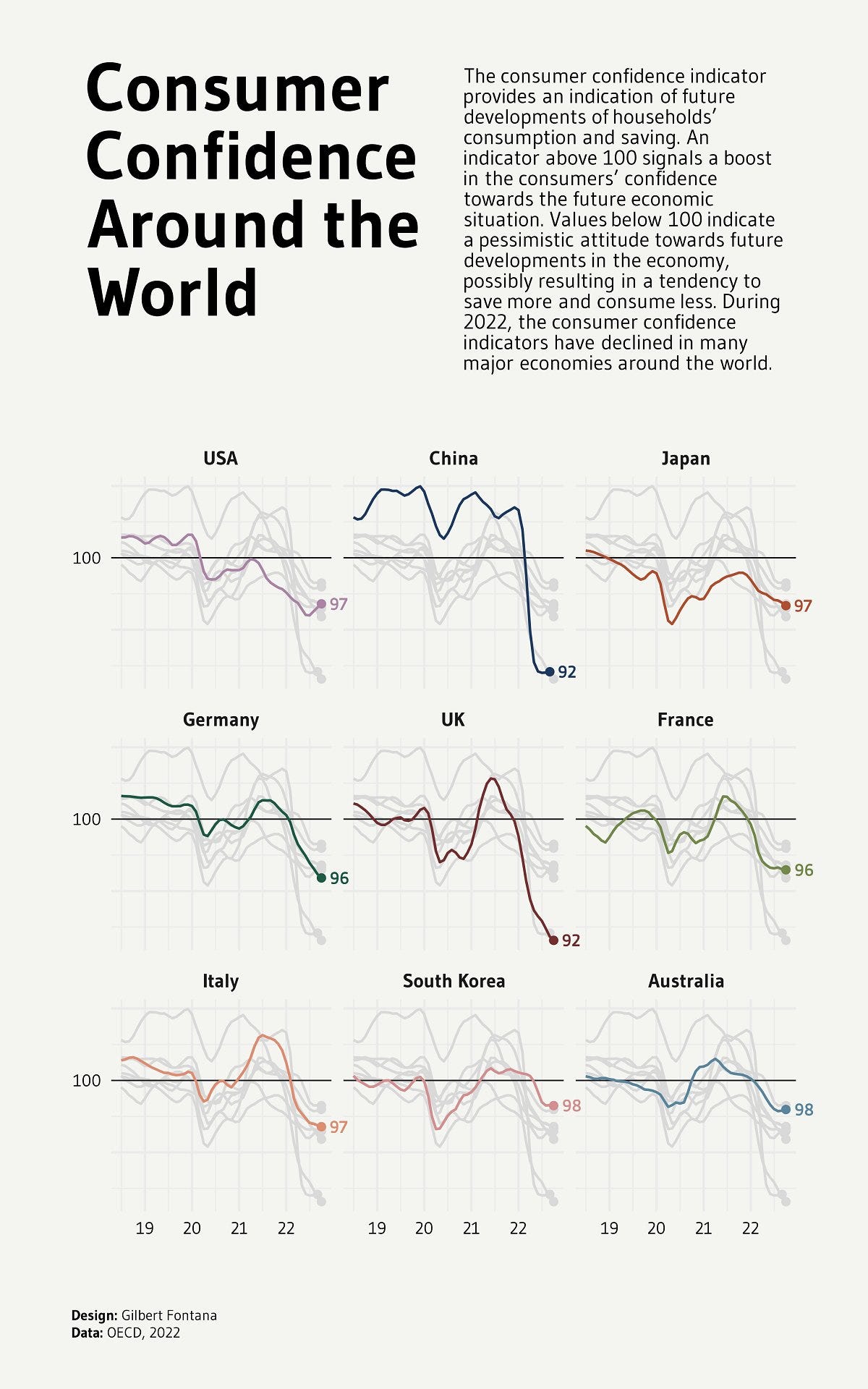
The designer of the above graphic could have made one giant line chart as large as a country map of its own size. But they didn’t. They took the time to create an information hierarchy and, most importantly, visual hooks. We’ll talk more about visual hooks in the coming weeks. For now, I’ll let you simmer on the idea that too much information is for your enemies.
Thanks for reading The Plot 🗺️
See you next week,
Evelina

Weekly gem
Stealing visuals. A beautiful collection of visualisations based on real-world objects by Alessia Musio. Last week’s graphic spoke to me especially as I was juggling huge client projects!
Need help with dataviz and storytelling at your organisation? Reach out and we’ll craft engaging data stories together. I take on design, consulting, and training projects. Hit reply to this email and we’ll set up a chat to get started.
Would like to see more such analysis and tips in an issue. Good job :)
Thank you for reminding me of the map the size of the imperium. I recall La Biblioteca de Babel every time I hear talk of "data architecture." On the consumer confidence example, I would have added an annotation to one of the charts maybe, a 'how to read' to summarize the intro: More optimistic/More pessimistic, maybe?