
Your cheat-sheet for impact reports
Narrative, data and design—three simple steps to an outstanding report

Organisations publish reports every day. Most are annual statements, focused on financials. But recently, as more companies look beyond profit, a new format has started to emerge: the impact report. It’s sometimes called a mission, sustainability or DE&I report, but it always has the same goal: show how your work affects people and planet. Publishing one isn’t easy though, especially the first time. It takes months of thinking, analysing and polishing.
To make the task less overwhelming (and, dare I say, enjoyable!), use this publication as a three-step cheat-sheet when you plan your next impact report.
Build a solid narrative structure
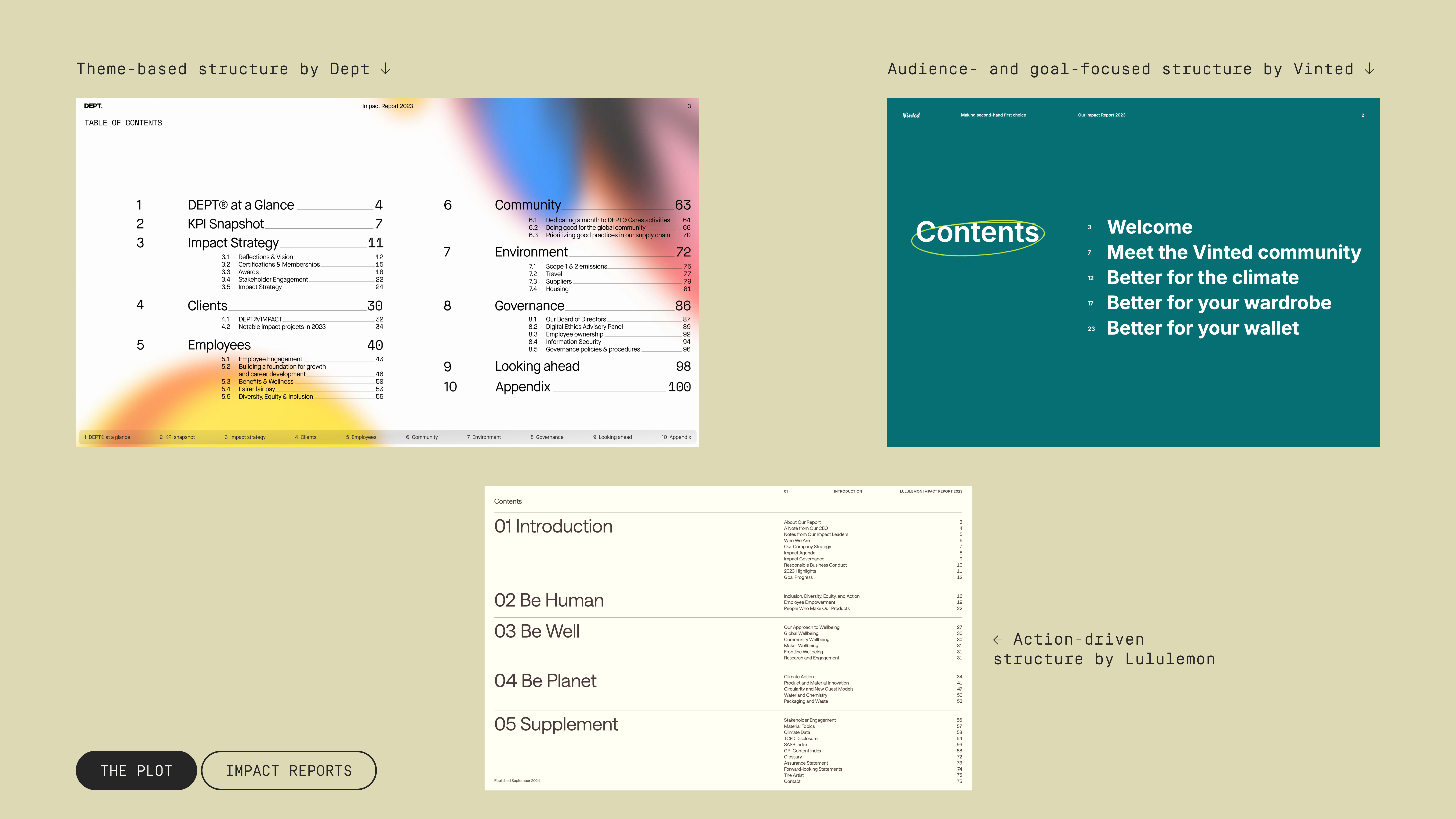
Start by asking: what do you want to communicate? What belongs in the report so readers see who you are, where you’ve been and where you’re headed? Think in broad strokes first—chapters and sequencing. Many of the best reports follow this three-act shape:
Act 1: Overview: origins, strategy, team and community. Often includes a CEO or stakeholder letter.
Act 2: Deep-dive into your impact on people and planet, often broken down by type or audience.
Act 3: Concluding notes, or your strategy for the coming years.
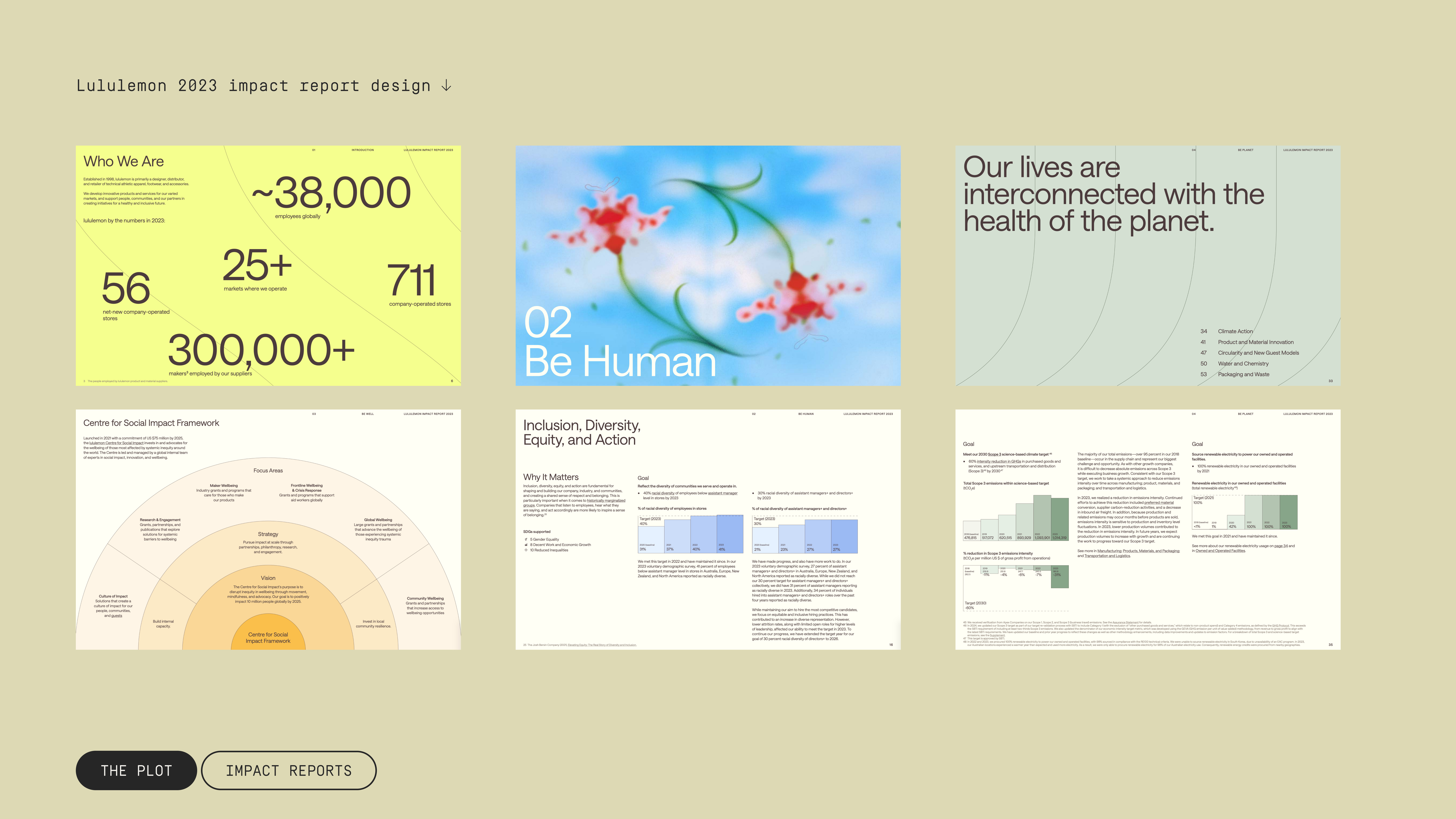
Act 2 is usually the longest and a good place for creative title writing. Recent examples from Dept, Vinted and Lululemon show how strong section names pull readers in:
If that sounds like a big undertaking, that’s because it is. An impact report is complex and time-intensive. But it should be a team effort. So even if you’re the point person, bring in colleagues from programmes, data, finance, HR and comms and, when useful, external consultants and advisors to help you flesh out the narrative.
It’s worth investing early in a content structure that fits your organisation’s goals, editorial style and audience. Once the foundation is set, you can reuse the same framework year after year—updating results rather than reinventing the report, and shortening timelines in the process.
Set measurable goals
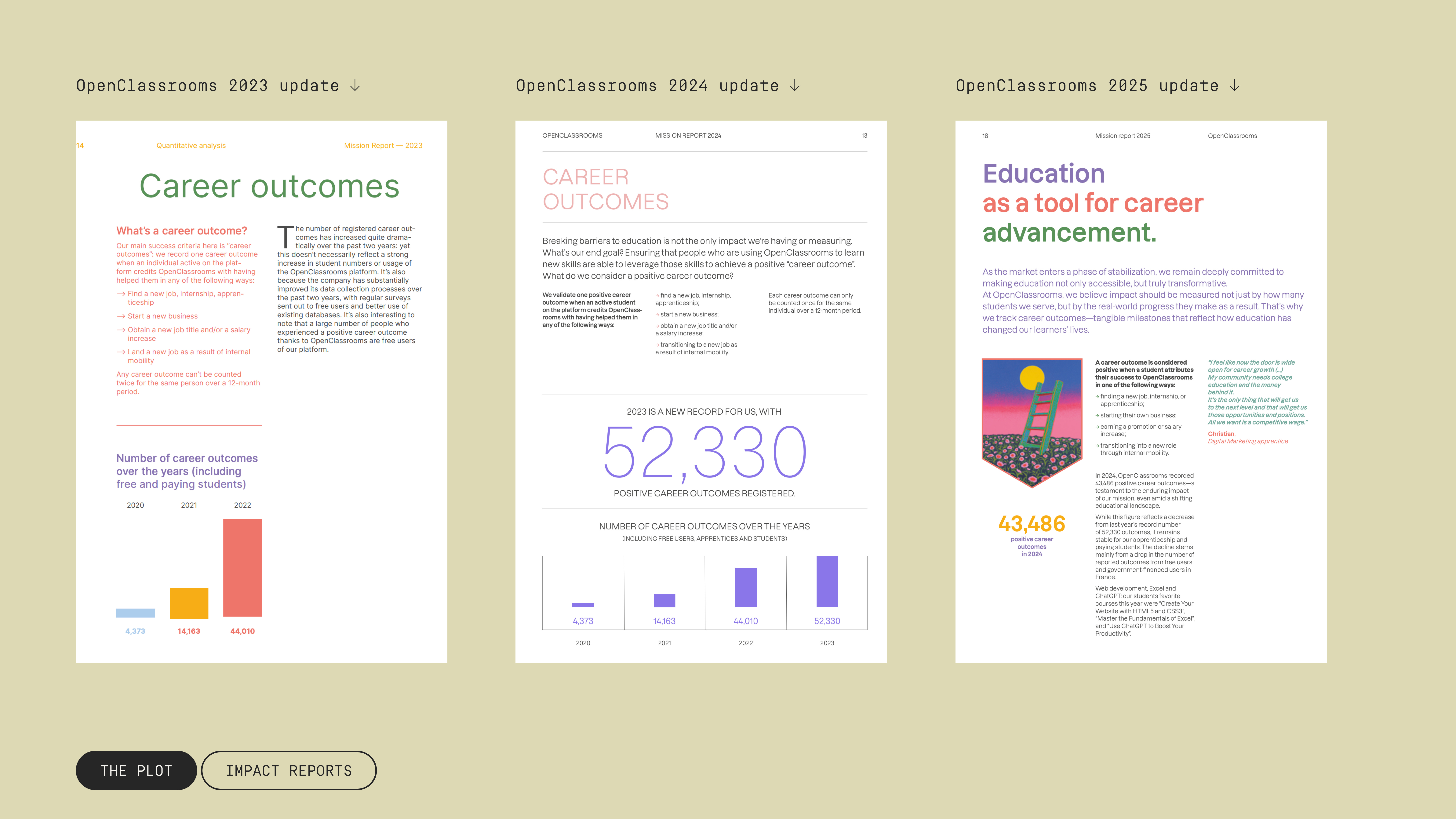
With the structure ready, enrich it with data. Regardless of the type of work you do, you need figures to back up the claims on what you’ve achieved. Instead of simply including some time-series and bar charts here and there, treat data as your through-line. Start with a north-star metric: the one (or three) goals your organisation is working toward. Then make the report a transparent progress tracker.
OpenClassrooms, an online education company, has recently announced that:
Our ultimate objective is to reach 500,000 career outcomes per year every year, starting in 2025.
They’ve been reporting this figure in their mission reports for a while now. Their “north-star” target is 500,000 positive career outcomes per year, and from 2025 onward, they aim to hit that level every year.
Oatly, a food company that makes products from oats, set multiple objectives in their sustainability reports. They then share the progress in each of the ambitious pillars, using them to divide the report into smaller sections.
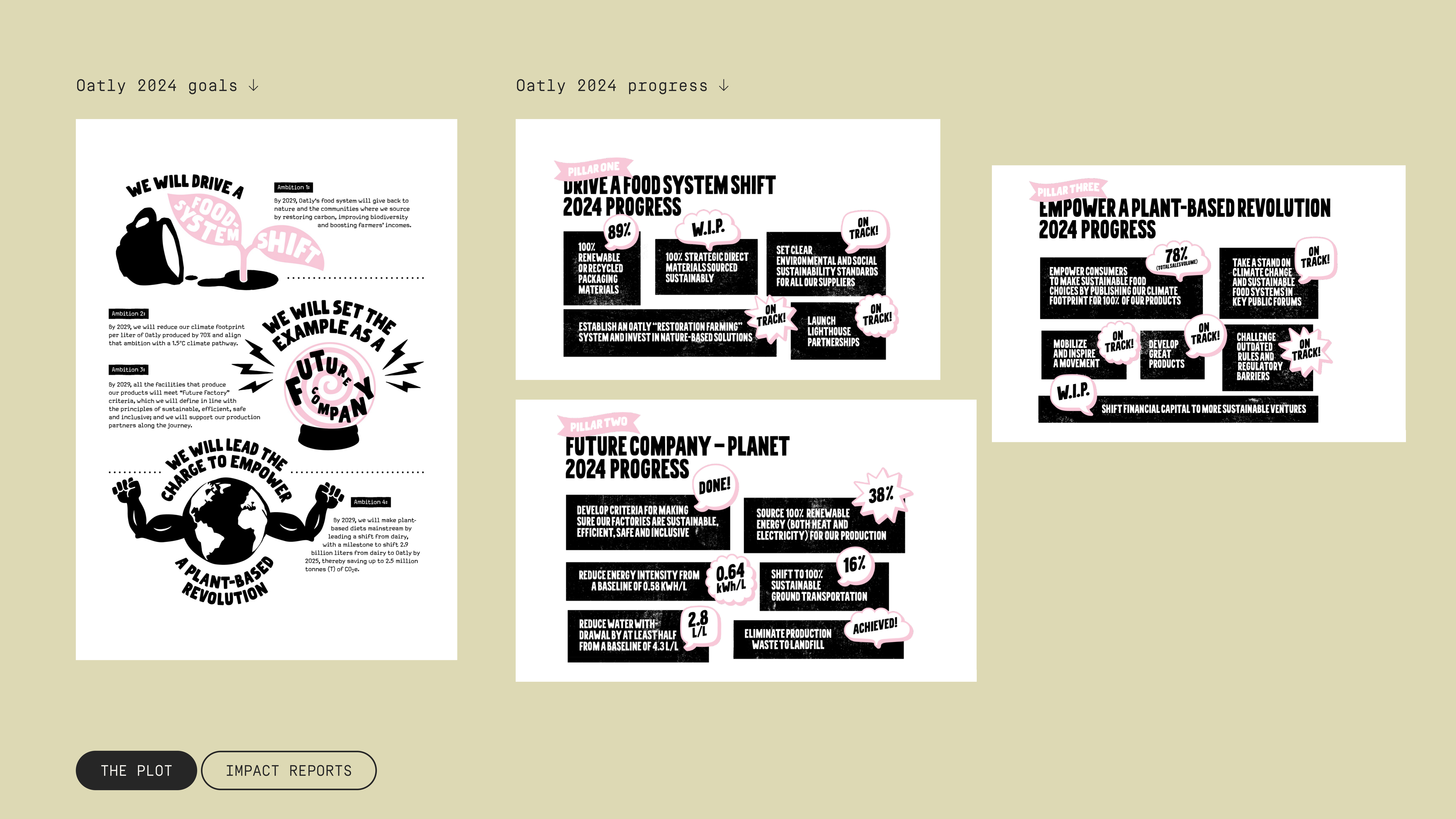
What stands out about Oatly is that they don’t pretend every target was a win. It seems counterintuitive at first—impact reports are meant to showcase successes—but candour about failures builds trust. Their cover slogan says it best: “Wake up. Fail. Succeed. Try again.” Food for thought?
Let professionals do the design
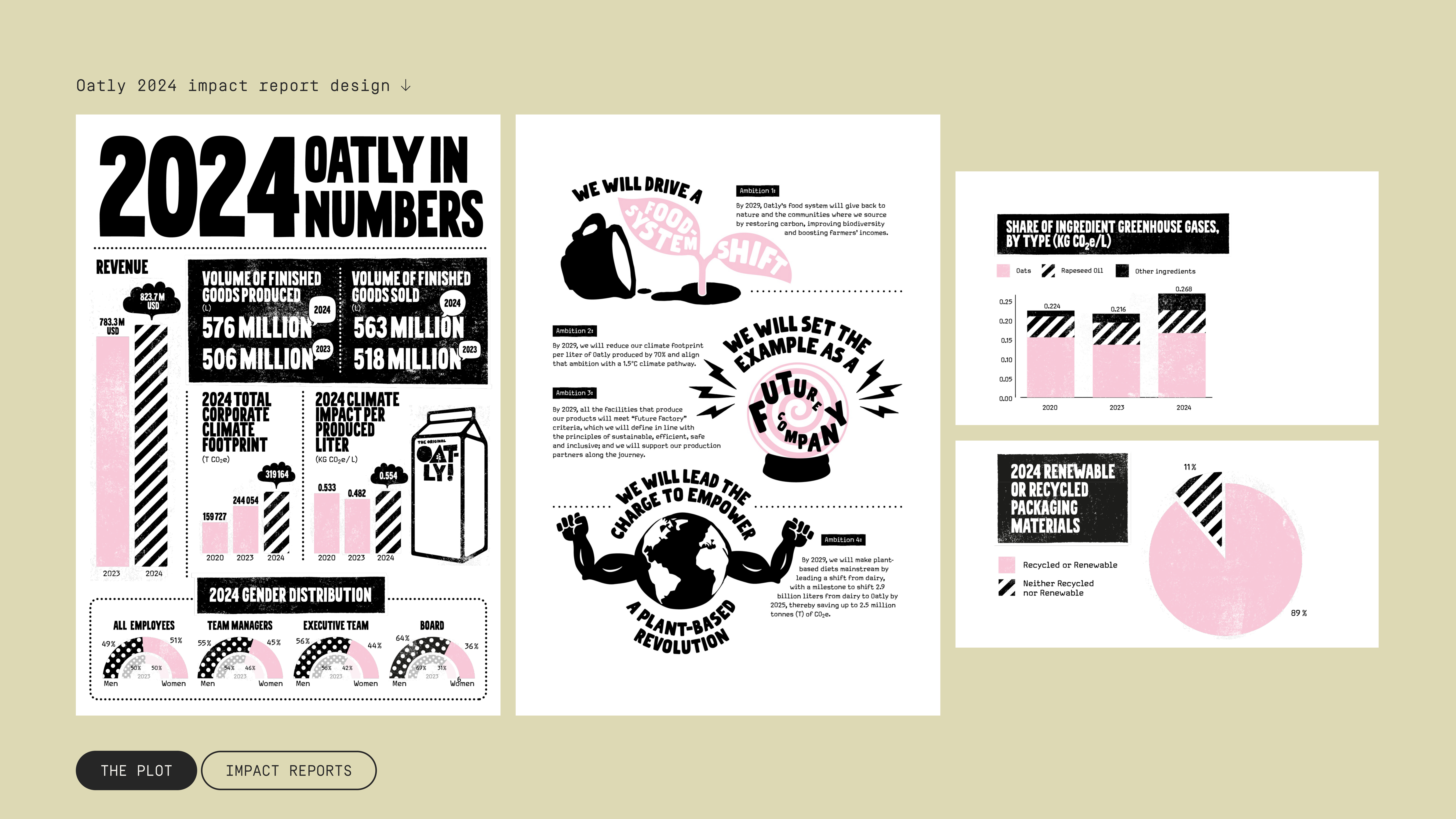
You have the structure and content, and the data is set—so what’s left? Making the report inviting to read. You probably have an in-house design team that can set the creative direction and layout of the report, but that’s not all. The charts need the same level of attention and you may need to hire outside help specialised in data visualisation.
When I open an impact report, I can tell really quickly how much effort went into its design. Many times, the overall look is polished but the graphics are weak. The first sign of that? Overdose of pies. And sometimes it feels like the design team wasn’t involved at all.
Design decisions can make or break the report and you should take them seriously. A professional output should include:
An effective creative direction, both unique and on-brand
Varied chart choices that fit the data, not only pies and bars
Consistency across typography, colours and graphics
Oatly’s reports are a great example of significant design effort. Even though each page communicates different information, the style remains the coherent.
If their playful tone isn’t your style, Lululemon shows how a gentler approach can still be coherent, clear and unique.
Whatever your style, what matters is thought, effort and consistency. You want readers to feel they’re holding an artefact the company considered important enough to spend time on.

Bottom line: Narrative, data and design will take you from zero to an effective impact report. Set your editorial and design style, bring in the right stakeholders and don’t be shy about repeating the same structure year on year.
Feeling lost? We’re here to help.
Making impact reports is our specialty at Parabole Studio! Reach out and we’ll help you create a report that has real impact. 💫