
How fast can you read this chart?
Small details can help your audience read your graph almost as fast as you

“You can read the charts so much faster than me. I’m still deciphering what this particular one represents, and you’re already discussing the insights.”
Last month, I visited a data visualisation exhibition with a friend. The theme of the display was world population, and it included lots of charts on demographics across the world (see summary here). When my friend made the comment above, we were looking at a beeswarm chart that showed the median age for continents and countries. The credit of the original visualisation goes to WeDoData, but since it’s in French, I’ve recreated an English version for you below. Take a moment to analyse the chart.
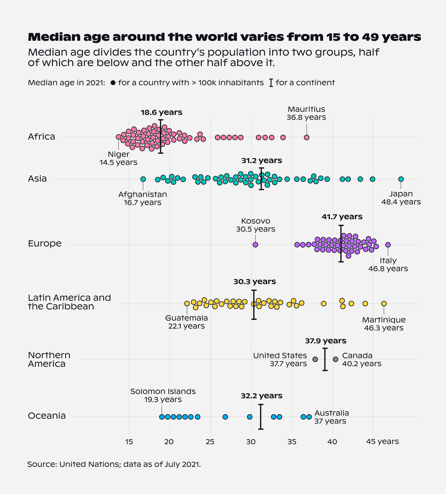
How much time did you need to draw some initial insights from it? When I was first looking at the visualisation, it took me no more than 30 seconds to start commenting on some of the most interesting data points. I was amazed at how much older Europe was compared to any other continent, and how young many African countries were. I also wondered if the median age in Afghanistan was impacted by the long-lasting war and turmoil.
I didn’t realise I was reading the chart very quickly until my friend said something. And then it hit me. I look at graphics every single day. In fact, I’m so used to reading them, that it only takes me a few seconds to understand what’s going on. But that’s not the case for most of our readers, is it? Hence the reader always takes longer to read the chart than its creator.
Now that’s quite something to keep in mind.
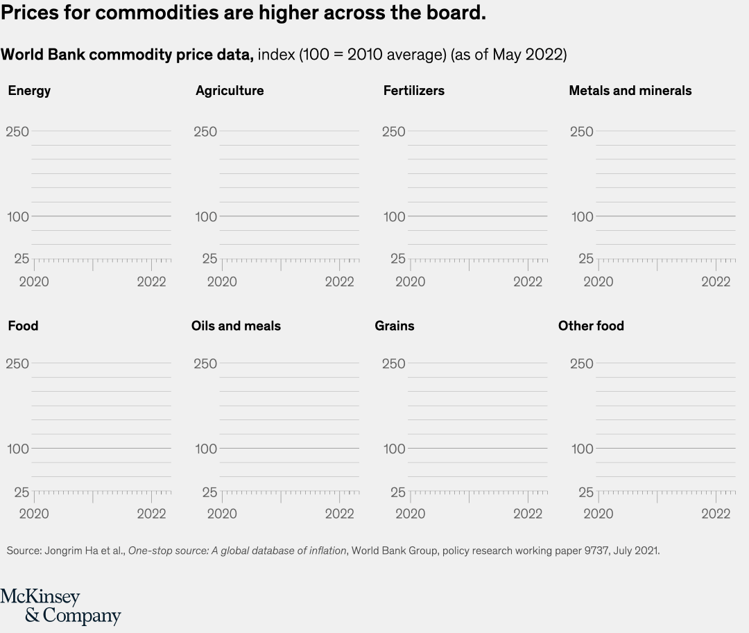
If we wanted to help our readers decipher our chart quicker though, what could we do? One way to go about it is to introduce data gradually, using a GIF or motion design. I was recently reading McKinsey’s 2022 charts in review, and they do exactly that with many of their creations. In the example below, we see axes first, line second, and area (aka final insight) third.
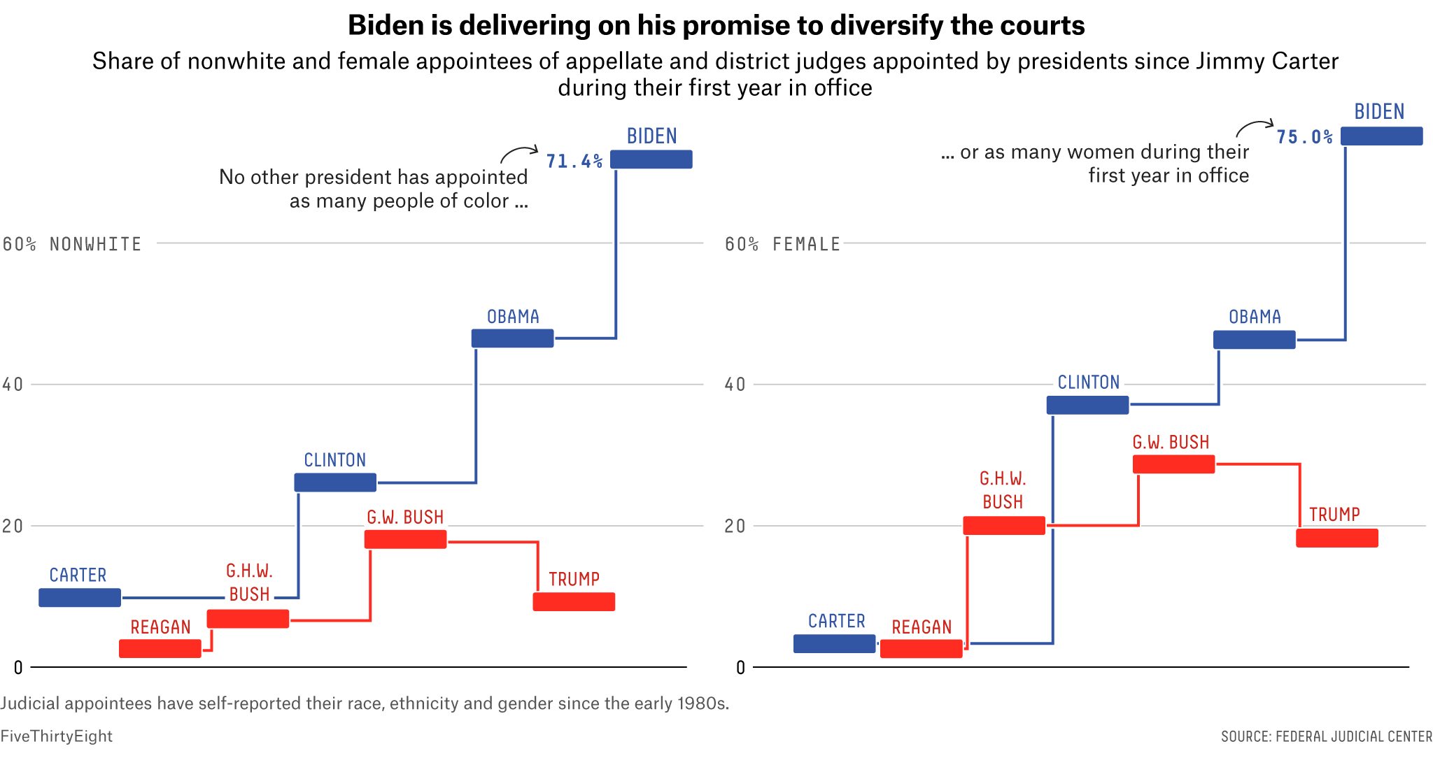
Another way to reduce your audience’s reading time is to multiply explanations. I heard on a podcast a while ago that, as a data designer, you should not expect the audience to always read your legend. Instead, you should encode things twice. While I can no longer name the person who said it, this piece of advice stuck with me. An example of explaining things in multiple ways is the chart below by FiveThirtyEight. Even though we can see from the way the timeline is constructed that the percentages are the highest for President Biden, the annotations help us get to the insight faster.
So next time you create a chart, remember that your audience will most likely need a little more time than you to decipher it. And if you need them to read it faster, can you find creative ways to guide them?
As always, thanks for reading The Plot!
See you next week.
— Evelina
Resource corner
PosterLad — a beautiful collection of posters, perfect for design inspiration.
World Builders — an awesome newsletter on storytelling. If you’re not a subscriber yet, now is the time!
Creative Data Visualisation — a stunning online course by Gabrielle Mérite that will help you think outside the box.
Did you know that I run my own data design studio called Parabole? 📡 If you like The Plot and my approach to data storytelling, do reach out to us for design projects, trainings or consulting services. Just shoot me an email at evelina@parabole.studio and we’ll get things going! See you soon :)
I think not only do I as a creator, or designer looking at someone else's work, interpret faster, so does the client (source of the data). It's so important to step back and ask yourself what assumptions we're leaving unspoken. That goes for any design or visual messaging. We want to design without words, but are we then excluding viewers from getting the message. Message before aesthetics...always.
Thanks for writing this, yes you’re right I tend to assume the viewer will be as quick as I am to understand a visual! A good reminder that it’s usually not the case