
Headlines, not headings
How to write memorable titles for your data graphics

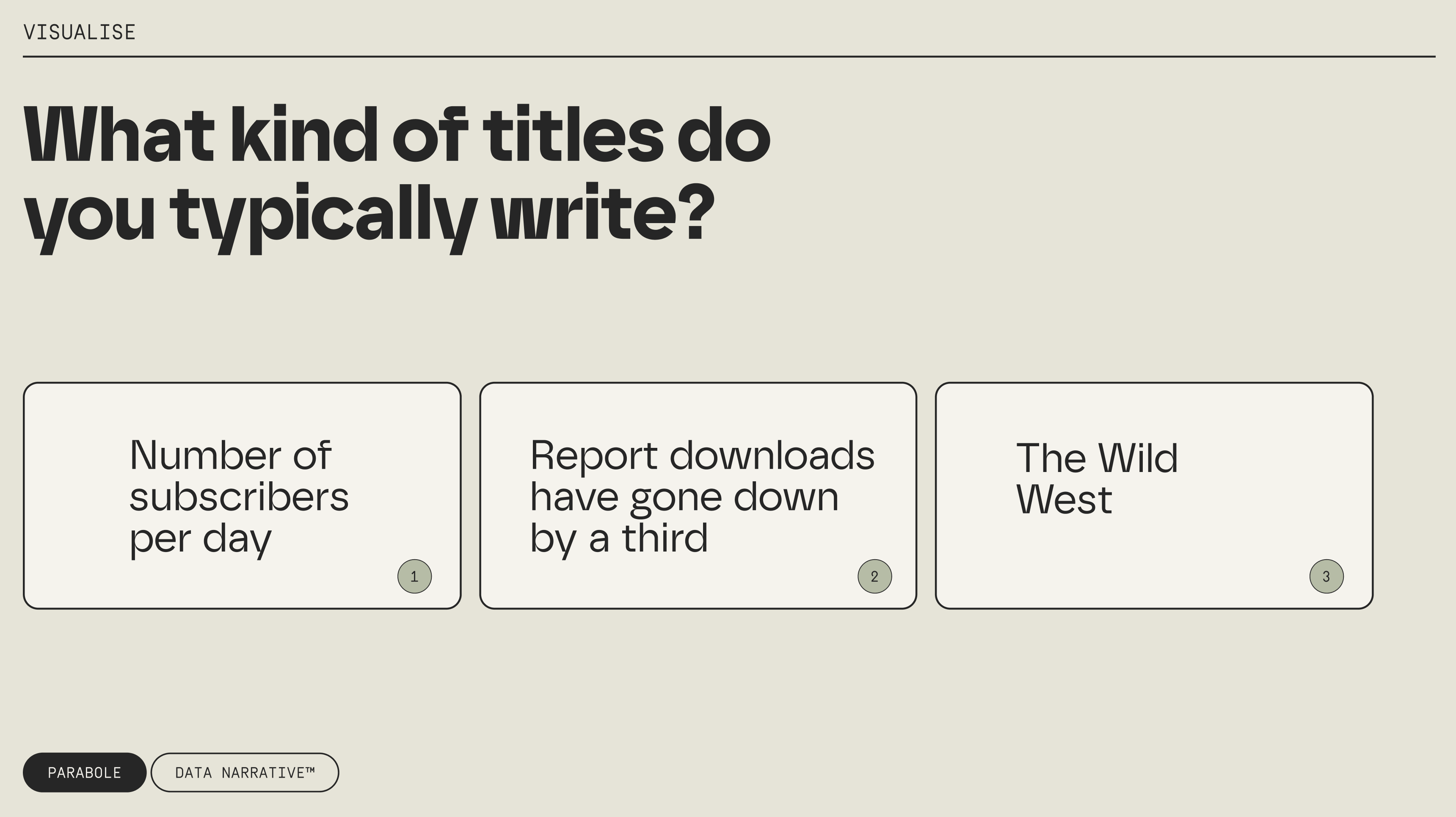
When you write titles for your charts, what do they typically look like?
Do you often default to option 1? I hate to break it to you, but that might be shooting yourself in the foot. Let me explain why.
What’s a title really for?
The title is that big, bold chunk of text sitting at the top of your chart. It's often the first thing people see because it’s at the top of your visual hierarchy. So ask yourself: Do you want your audience's first reaction to be curiosity and engagement... or a yawn?
Looking at the examples above:
"Number of subscribers per day" - just describes what we're looking at (yawn)
"Report downloads have gone down by a third" - states the key takeaway (nice!)
"The Wild West" - creative but potentially difficult to pull off (tricky)
Turns out, option 2 is your best shot. But don’t take my word for it—let’s look at the research.
What the research says
The authors of the paper Beyond Memorability: Visualization Recognition and Recall arrived at a fascinating conclusion: titles that deliver key takeaways make visualisations much more memorable. Why? They create stronger mental connections that help viewers understand and remember what they're seeing.
In fact, when people were asked to recall graphics a moment after seeing them, titles were mentioned in nearly half of all descriptions. The difference between 1️⃣ City population and 2️⃣ 66% of Americans feel Romney performed better than Obama in debates as a title is massive. The second one gives your brain a clear framework for understanding the data.
Across all textual elements, the title is among the most important. A good or a bad title can sometimes make all of the difference between a visualisation that is recalled correctly from one that is not.
This is exactly what Janine Kurnoff and Lee Lazarus talk about in Everyday Business Storytelling: we need to write headlines, not headings.
Strong headlines in practice
In a recent report we designed for Moloco, we used big, bold headlines that were impossible to miss on the page.
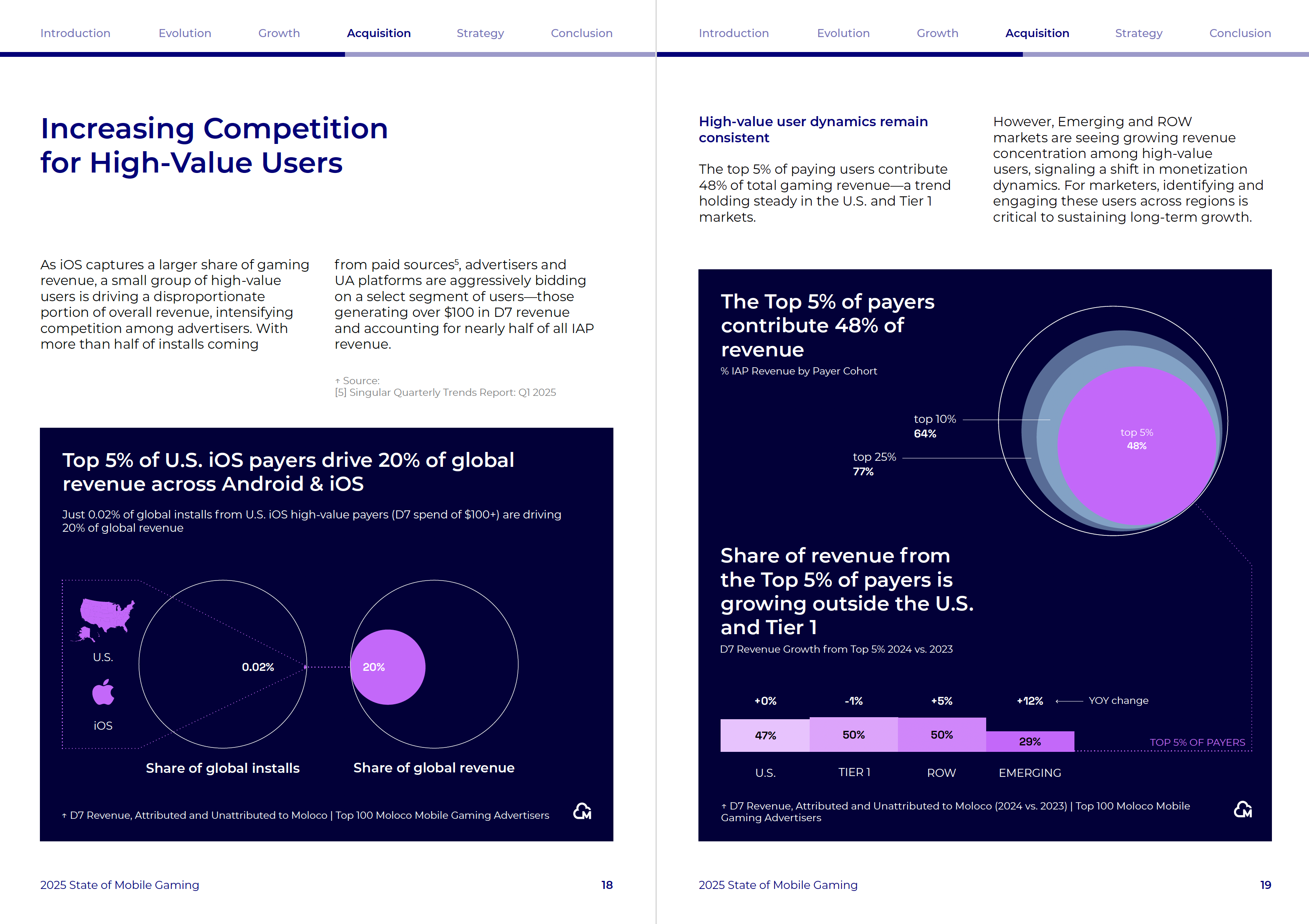
Sometimes they even connected multiple graphics together, creating a cohesive narrative.

So how can you write good titles yourself? Here are three tips to get you started.
Keep them short.
Short headlines are punchier because they're easier to process at a glance. So instead of 1️⃣ An analysis of the declining trend in monthly website visitors over the last quarter, try 2️⃣ Website traffic down 23% since January. If you cannot get away with such a short title, aim for no more than two lines.
Make them easy to digest.
When people can process information easily, they're more likely to engage with it and remember it. Use concrete language and simplify numbers and fractions, when possible. Instead of 1️⃣ Temporal analysis of user acquisition metrics shows subscriber counts are up by 37% in the morning, try 2️⃣ When do people subscribe? Mornings win by a more than a third.
Keep the audience wanting more.
The best headlines create a curiosity gap—they give enough information to orient the reader but leave something unresolved that compels them to keep reading. So perhaps you replace 1️⃣ Analysis of customer retention factors by 2️⃣ The surprising reason customers stay (it's not customer service).

Headlines all the way? Not so fast
Before you rush off to rewrite all your chart titles, there's something important to consider. In Frames and Slants in Titles of Visualizations on Controversial Topics, researchers showed that titles can significantly influence how people interpret data—often without them even realising it.
For example, with the exact same data about Syrian refugees, look at these two different but factually accurate titles:
U.S. has accepted a lower percentage of Syrian refugees than the U.K., Spain, Finland, and Australia
U.S. has accepted more Syrian refugees than the U.K., Italy, Russia, and Finland combined

Both titles present technically correct information from the exact same dataset, but they tell different stories due to the data points selected. And here's the surprising part—the subtle nudges often work better than obvious ones. The researchers found that gentle framing, like simply highlighting certain metrics or comparisons, can actually be more persuasive than strong statements because they feel more objective to readers.
So what’s the bottom line? Choose headlines that deliver meaningful takeaways for your audience—but choose them carefully and ethically. Your title isn't just describing data; it's shaping how people understand it.
Thanks for reading!
See you in two weeks,
—Evelina
P.S. If there are topics you’d like me to cover in the next months, reply to this email with your ideas 🚀
Hello Evelina, what about titles in an automatic dashboard?
What most resonated with me from your data storytelling course was the part about headlines. It felt like a true "aha" moment 🤓, the same for this article