First impressions
Three considerations that make or break the first encounter with a dataviz
When you meet someone for the first time, how do you decide if you want to get to know them better?
You probably won't be charmed if the person in front of you rambles awkwardly about themselves, spewing random facts left and right as an introduction. But what if they gently mention some compelling details about who they are, woven into a neat storyline, while also pausing and asking you some questions? You’ll most likely want to engage more.
I recently realised that I react similarly when encountering a data visualisation for the first time.
Last week, I was browsing through the longlisted projects of the World Data Visualisation Prize (WDVP) — an initiative organised by Information is Beautiful and the World Government Summit. I took the time to click on every poster and interactive piece, and some of them felt inviting almost immediately. Others were a bit more of a struggle to engage with.
Which got me thinking: why is that? what makes or breaks the first encounter with a chart or infographic? what are the criteria for a good first impression?
I can name at least three.
Alignment
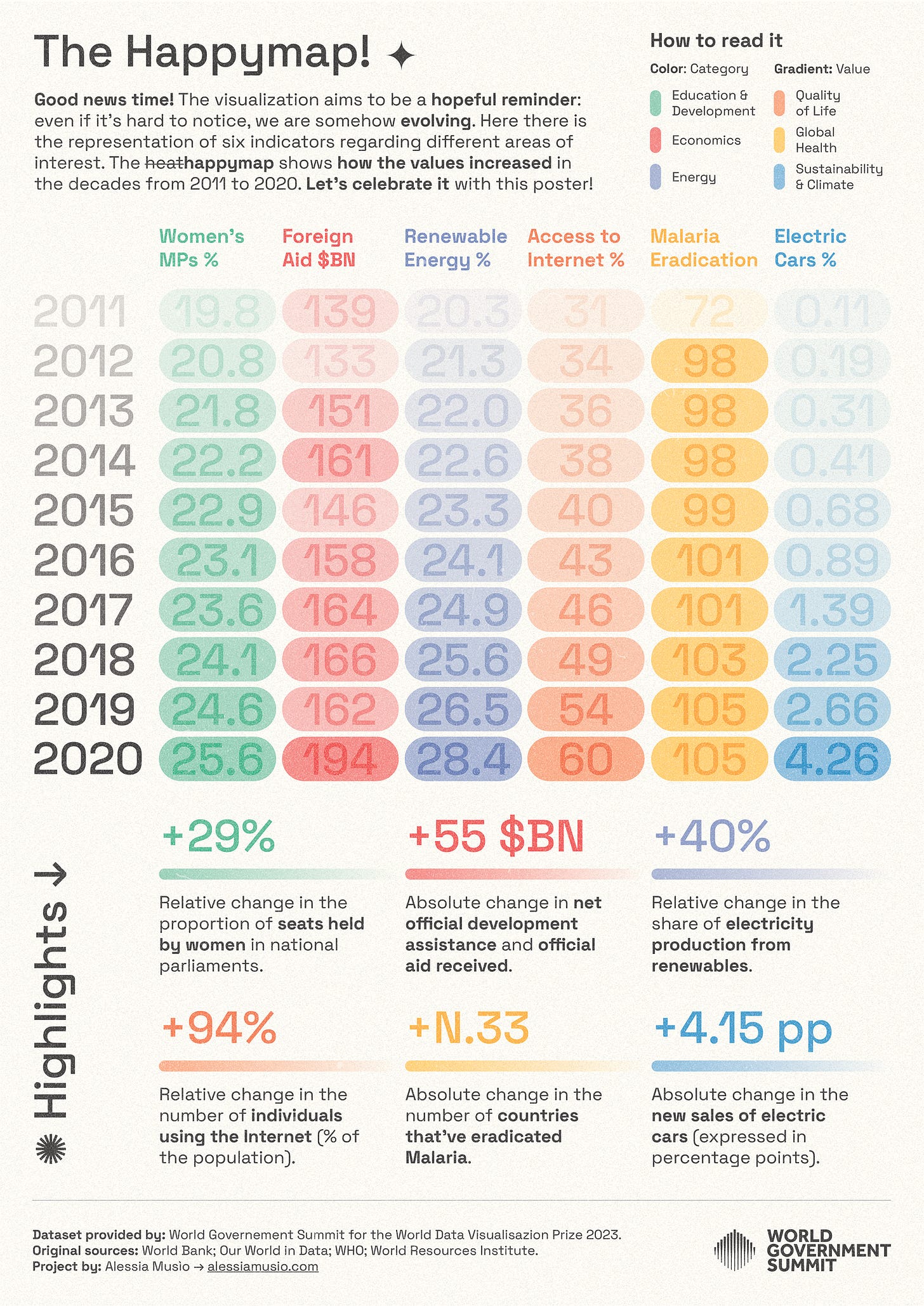
It’s no secret that we like symmetrical things. Gestalt theory of design analyses this: the human brain tends to perceive symmetrically balanced objects as more aesthetically pleasing. It also helps reduce cognitive load. Here’s an example from the WDVP entries — The Happymap by Alessia Musio. There are quite a lot of elements on the poster, but the effective layout grid makes it pleasant to navigate.

White space
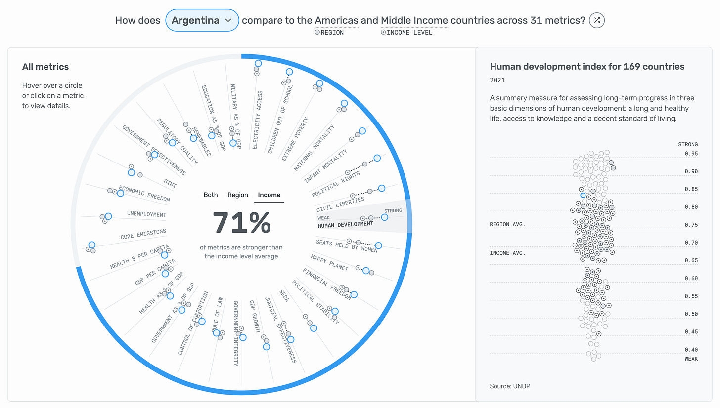
Creating enough white space is like remembering to pause. Can you imagine listening to someone who speaks so fast that they never stop to breathe? It would be overwhelming. Lack of empty space in design can make you feel the same. Increasing it, on the other hand, allows the user to think and digest. Below is an example from Lindsey Poulter — the interactive piece that was awarded the grand prize at the WDVP competition — with a little space between different chart elements. Feels just right, doesn’t it?

Consistency
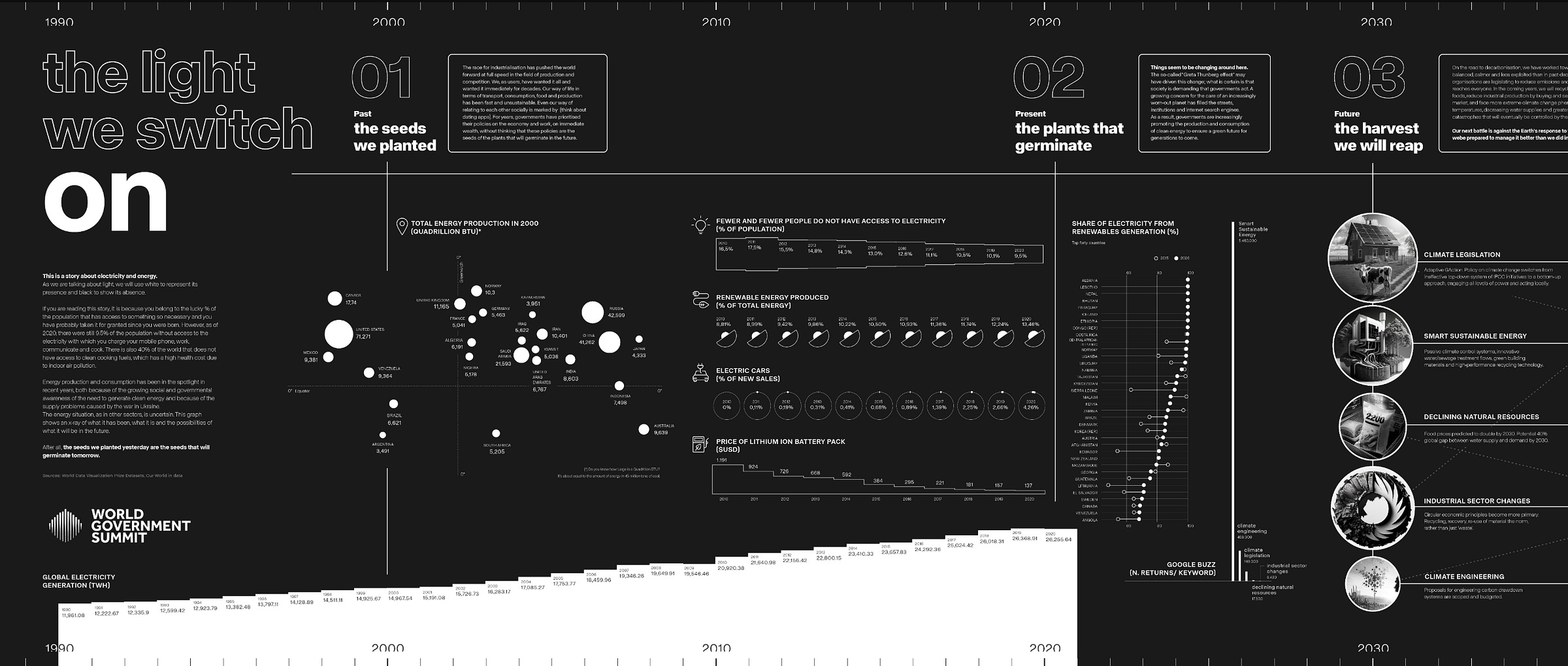
Oddly, our brain also loves repetition. There’s a long list of rhetorical devices — techniques that increase the persuasiveness of our writing and speaking — that include repetition of a letter, a word, or an entire sentence. For example, alliteration is when you start several words with the same letter in a single sentence. It seems to increase the effectiveness of the message. In data design, a similar outcome is often achieved by using consistent colour and typography. The infographic below by Raphael Hohr is a great example of using consistent design elements for section separators, labels, and titles. You only need to register what they mean once, and then the rest of the piece becomes easy to follow.

Is it worth talking about first impressions at all? We’re often taught not to trust them. Don’t judge a book by its cover, says common wisdom. And there’s some truth in that. But I’m sure you can name at least one friend today that you didn’t necessarily love at your first encounter. What if you hadn’t gotten a second chance to get to know them better? You’d certainly miss out.
Not everyone will take a second look at your graphic. You may lose the opportunity to inform or even spark some action.
So why not pave the way for success right off the bat?
Thank you for reading The Plot ✨
Talk next week,
—Evelina
New: data storytelling course
Next month, I’m running my very first data storytelling masterclass open to the public (yay!). We’ll work on how to craft, design and present data stories that inspire action. You can find more details and enrol here! If you have any questions about the course, hit reply to this email or schedule a chat here.


Love this piece, and the curation of examples. Thank you! :)