Dataviz party
Three dataviz techniques from election graphics we should use more often
A few weeks ago, the U.S. citizens elected a new president. I know you know that. And while the aftermath was difficult for some, depending on your political leanings—a topic beyond the scope of this newsletter—there’s a joyous side to elections of this magnitude.
It’s a dataviz party.
Key moments in history are often pivotal for the advancement of the data visualisation field. Covid-19 pandemic was one of those moments. The U.S. presidential election—the most recent one. The sheer amount of graphics produced and viewed in one election day must break some sort of record. It’s also when new, unconventional visualisation techniques flourish. Graphics dress up a bit better for the occasion—just like you might when you go to a party.
What can we learn from them this year? Here are three dataviz techniques that caught my eye during this election period and that we should employ more often.
Key information only? Yes, please.
The audience needs all the information: how every state and county voted, how the count evolved over time, what’s the winning margin in each area, etc. Right? Not really. In the case of the election, we know in advance how some states are going to vote. This year, we were particularly interested in the swing states—the places that could “swing” to either Democratic or Republican candidates.
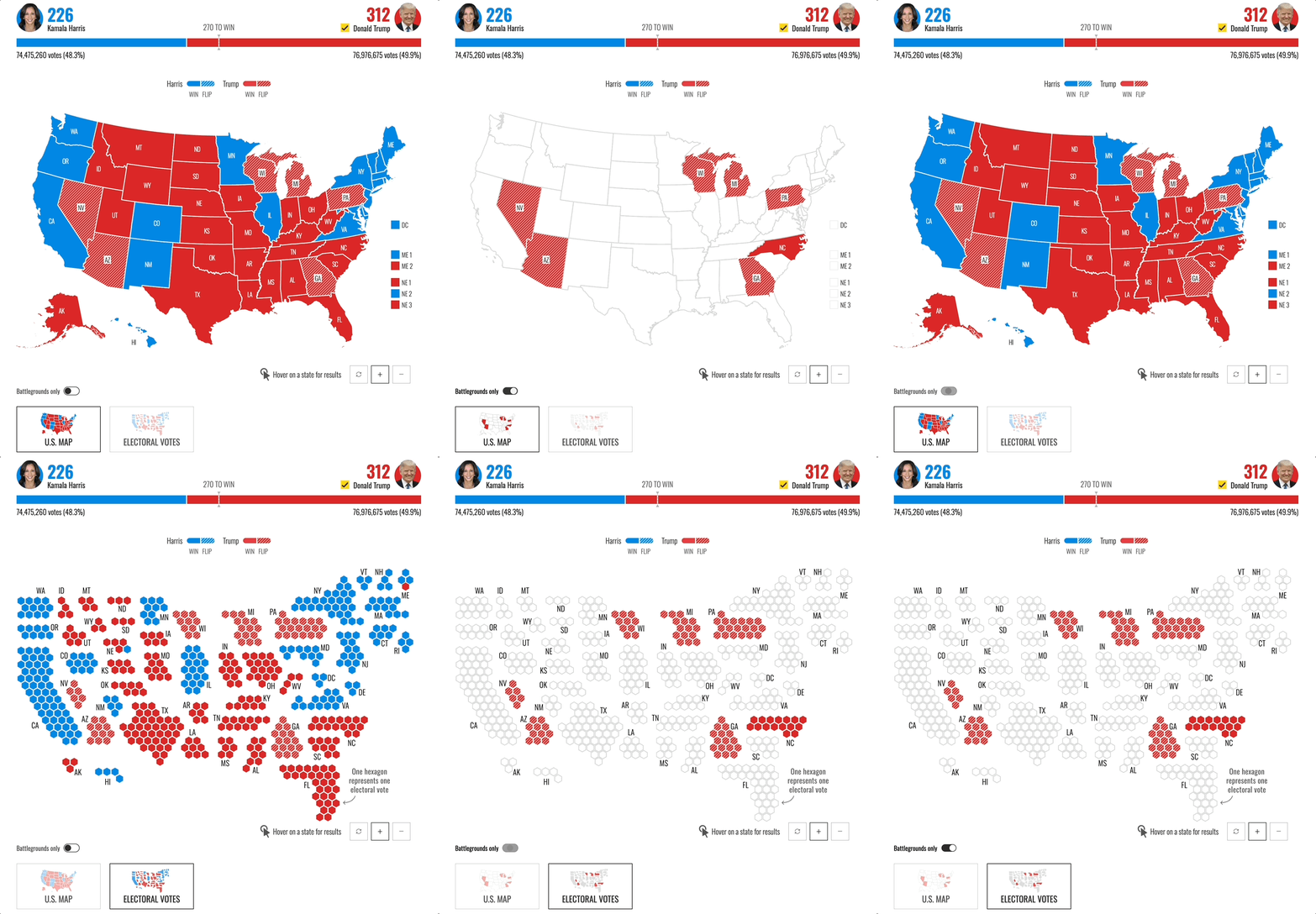
I love how some news outlets allowed the readers to focus on these battleground states only, like using a toggle in these NBC maps.

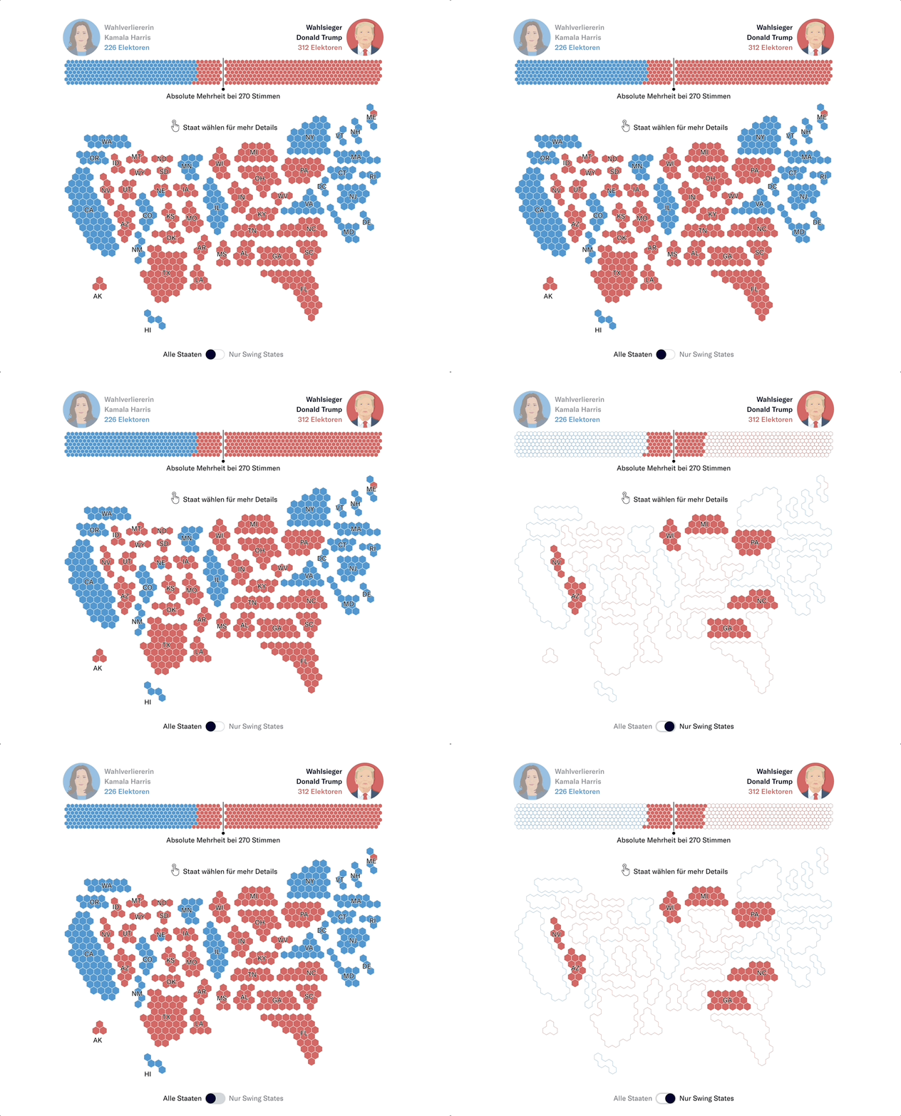
Or switching between two maps on the NZZ election coverage page, which also filters the bar chart for the total vote count at the top.

These are great examples of choosing the data points that are key to the story and allowing the audience to focus on them.
All maps are fair game.
If you ask a random person what kind of maps they know of, they’ll probably mention the choropleth maps and the point maps. While I don’t expect people to actually remember the term choropleth, most of them have seen that coloured map. Other, atypical map choices are often criticised for being strange and hard to read. One of those is a hex—or cartographic—map in which countries or states are not scaled based on their land size.
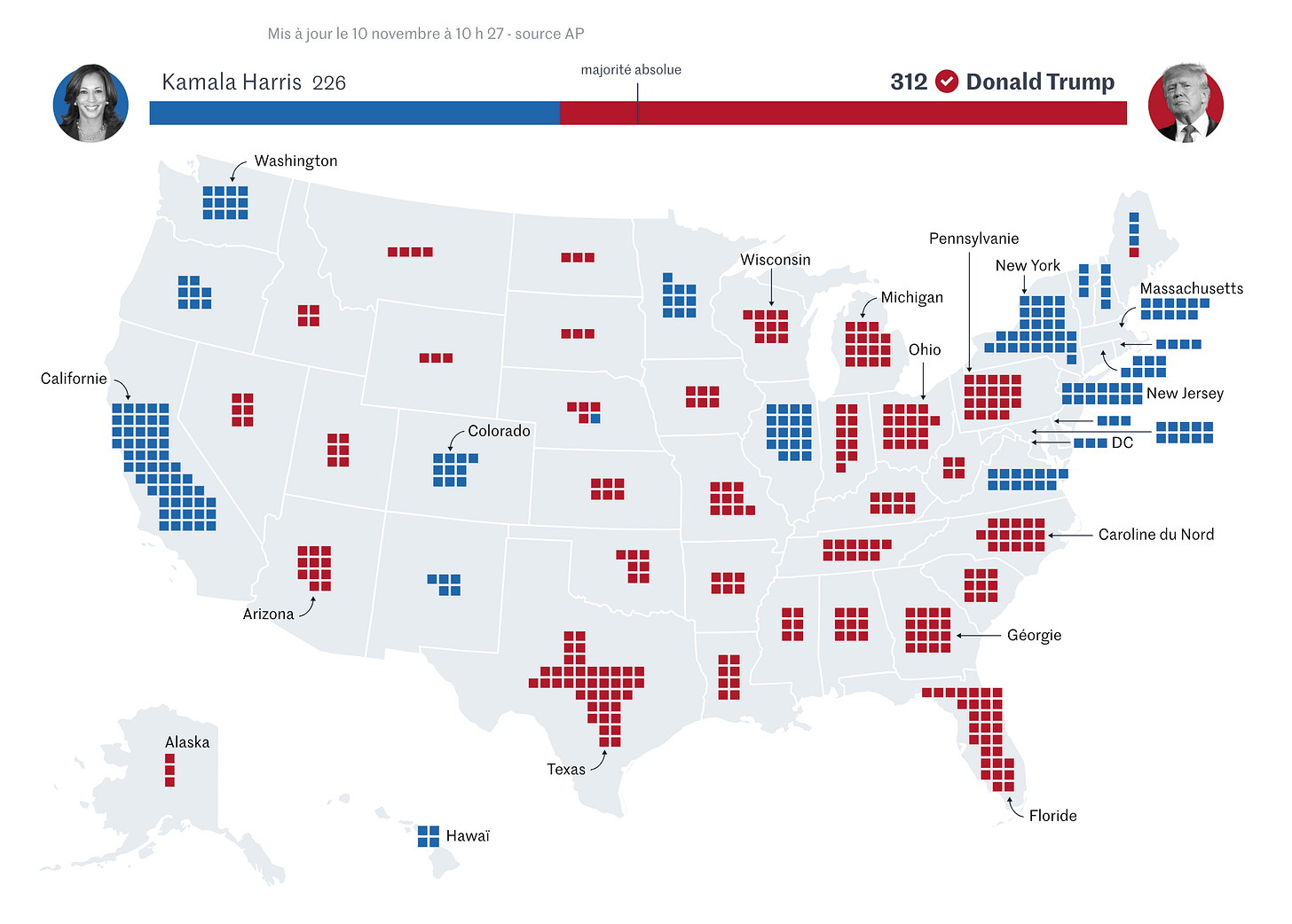
During the election period, these maps become fair game. That’s especially the case for the U.S. as their electoral system isn’t based on the popular vote which can be tricky to visualise. Many news outlets created electoral maps with shapes representing the number of electoral votes—see an example by Le Monde below.

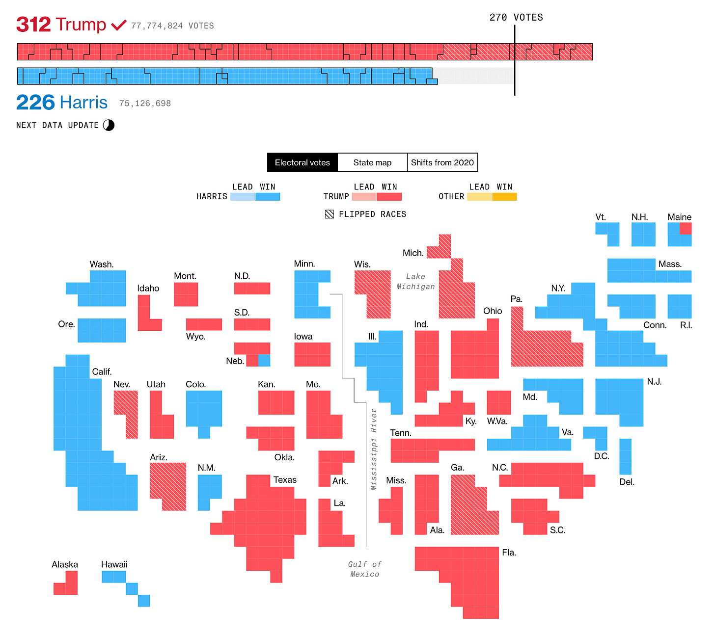
Bloomberg even reproduced that pattern of units for their total vote bar chart at the top.

Other news outlets used size—not land size, but the number of electoral votes, to recreate the map. I quite like this example by NPR.
While we use maps all the time, they often represent a skewed view of the world. Perhaps these atypical election representations can pave the way for more creative mapping in the future.
Patterns over colour.
To separate multiple categories, colour is the best tool. Right? Well, maybe not. While we tend to default to colour to distinguish between elements, it’s not the only way. Perhaps it’s a good thing that for the U.S. election colour is known to represent specific parties, which means we cannot use it for anything else.
Enter patterns.
In this year’s chart parade, it was quite common to see the flip states highlighted using a hatched pattern. And I’m loving it.

The Economist also used a dotted line pattern to show where the results have changed since the last election.

Patterns can be a great way to encode additional data elements. If you’re too used to colour, you don’t need to get rid of it altogether—just try a pattern or two in addition.
What do you think of these examples? Which of these three techniques are you most likely to implement in your work? Let us know in the poll below.
See you next time 🗳️
—Evelina
Plan a data storytelling training for 2025
This year, I animated 20 trainings in 5 different countries. From public policy, to healthcare to second-hand goods—professionals in every industry need good data storytelling skills. If your team is interested in one of our trainings for next year, do reach out! I’m currently taking bookings for February 2025 and onwards.


Love a good map post