
Your data storytelling profile
Rate your confidence in crafting, designing, and presenting data stories

Hello and happy Thursday!
I’m curious — how many personality tests have you completed in your life? Most people around me have toyed with the Myers-Briggs Type Indicator (commonly known as MBTI). I’ve also done the Process Communication assessment, and — of course! — the quiz that tells you which Harry Potter house you belong to. 🪄 These types of tests often have a bad reputation though, so what are they good for?
Their primary promise is to teach you something new about yourself: to uncover personality traits and behaviour patterns. I’m not sure they deliver on this promise, but they do have another benefit — a community effect. After completing such a test, you often get to compare your profile to those of people around you, including famous people. For instance, I no longer have a clue what my four-letter MBTI profile is, but I distinctly remember that Barack Obama has the same one.
So why on earth am I talking about personality tests in a newsletter on data storytelling?
I’ll tell you right now.
This is a big week for me. I’ve just opened the enrolments for my very first public data storytelling course 🥁. It will kick off in late March on the Maven platform, which allows me to provide the most fun and interactive cohort experience. As I was working on the course content, I was stricken by this idea: what if each of the participants had their own data storytelling profile?
After a lot of thought (and brainstorming with my partner, who patiently listens to my nerdy Saturday morning ideas ❤️), I created the model below. In it, you evaluate your knowledge and confidence levels in three key areas of data storytelling: narrative, design and presentation. The resulting profile consists of a letter, a number and a sign — for example, N1++ or Q3-.
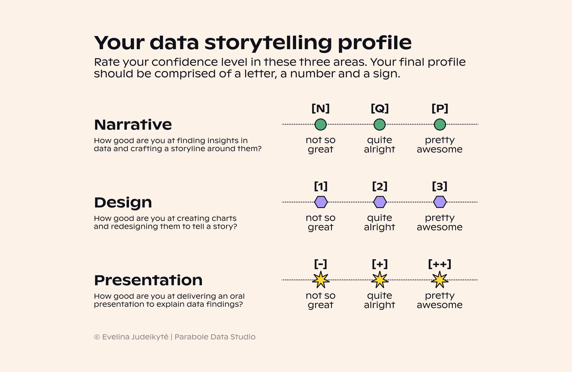
What’s your profile? What are you most comfortable with — crafting a storyline, designing charts or delivering presentations? Which profile do you think would be the most common among your peers?
If at this point you’re thinking that the above doesn’t cover all the skills needed for successful data storytelling, you’re right. The course I’m running next month is very much communication-based. We’ll hence be focusing on a subset of skills from the data storytelling field.
What would the full list would look like? The image below is my take on it.
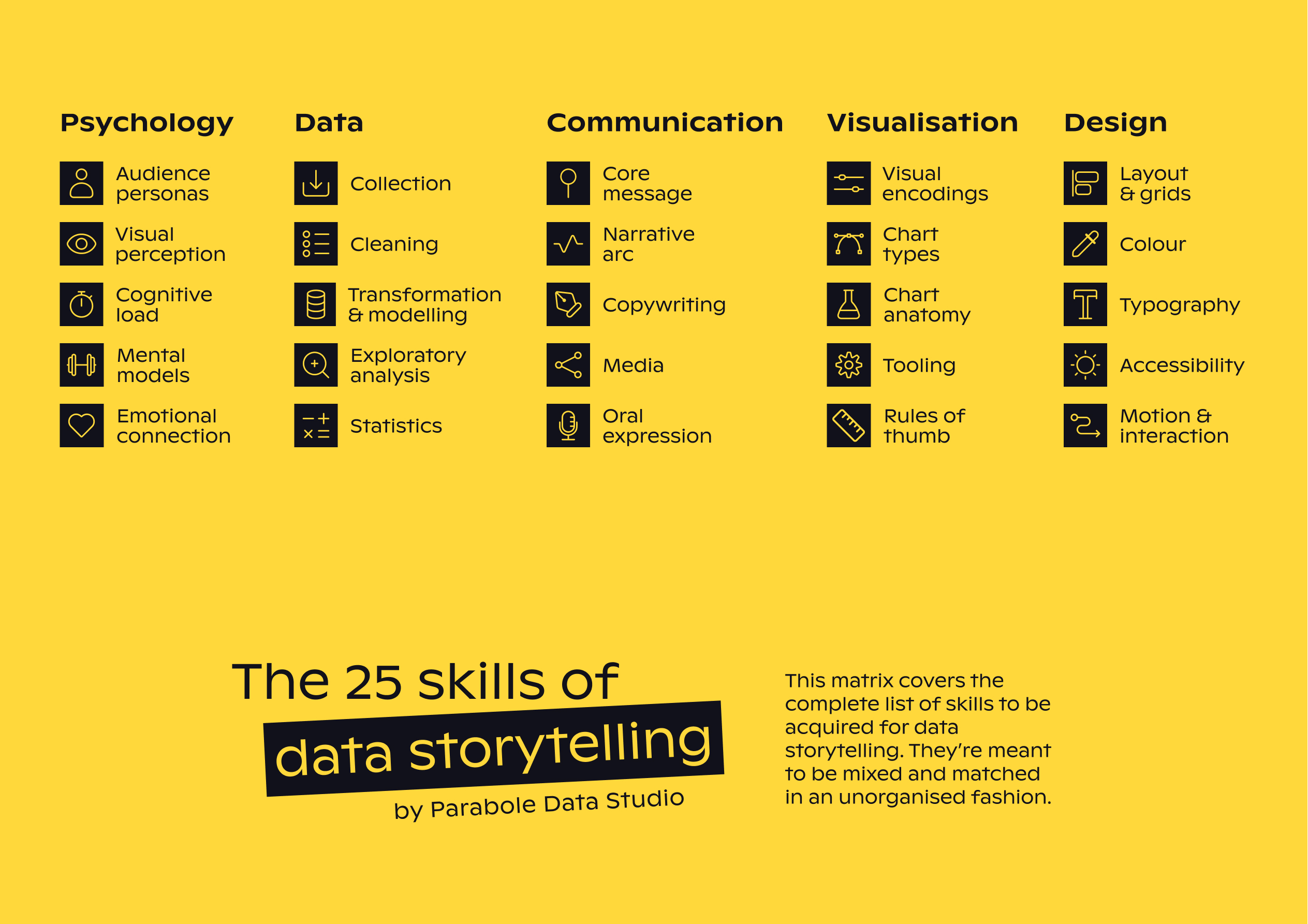
It’s long and honestly quite overwhelming, so let’s work on these competencies little by little, shall we? In the meantime, leave a comment below to let us know your data storytelling profile!
Thanks for reading, and perhaps I’ll see you in the course?
Until next week,
—Evelina
Resource corner
Realtime Inequality — a collection of dashboards that provide statistics on the distribution of economic growth in the US. The site is both informative and inspirational in its design.
World dataviz prize poster longlist — A showcase of many amazing submissions for this competition. You can also see the interactive pieces here.
Fantastic news about the course!