
Complex data, creative charts
A few fun dataviz solutions from a recent project at the studio

Hey there! For this last edition of The Plot in 2024, I want to share a peek behind the curtain of our latest interactive project—Moloco's Beyond Borders report. Ever wondered how to squeeze multiple metrics, regional breakdowns, and interactive filters into something that actually makes sense? Let’s take a look, and perhaps get inspired along the way.
When "show everything" is actually the brief
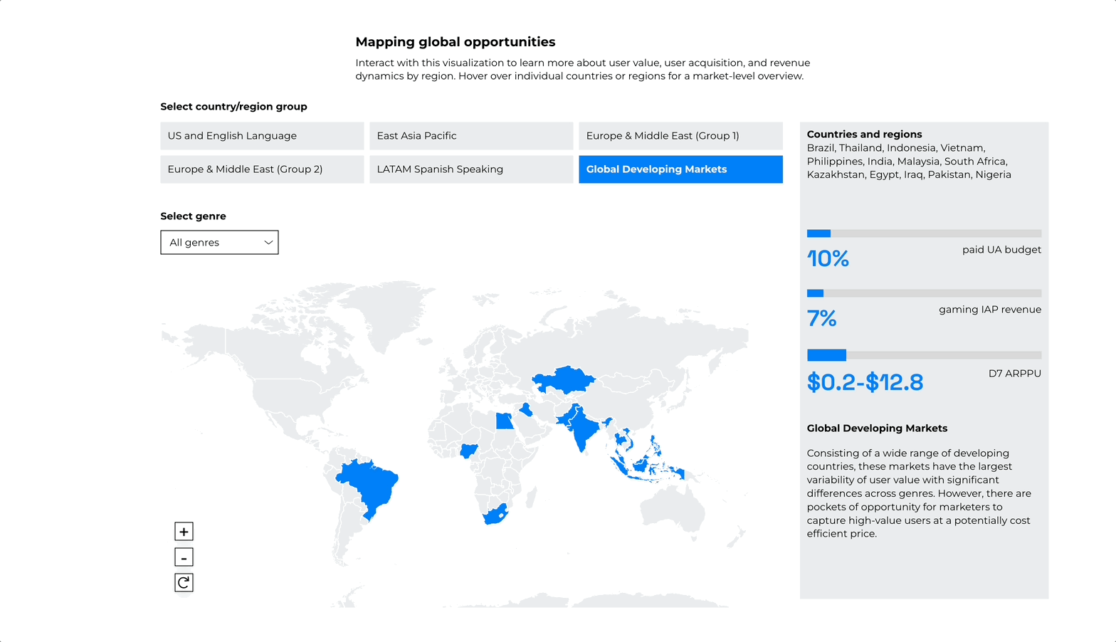
How do you visualise multiple metrics and dimensions at once? How can you show at least three different figures, grouped by region and country, and throw in the possibility to filter? Oh, and make it intuitive. I can see you wincing – we've all been there!

Here's how we cracked it: we created the interactive map above that breaks down the data into digestible bites:
You start by picking a country group
Get three key metrics in a side panel
Spot differences with the sneaky little slider showing revenue ranges
Hover over countries for a deep dive
Switch game genres with a dropdown
See how the map works in the GIF below or explore it yourself!
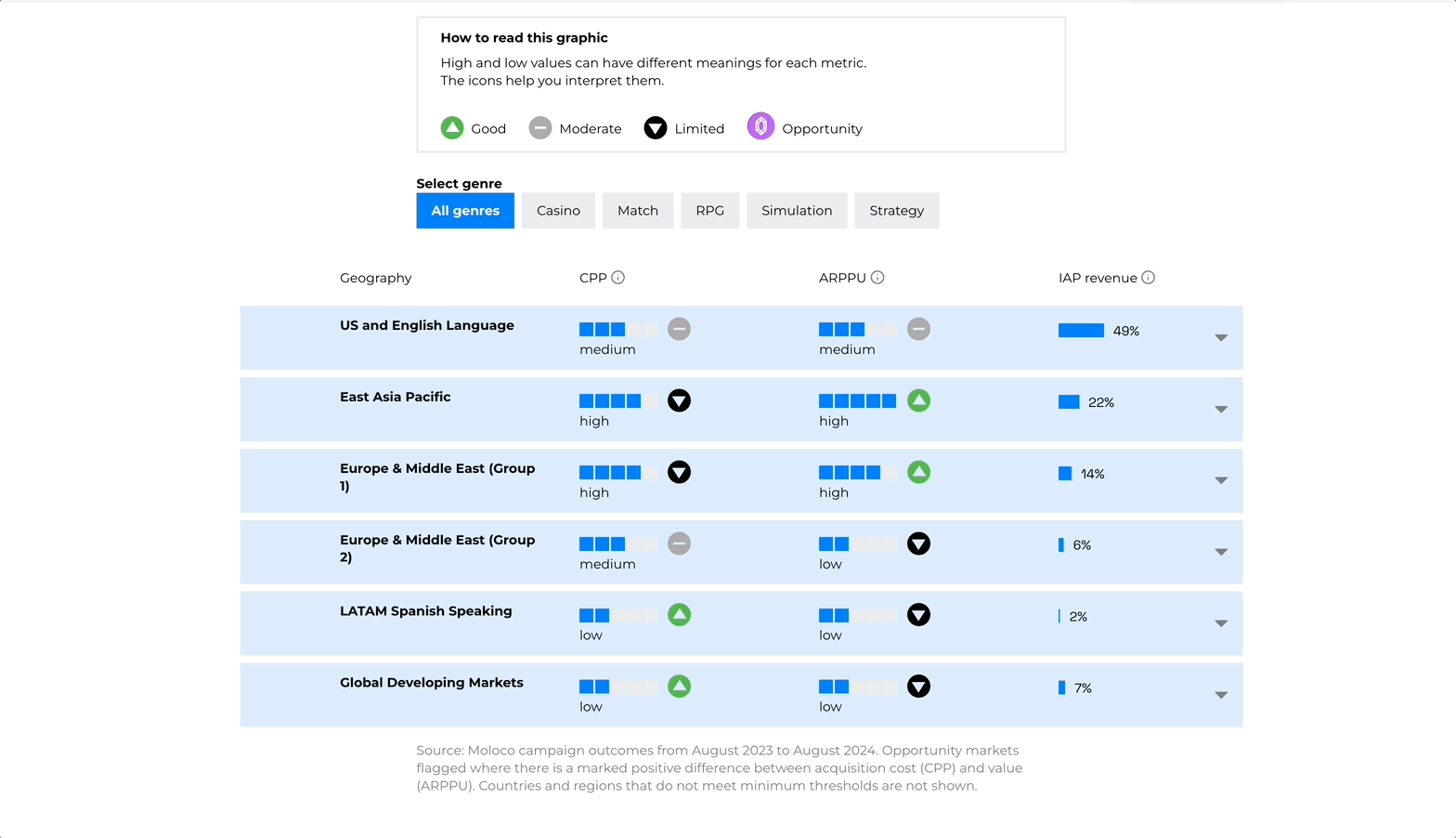
The "good news, bad news" dilemma
Another head-scratcher: how do you show three metrics where high numbers mean different things? For one variable, higher is better. For another, it's worse. The initial data looked like the heatmap below—awfully bright, isn’t it? So what did we make instead?

An interactive table that wears many hats:
Tiny unit charts show the value at a glance
Icons tell you if that's good or bad news
Region view by default, but one click reveals all country details
Bonus: sparkly gems (💎) to highlight high-potential markets
And yes, you can filter by game genre:
There's more to explore in the report – from simple charts to the hero spinning globe animation. It's amazing what happens when you combine a creative team with a client who's up for trying new things. 🤩

2024 has been incredible. But if I'm honest, it's been a lot. As I look toward 2025, my goal is simple: do less, enjoy more.
Which brings me to a question: what should happen to The Plot? You might have noticed my bi-weekly schedule becoming inconsistent these past few months as life got busier and busier. So I'd love to hear your thoughts: should The Plot continue its journey in 2025, or has it told its story?
Let me know what you think below 😀
Until next time (whenever that may be 😉),
—Evelina
Thanks for guiding us through your approach to this brilliant piece of work. Can I ask you what tools did you use to achieve the final results? Just keen on trying something similar for fun and learning.
WoW. The last visualization that you chose a table instead heatmap chart was an amazing solution.