Creative axes
Let your Y-axis follow the data
A few weeks ago, I casually tweeted a snapshot of a line chart by Bloomberg in which the vertical axis was placed on the right side rather than the left. To my surprise, the post resulted in quite a discussion. Dataviz practitioners on Twitter seemed divided: some people were enthusiastic and excited about the right-aligned axis, while others were…a little outraged.
Who knew the Y-axis could spark such a discussion! So it got me thinking: is it okay to place the vertical axis in unusual spots? how does one decide?
Let’s try to answer this question with some examples.
We typically place the vertical axis on the left of the chart and the data. I’m sure that’s not news for you. The reason behind it is simple: in the West, we read from left to right. That’s how we understand the world, and how we’re used to consuming our data: we familiarise ourselves with the value description and range before diving into the numbers themselves.
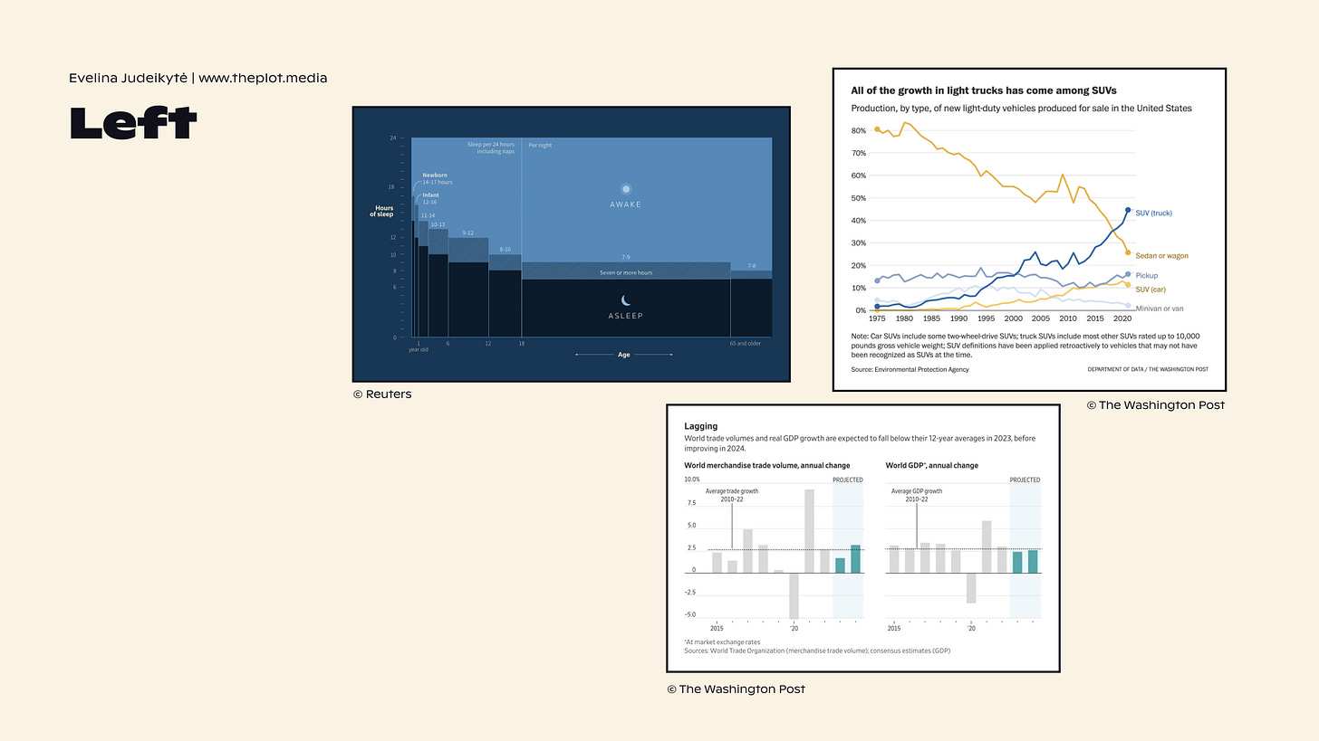
But we also encounter more and more charts that have the y-axis placed on the right. See some neat examples below. What do they have in common?
The axes ticks are placed on the right because they follow the data. When the most important data point—i.e. the most recent date or the last category—is towards the right, it makes sense to place the ticks close to it. This is what we observe in the charts above. It may be unusual, but it does help us interpret the data points more easily: there is no back-and-forth between the data and the elements that explain it.
That doesn’t sound too crazy, does it?
If right now you’re thinking: wow, did she really write an entire newsletter about a right-aligned vertical axis?!… Yep, I really did. 🤓 Good data communication is not only about the grand things like writing a persuasive narrative or choosing a fancy chart type. Good communication is in the details. The tiniest aspects of your design—like ticks and lines—can have an immense impact. With that said, I have a challenge for you.
If the guideline is to follow the data, then left and right alignments aren’t your only options. You can show just one or two key ticks, label the bars or lines directly, or mix multiple approaches. See some inspiration below.
So how will that impact your next chart? Where will you place the Y-axis based on these three criteria:
ease of reading,
shape of data,
and the space you have available?
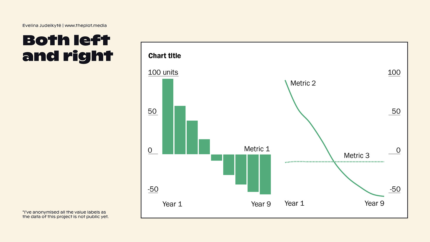
In a chart I designed right after the Twitter discussion, I ended up going both left and right. As the graphic was a small multiple (see below), I decided to repeat the value ticks on the right-hand side. What do you think? Love or hate?
Thanks for reading this nerdy edition of The Plot! ❎ Do share your rebel axis designs with us in the comments.
See you next week,
Evelina
Weekly gem
The Brand Identity. One of my favourite accounts on Instagram for design inspiration. I’ve also just purchased some of their books and magazines, and they’re pure gold.
Need help with dataviz and storytelling at your organisation? Reach out and we’ll craft engaging data stories together. I take on design, consulting, and training projects. Hit reply to this email and we’ll set up a chat to get started. I’m currently taking on projects for September onwards 📆


Glad to have found your Substack! Just subscribed and looking forward to learning to from your insights.