
Conflict & Confirmation
Introducing nuance makes for a more credible data story

Complete the following sentence:
A story structure is divided into…
I’d be willing to bet your answer has something to do with threes. Perhaps you replied that a story has a beginning, a middle, and an end. Or perhaps you think in acts instead. That’s a great starting point for building a narrative from the ground up. But where do you go from here? How do you know what content to include in each of the three acts?
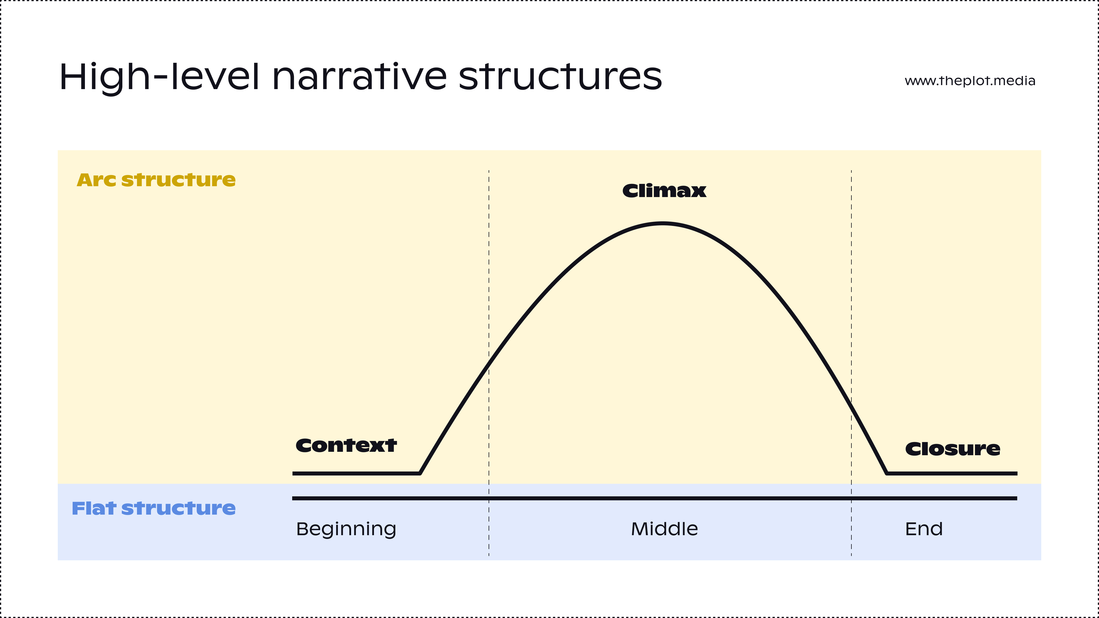
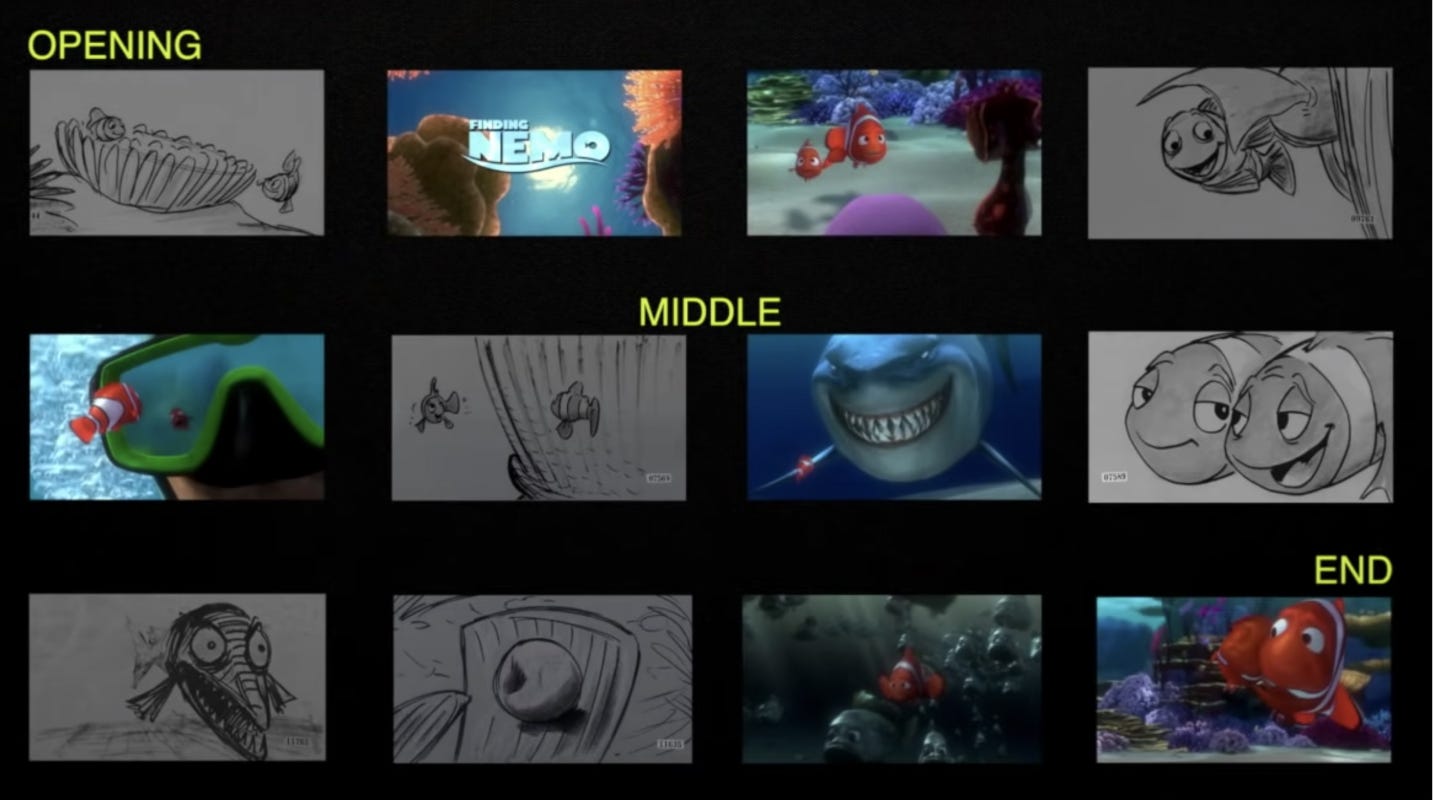
This is what we tackled in my data storytelling course that ended last week. The participants developed additional ingredients to the story arc: story beats. What on earth are story beats, you may ask? Great question. The creatives at Pixar define story beats as key moments in a story. They represent the turning points after which the narrative is forever changed. Altogether, they make up a logical, coherent narrative. Here are the story beats for the film Nemo, in visual form:
The number of beats for a story can vary: for instance, some screenwriters shape their narratives around 7 plot points. For the course project, the participants worked with 5 beats. The goal was to make their data stories more credible. And for them to be credible, there needed to be moments of surprise, tension, and contradiction.
Enter conflict and confirmation.
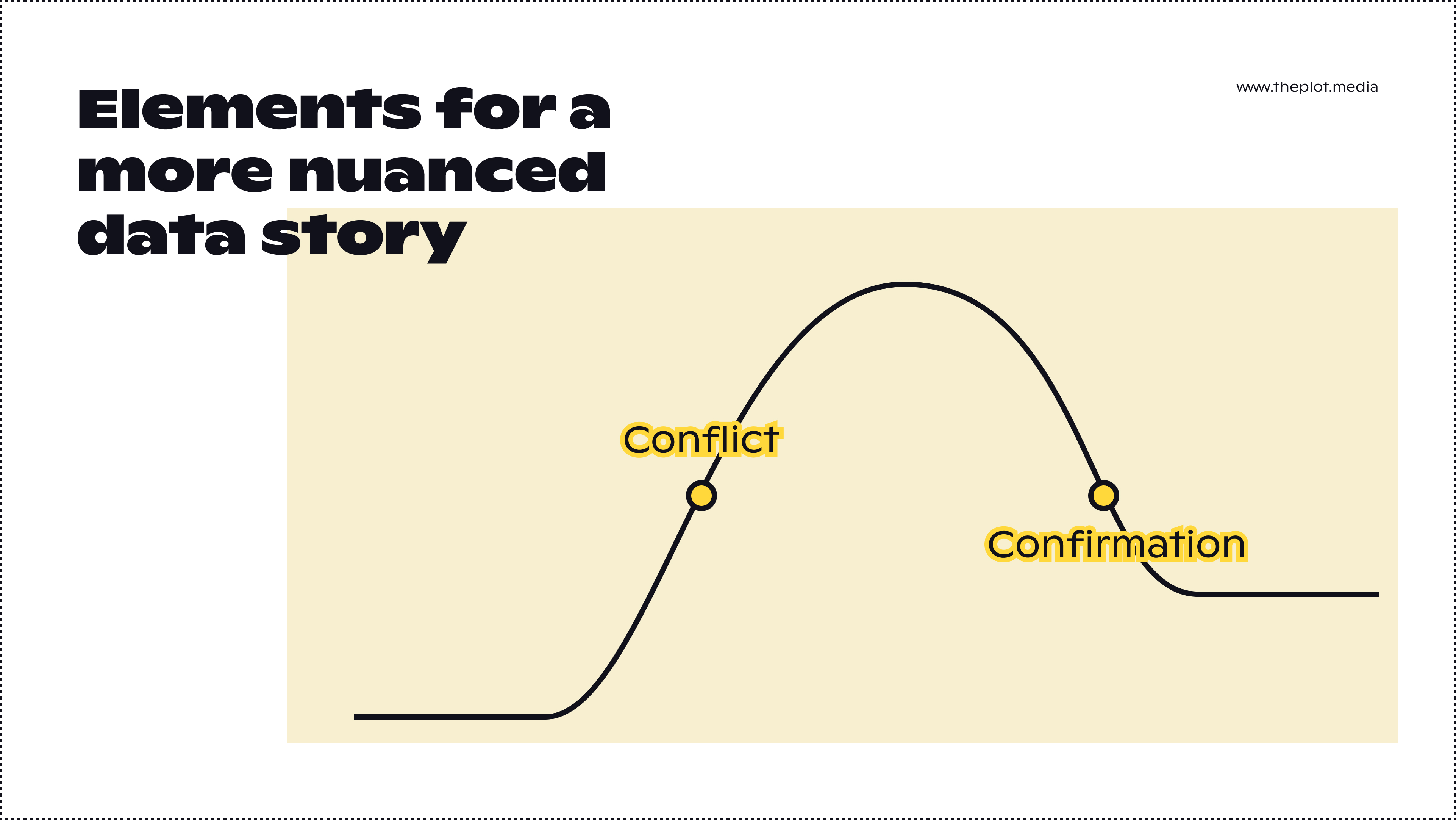
We added two additional elements to the story arc: conflict and confirmation. The conflict is the inciting incident in screenwriting terms. Aristotle called it division. Essentially, it’s in the conflict that we find out why we’re here: are there diverging opinions on the topic? is there a hypothesis that needs disproving? In the conflict, you make your audience care about the climax that is about to come. So far so good, right?
Now confirmation is a little trickier. It’s the rebuttal of the remaining arguments against your insight or recommendation. Here, you’re addressing opposing views. This little detour is what makes your story so much stronger: instead of simply presenting the insights in the climax and concluding on a high note right away, you’re acknowledging that you don’t hold the full truth and that your story is nuanced.
Confused?
I can’t blame you. It’s high time for an example.
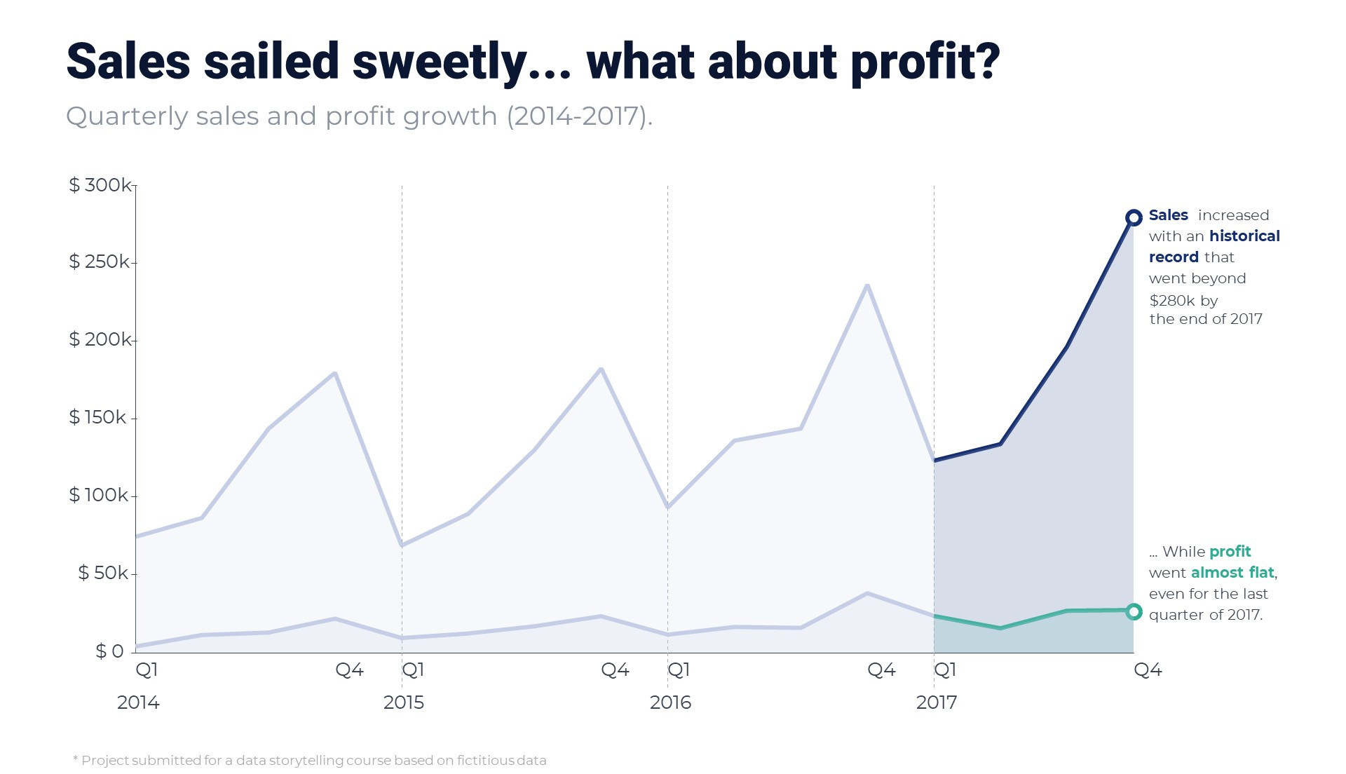
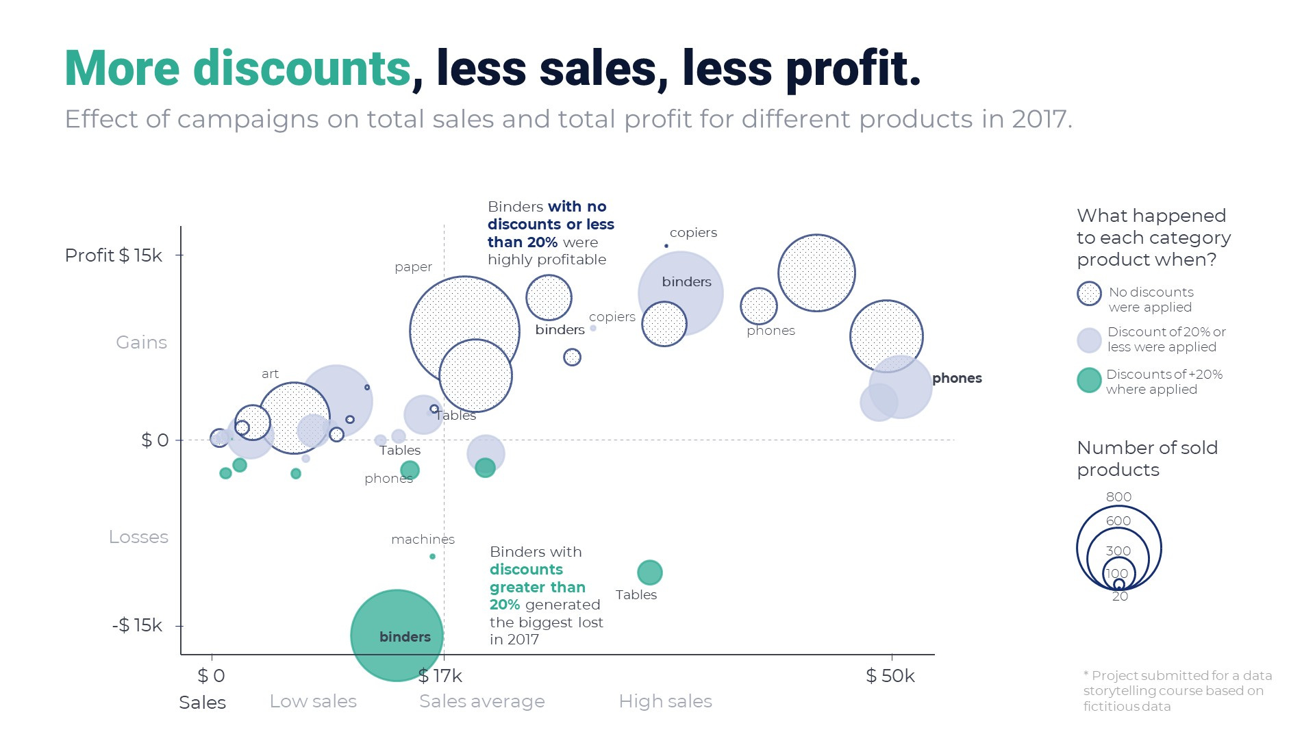
Moyocoyani Molina, one of my course participants, crafted a storyline around the Tableau Superstore data (you know, that slightly boring dataset on a fictitious business). Here are his story beats:
Context: Sales increased substantially since last year and we’re analysing the implications of this trend for the business.
Conflict: We tend to think that more sales equal more profit. But is that really the case?
Climax: The company’s profit did not follow the same trend as its sales. The culprit seems to be the promotional campaigns with discounts beyond 20% and more than 10 items sold. For instance, binders and tables are typically among the most profitable items, but incurred losses during the promotional period.
Confirmation: Some products are exceptions to this conclusion but they don’t alter the overall trend.
Closure: When launching promotions, we need to be careful and either curb the discount amount to a 20% maximum or include a minimum number of orders.
See how much better the story becomes with conflict, and most importantly, confirmation? If Moyo hadn’t acknowledged the exceptions, his story would sound just a little too linear. By adding a confirmation after your climax—that is, by addressing the remaining doubts—you’re making the story finish stronger. Essentially, you need to disagree with yourself a little to prove your point.
So where do we go from here? The next step for Moyo was to translate the above story beats into visuals, which he was kind enough to share with all of you. See his stunning charts below:
Can your next data story benefit from conflict and confirmation?
Thanks for reading The Plot. 🗂️
See you next week,
—Evelina
Weekly gem
One of my favourite dataviz conferences, SHOW by Graphic Hunters, will take place on 1-2 June this year. I’ll have the privilege to host a panel with Nadieh Bremer, Olivia Vane, and Manuel Lima on the second day of the event! Will you join us in Utrecht? 🌸
When you’re ready, you can reach out to me to help you craft and design engaging data stories. I take on design, consulting, and training projects. Hit reply to this email or set up a chat to get started. Don’t wait too long though—my schedule for Q2 is nearly full!
I absolutely love your applying Aristotle to the Tableau supermarket exercise ♥️
It is very interesting and it also made me smile!
Great job, Moyo and Evelina!
Hi Evelina, thank you for sharing this article. Such a great insight for me. I want to know what kind of platform that you use to visualize 2 last visual? Thank you in advance.