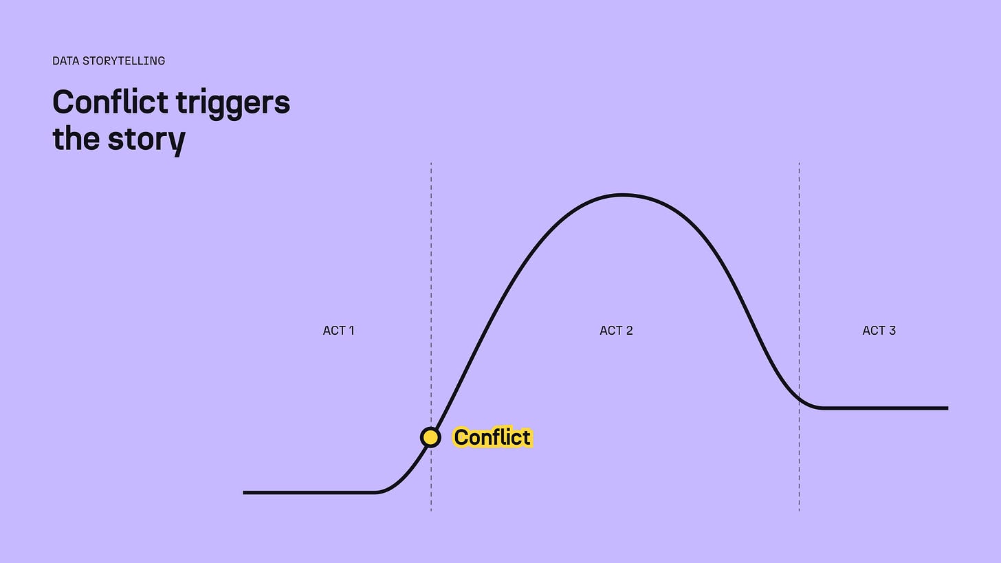
Story trigger
The one indispensable ingredient of any story
Kevin is left home alone and has to defend his house from thieves. Someone is turning the citizens of Zootropolis crazy and Judy wants to find out who and stop them. Nemo wanders away during school and gets kidnapped, so his father has to cross the ocean to save him.
You may have recognised story snippets from Home Alone, Zootopia, and Nemo. But they’re not random extracts from those films. They all represent the same moment in the narrative. What is it? It’s what triggers a story. It’s the element you need to begin any story. So what is it?
Conflict.
For a story to exist, something has to go wrong. Would you watch a 1h40min movie if Nemo never got lost and simply lived his quiet life and went to school? I don’t think so. Something compelling needs to happen. Across different story structures, this moment has different names: inciting incident, obstacle, turning point… But it’s always there. It’s present in all stories throughout time—whether you’re reading the Bible or watching your kids play house. It represents the inflection point: the moment in time when things get interesting.
Without conflict, there’s no story.
That begs the question: how do we work with conflict in data storytelling?
You can think about it through (at least) two different lenses.
Conflict as an event.
You’ll likely observe an occurrence that will trigger your data storytelling process. Perhaps your company’s sales plunged. Your recent marketing campaign underperformed. Or the population rates in your region decreased much more than in the rest of the country. These types of events will incite you to analyse the data for explanations. And once you will have found the answers in the data, you’ll craft a narrative around them.
Example: In this story I helped design for ONE Campaign, we looked at climate finance data to see if promises were even close to reality. The story was triggered by an observation that countries in need of help were not necessarily doing better despite the promised funds.
Conflict as a question.
Sometimes, you may not have a specific event to report on, but you still want to explore the data. In this case, your conflict may be slightly less dramatic: you would formulate it as a question. Is there a relationship between literacy rates and unemployment rates? How has inventory evolved? Which departments of the company contribute to the most carbon emissions? It may sound less exciting at first, but finding answers to the conflict question can lead to a compelling data story nonetheless.
Example: In this research report I designed for HRFN, we aimed to answer the following question: do the differences in funding between Global North and Global South & East signify a gap in trust? The answer was eye-opening (check out the full report for more!).
There are many parts to a story and you do need to tend to all of them. For example, you need an engaging hook and an inspiring closing, along with clear takeaways. But next time you create a data story, I encourage you to start with the conflict. What’s the inciting incident? Will your audience care about it, and will they be able to help you resolve it?
Let me know how it goes!
As ever, thanks so much for reading. See you next week.
—Evelina
Upcoming training 📆
Want to learn data storytelling with me? Join my three-week online data storytelling bootcamp starting in early June. This will be an updated and improved version of my usual course. As always, you can use the code THEPLOT10 for 10% off.


This is interesting, but have you count for their PPP? So as to not confuse the nominal value with the actual value. I guess, by converting to PPP value, one can see the disparity better. Organizations, I propose, should adopt this approach too in giving Global South chance to see 'actual' problems from their eyes and not from the eyes of Global North.