
Breaking colour rules
Is the way we colour charts about to get a makeover?

“Pick one accent colour, push everything else into greys.” You’ve probably heard this advice when you were learning data visualisation. I certainly have taught it in many of my data storytelling workshops. But lately, I’m catching myself fascinated by designs that circumvent this rule.
If you read recent impact reports or scroll interactive sites, you’ll spot charts that use gradients, alternate hues or stay defiantly monochrome. Are we entering a new colour era in dataviz?
Let’s tour the evidence.
1. Gradients
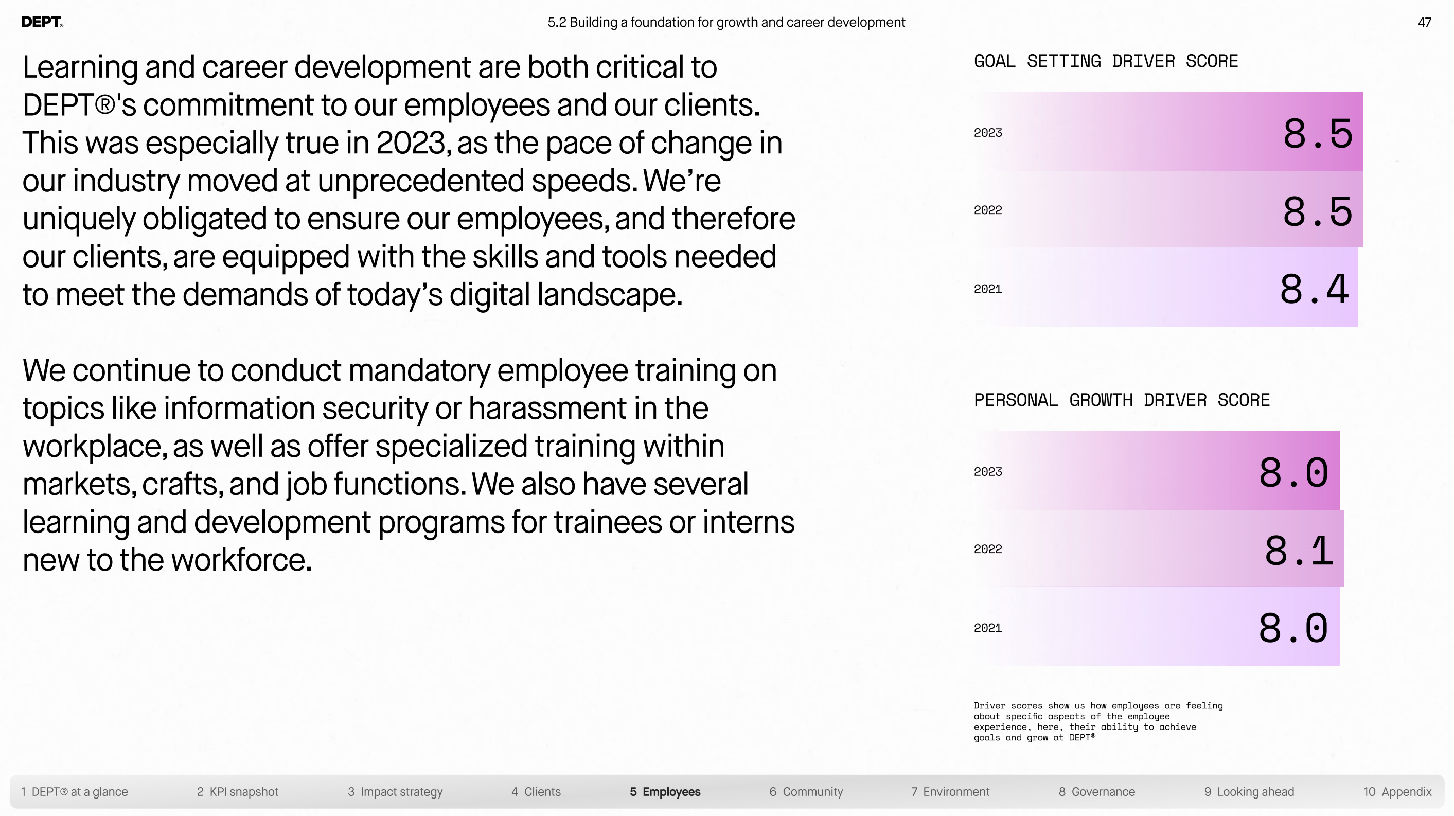
Remember when gradients were banned for obscuring data edges? Dept® challenged that dogma in their recent impact report with soft colour transitions in each chart.
Figures & Figures turned it up for a Vox climate project—employing colour fades that guide the eye along evolving temperatures.

Finally, AlgoTV proved gradients can even survive motion in animated dashboards.
2. Alternating hues
Rainbow categories are considered one of the biggest chart crimes. Yet ADL’s recent report alternated bar colours to brilliant effect: each value feels distinct and the pattern itself mirrors fragmentation.

Google’s Material Design 3 goes even further, exploring expressive palettes that shift colour, shape and hierarchy. Their research on the topic is fascinating, too.

3. Monochrome
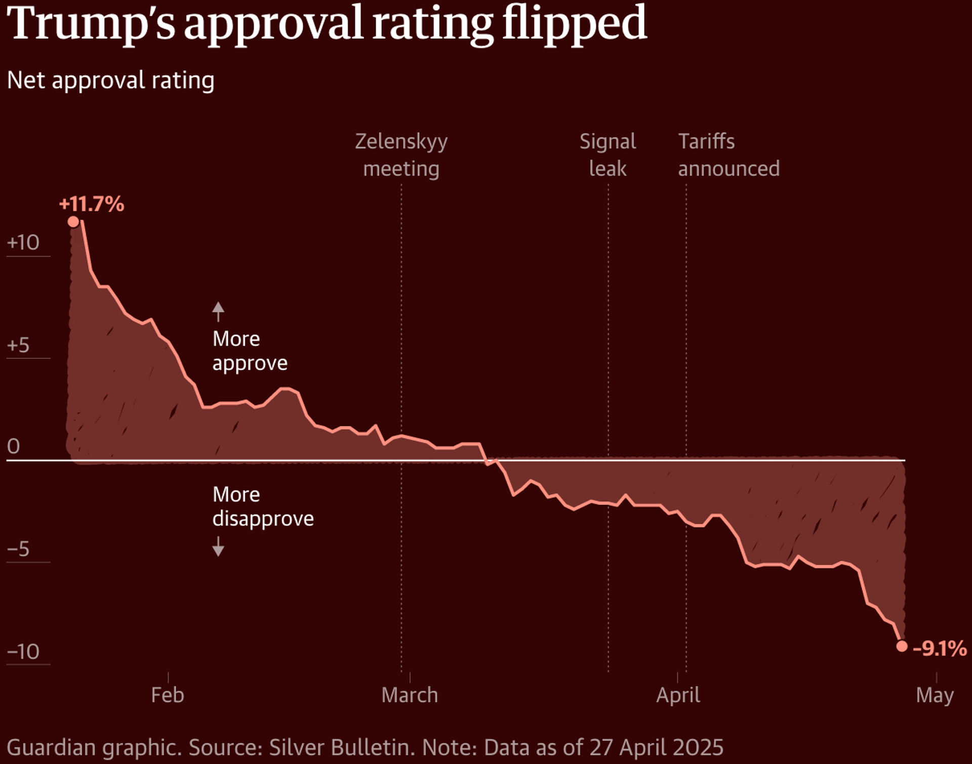
Are single-hue charts always bland? A recent design trend proves the opposite. In this example, The Guardian used nothing but deep reds to tell the Trump approval rating story.
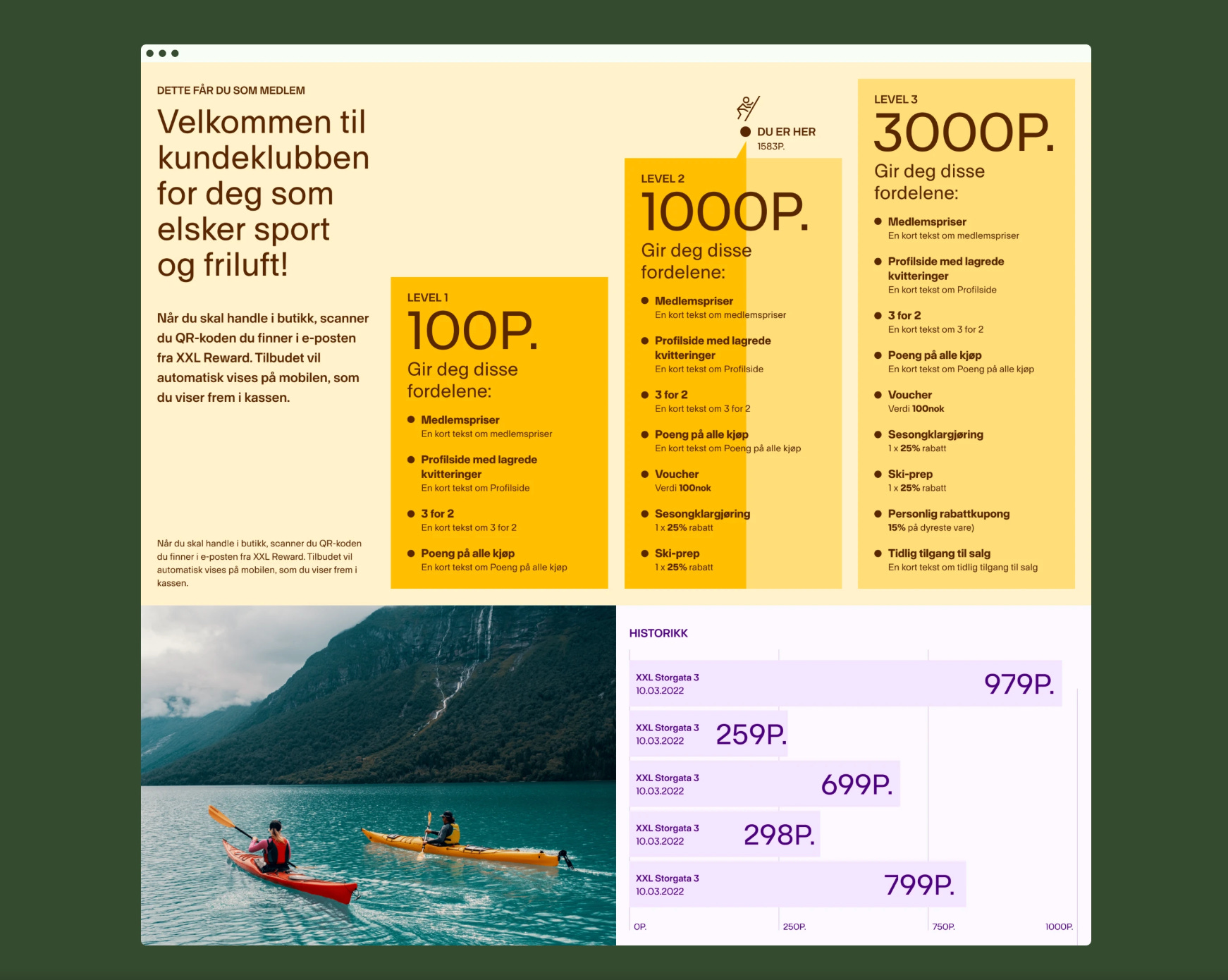
The web design below follows a similar technique, alternating between light and dark yellows and purples.
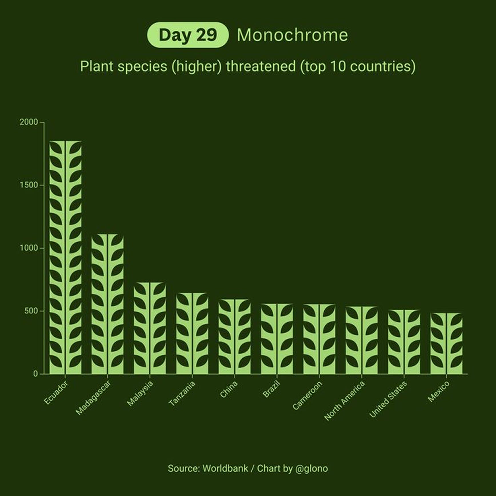
And this plant-focused graphic employs greens only.

What conclusions can we draw from the above examples? The arguments against such experimentation typically focus on legibility issues.
So the question is: Could you read each graphic above quickly? If yes, the design passes. The perceived danger of too much colour may be smaller than the engagement you gain—provided you layer in labels, tooltips or annotations for added clarity.
Over to you
We’re already testing bolder colour palettes at our studio. If you feel adventurous to try to explore them with us, here are our best tips:
Gradients: Try it if you have continuous data and want to signal movement. Watch out for low contrast at the extremes; annotate start/end values for clarity.
Alternating hues: Try it if categorical data needs equal weight and labels alone aren’t enough. Watch out for accidental hierarchies—our brains will search for a dominant tone.
Monochrome charts: Try it if the narrative leans on brand colour or mood. Watch out for adequate light/dark contrast (WCAG 2.1 AA is your friend).
Thanks for reading!
See you soon,
—Evelina
Big fan of the google material version 🤩
Rules are meant to be broke