Beautiful food
Some of the most striking food-related brand identities from NY
Hey there! Greetings from the Big Apple 🌞 It's been a full week of city adventures for me, including diving into NYC's culinary scene. On top of the great food all around, I also found myself captivated by the stunning brand identities of these eateries. So, in today's quick edition of The Plot, I'm excited to dish out my top three design systems from this trip.
Fair warning—you may want to get a snack before you dig in!
***
Sweetgreen is a healthy yet delicious salad place. They use the gorgeous Sweet Sans typeface (as is appropriate for their name!). I also love the pastel colours of this brand—so elegant and soothing. See for yourself below!
Eat Offbeat is another fascinating restaurant chain with cuisine from around the world. I had the best eggplant curry of my life in one of them. And their brand design immediately caught my eye—the Trailers typeface in all caps for headings is stunning and the colours are exceptional too. After all, it’s not every day that we see a tasteful mix of orange, yellow, and green.
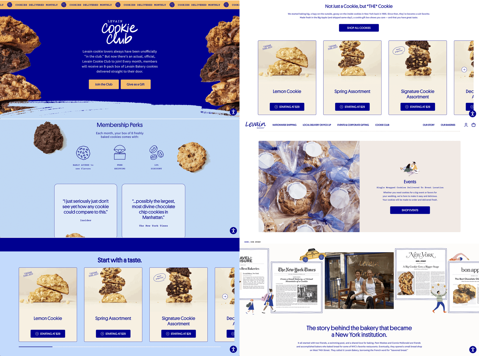
And for dessert, look at the Levain Bakery and its scrumptious cookie designs. I love the dominant bright blue colour that pops throughout the website and that is, every once in a while, paired with another shade of blue or beige. They use a typeface called Platform LC Web for their headers and buttons and it doesn’t disappoint.
Which of the above design details have caught your eye and why?
Thanks for reading, and I’ll see you next week—from Europe this time 🍪
—Evelina
Want to develop your data storytelling skills? Grab your discount today.
Join my three-week online data storytelling bootcamp starting in early June. This will be an updated and improved version of my usual course and there are still a few spots remaining.
Use the code THEPLOT10 for your exclusive 10% discount!


Love the Eat offbeat's logo. A great example of how you can suggest "movement" and dynamism through text as well 😀