Basic bars
Teaching others to get the simplest chart type right
What’s the simplest, most popular chart type?
I’m sure many of you would reply bar chart to this question. It’s certainly one of the most common graphics we see in the wild, and for good reason: it’s quick to make and easy to read. But as much as I’d like to think bars are basic, I still encounter quite a few versions of them that make me scratch my head. Let’s take a look at some not ideal bar formatting options and make sure we don’t take part in their making.
The legend exaggeration
I stumbled upon the bar graph below in Datacamp’s course on data storytelling. How quickly can you tell what I don’t like about it?
In the chart above, the legend adds so much complexity. Not only do I need to go back and forth between the key and the data to understand what’s what, but I also can’t help but wonder if the colour palette means anything. Spoiler alert: it doesn’t.
It would be so much simpler to just label the bars directly:
The category concealment
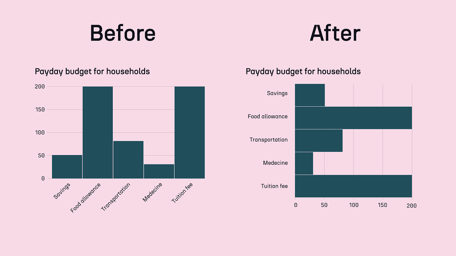
The chart is already much quicker to read. But there’s still something off about it: the category labels are pretty hard to read. Believe it or not, it’s the chart fix I suggest to people most often. And the solution is rather straightforward—you only need to switch from a vertical column chart to a horizontal bar chart.
There, you no longer need to tilt your head to read the text.
The order conundrum
Can you guess what’s the one last thing I’d like to improve in this chart? Add some order to it. Now, there are no rules on what type of sorting is better—depending on the key insight, you may want to go from smallest to largest, or the other way around. Sometimes, even alphabetical order can make sense. As long as it’s thought-through and not random, it’s up to you.
Legend, direction, and sorting.
If by this point of the newsletter you’re outraged that I wrote something so basic, take a step back with me for a second. Even though the iterations above may seem obvious to us, that’s not the case for many other people. And it’s only because they’re not aware of the better options.
When I encounter such confusing bar chart variations and suggest improvements, people tell me that they just didn’t know better. They tell me they’re so used to seeing category labels slanted at 45° that they don’t even question it. Once presented with alternatives, they’re usually convinced immediately.
It’s our job to teach them.
So next time you see a bar chart that can be improved, explain to its creator why and how to do it. Chances are, they’ll never design their charts the same way again, and you’ll have made a huge impact.
As always, thanks for reading The Plot! 📊
See you next week,
—Evelina


Hi Evelina,
I'm a big fan of The Plot and love the simplicity & clarity of this post. I'm a life sciences professor & have also had some run ins with ineffective bar graphs & wrote about it recently here: https://www.stonybrook.edu/commcms/alda-center/thelink/posts/benefits_and_burdens.php
Would love to know what you think.
Thanks for the great insights!
- Tom O'Connell
This is really helpful! thanks for this post