
2023 in books
An updated map of dataviz books on my shelf, and new ideas for 2024

🎁 It’s that time of the year when many of us think about holidays and gifts. For me, it’s also the time to dream of new books. To be fair, books are always on my mind, but even more so in December—and not only as presents. Two years ago, I published a map—in the form of a scatter plot—that listed all the data visualisation books on my shelf that are worth reading. Since then, the book update has been my most popular post each year.
So for the last 2023 edition of The Plot, I’ve prepared an update of this map. Keep reading to find out which book I recommend the most this year and to vote for a potential expansion of this concept.

If the above image is of low quality for you, you can download a high-resolution PDF here.
Here are two lessons from this year’s book-reading adventures.
You can find fascinating books even if you’re no longer a beginner…
After consuming so many instructional data visualisation books, I got a bit of an overdose. I know there exist other great dataviz publications that are not on my list—those written by Stephen Few, for example—but it’s hard to find the passion today to read about the basics… again. But this year, I was pleasantly surprised by seemingly just another book: Good Charts by Scott Berinato.
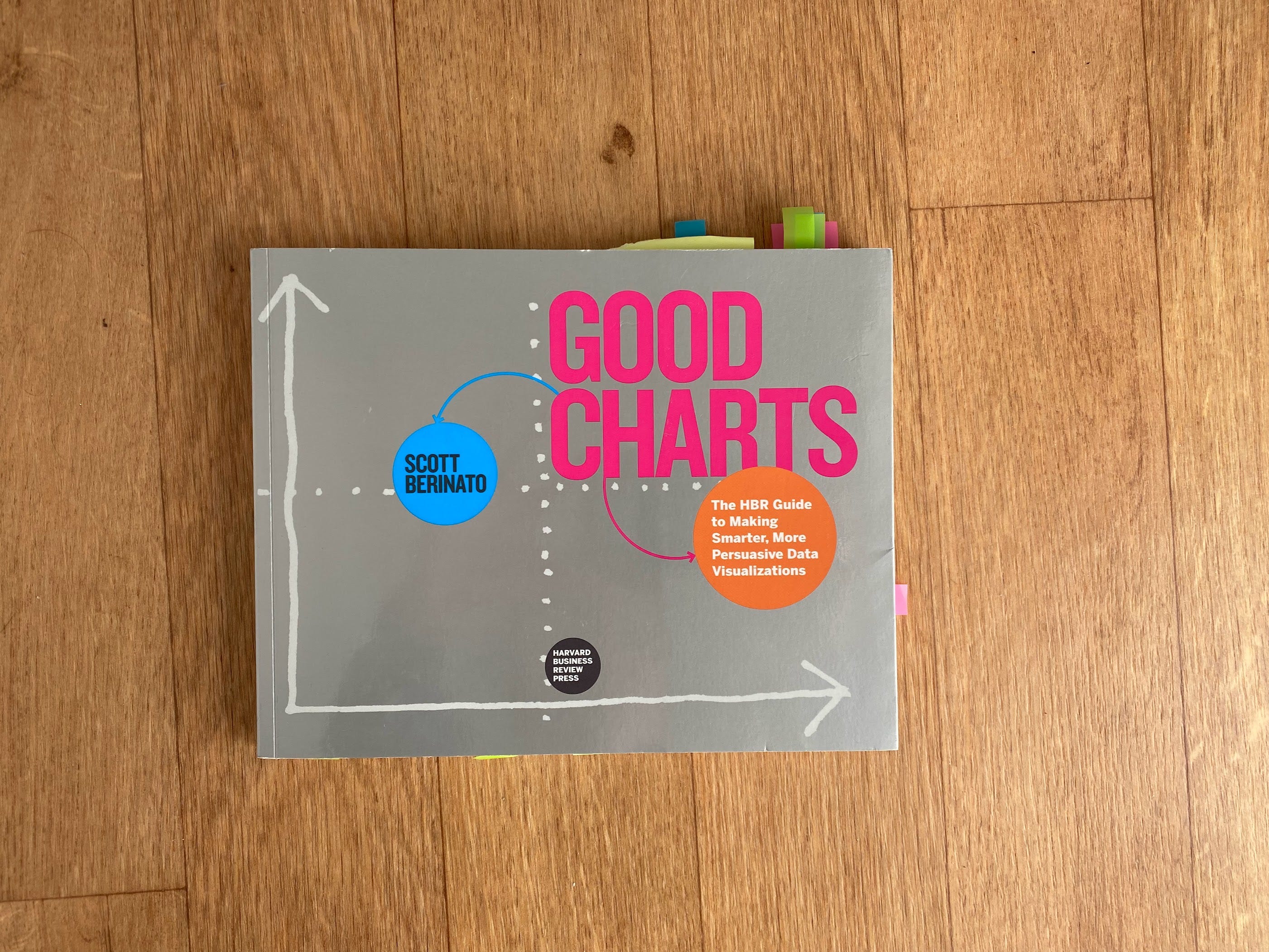
This masterpiece brings a fresh approach to thinking about data visualisation. One of my favourite concepts from the book is the good charts matrix. It points out that there are two criteria to evaluate the effectiveness of your graphics: contextual awareness and design execution. You may have the most beautifully designed chart that will fall flat without context. Or a cluttered one that may work wonders because of contextual details. The goal is to strike a balance. Get Good Charts for yourself to discover all the other gems in there. And no, this is not a sponsored post. 😉
One more thought. Since lots of new books get published at the end of the year, here’s the didn’t-get-read-in-time-to-make-it list:
You Are What You Watch by Walt Hickey
Chart Spark by Alli Torban
The Data storyteller’s Handbook by Gat Greenbrook
Not the End of the World by Hanna Ritchie
Information Design Unbound by Sheila Pontis
Britannica's Encyclopedia Infographica, designed by Valentina D'Efilippo
I’ll tell you more about these in a year!
..but branching out can be even more beneficial.
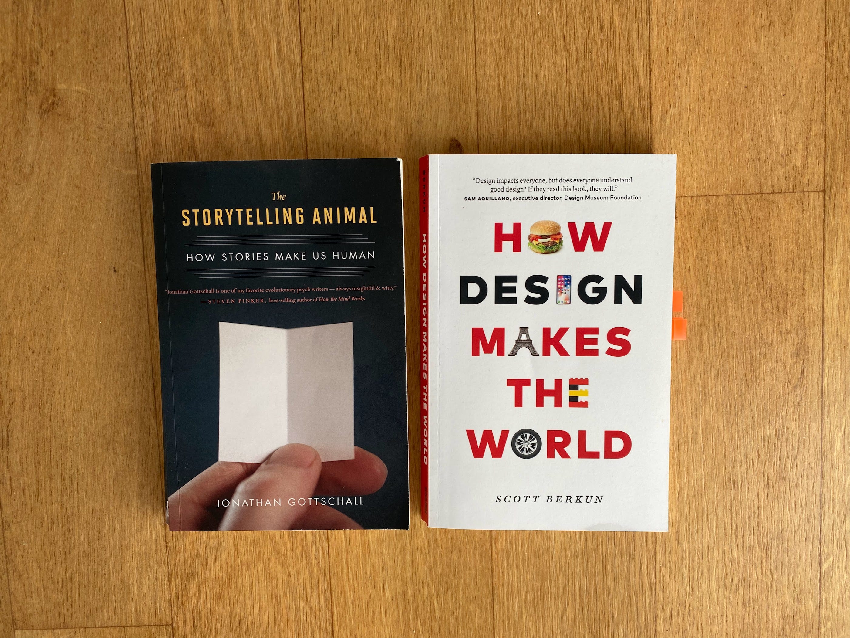
While I always keep an eye on visualisation and infographic books that come out, I have less and less interest in reading them. That’s because, as my data storytelling and design practices evolve, I find enormous benefits—and pleasure—in consuming content that is not purely about charts. There are two additional collections of books and magazines in my house that are not mapped above:
Storytelling (narrative design, presentations, public speaking, etc.)
Design (graphic design, editorial design, design for good, etc.)
The Storytelling Animal and How Design Makes the World are two examples from these categories.
So I’d like to end with a question: would you be interested in seeing the lists of these books as well? Let me know by leaving a comment below or replying directly to this email! Depending on your interest, I may create two new maps in 2024. 🤓
In the meantime, I wish you a lovely last week of the year. 🎄 See you in 2024 for more data storytelling goodness!
All the very best,
✨ Evelina
Just one more thing before you go.
Looking to improve your data storytelling skills? I’ve got you covered. The next round of my data storytelling bootcamp will kick off on January 29, and there are still some spots left. Perhaps this can be your Christmas gift to yourself? Join us for two weeks of interactive workshops and hands-on projects.
Yes to the two new maps!