
X is like Y
Moving beyond "football fields" to analogies that stick

“The size of the area was as much as 250 football fields.”
Can you visualise it in your head? Maybe, but likely not.
This kind of analogy is common in data storytelling. Its intention is good: to give the audience a reference point so they can better grasp the scale of an unknown object. But is it actually helpful? I’m not so sure. 250 football fields are still quite hard to comprehend.
That said, analogies are an incredible tool in our data storytelling belt. So, let’s look at how they work and how to use them to our advantage.
The analogy way
In philosophy and logic, analogies are primarily used as arguments or heuristic tools to transfer knowledge from a known subject (the source) to an unknown one (the target). They are widely recognised as aids to discovery.
According to Joseph Priestley, a pioneer in chemistry and electricity:
“Analogy is our best guide in all philosophical investigations; and all discoveries, which were not made by mere accident, have been made by the help of it.” (1769/1966: 14)
In today’s world, when we say “analogy,” we typically mean literary analogies: rhetorical figures used to explain an abstract concept by comparing it to a familiar one. For example:
“The structure of an atom is like a solar system. The nucleus is the sun and electrons are the planets orbiting it.”
In the context of data storytelling, analogies are crucial for bridging the gap between numbers and human understanding. While standard philosophical analogies focus on logic, data storytelling analogies focus on scale, process and impact.
Analogies that stick
Philosophy and history aside, which types of analogies are most useful for us today? Here are three key types and some real-world examples.
Magnitude analogies (aka social math)
This is arguably the most useful type of analogy for data communication. It translates vague figures into human-scale concepts. The goal is to make numbers “feel” real and encourage action.
My favourite example of this is the popcorn communications campaign in the book Made to Stick. Here is the story:
In 1992, Art Silverman had a tricky message to convey to the American public. The nutrition research group that he worked for had just found out that seemingly harmless popcorn in movie theatres was actually full of fat.
Nutritionists recommend that we eat no more than 20 grams of saturated fat each day. A medium-sized bag of popcorn had 37 grams—two days’ worth. The culprit was coconut oil, which theatres used to pop their popcorn. It was brimming with saturated fat.
So how to communicate the message of 37 grams of saturated fat? Silverman could have created a visual comparison—perhaps a bar graph, with one of the bars stretching twice as high as the other. But that was too dry and academic.
Instead, he called a press conference and announced the following: “A medium-sized popcorn at a typical movie theatre contains more artery-clogging fat than a bacon-and-eggs breakfast, a Big Mac and fries for lunch, and a steak dinner—combined!”
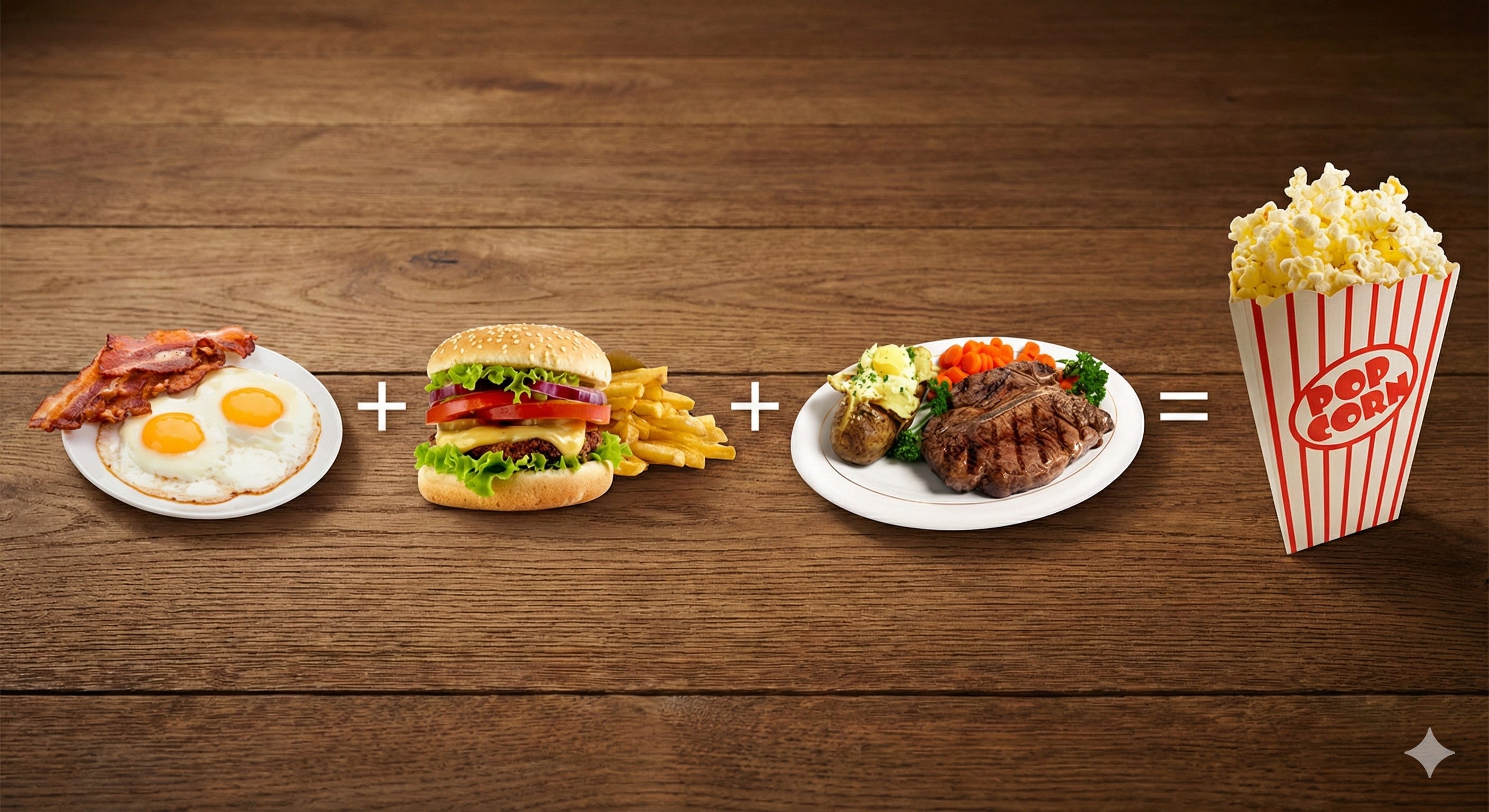
What happened here? The raw data said, “37 grams.” To most people, that number is meaningless. So Silverman turned it into a relatable analogy: three greasy meals for the size of one popcorn bag. It should come as no surprise that the story went viral. Sales plunged, and soon after, most of the nation’s biggest theatre chains announced they would stop using coconut oil.
Isn’t that the kind of impact we all dream of with data storytelling?
Process analogies (aka functional metaphors)
Sometimes you need to explain the mechanism before you get to the data. And that isn’t always as easy as it sounds. A complex scientific or biological process often needs an analogy to land just right.
A brilliant example of this is the article called Why outbreaks like coronavirus spread exponentially by Harry Stevens (remember the Covid lockdowns?). It illustrates how the virus travels between us and what social distancing can do.
To make concepts like “exponential growth” and “social distancing” accessible, the author simulated bouncing balls in a box:
A healthy person is a moving dot.
A sick person is a distinct coloured dot.
The process of infection is a simple collision: if a sick dot hits a healthy dot, it changes colour.
"Social distancing" is explained simply by freezing some of the dots so they stop moving.
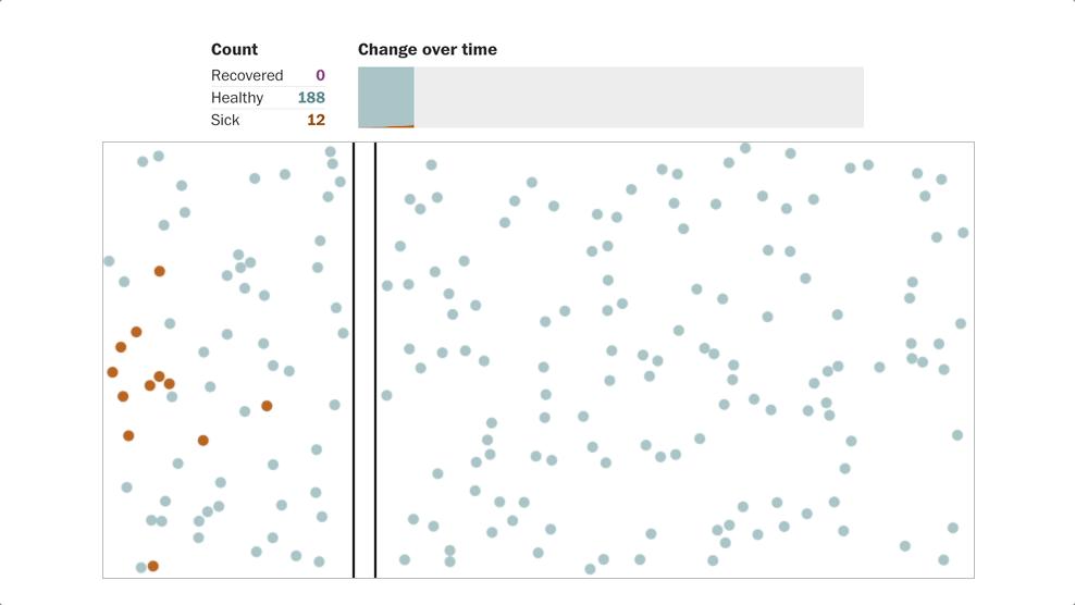
Why does this work? Well, I’m still talking about it five years later, so clearly, the approach stuck. It’s memorable because it strips away the biology and focuses on the mechanism of contact. You don’t need to understand virology to see that “dots that don’t move don’t touch other dots.”
Visual analogies (aka design-as-data)
Last but not least, your analogy doesn’t always have to be separate from the data story; it can be the data story.
A visual analogy involves designing the visualisation itself to resemble the subject matter, aiding memory and recognition. We create an emotional connection through design—the chart's shape mimics the physical object being measured.
My all-time favourite example is Drowning in Plastic by Marco Hernandez and Simon Scarr. To show the number of plastic bottles that accumulate throughout a day, month, or year, the authors don't just use words. They visualise those bottles piling up against famous landmarks.
Throughout the article, we see:
A pile of bottles the size of the Christ the Redeemer statue in Rio.
A pile half the height of the Eiffel Tower.
A mountain towering over the Burj Khalifa.
Not to mention those bottles falling from the sky as soon as you open the page!
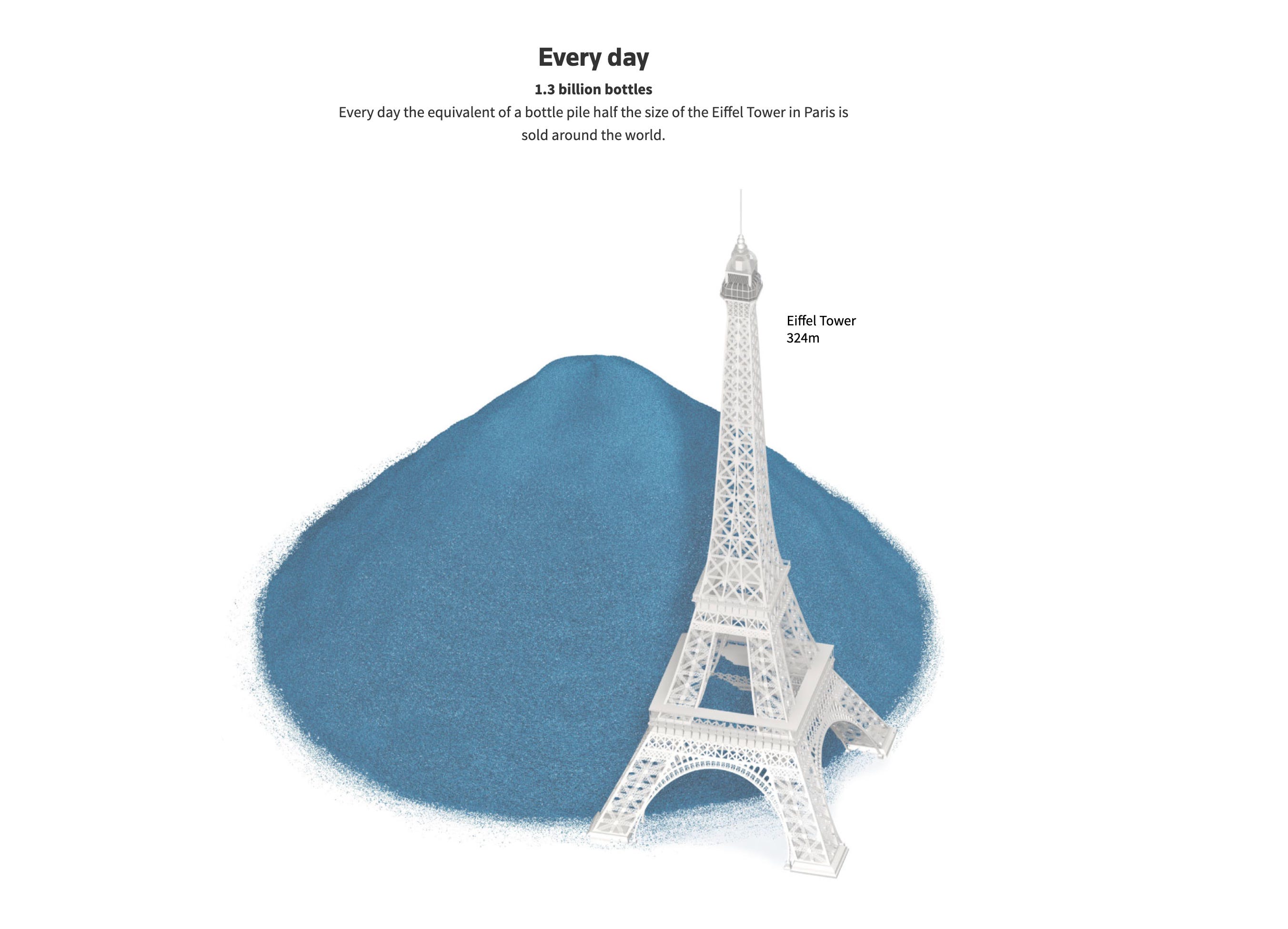
This works because it solves the problem of abstraction. We cannot visualise "billions of bottles," but we can visualise the Eiffel Tower. By literally "drowning" a city in data points, the graphic triggers a feeling of suffocation and scale that a spreadsheet never could.
Which one should you use?
If you’re wondering which type of analogy to try first, here is a quick cheat sheet:
Use visual analogies (like Reuters) when you need emotional impact (e.g. environmental issues, crisis data).
Use magnitude analogies when you need scale (e.g. budget deficits, user growth).
Use process analogies when you need understanding or buy-in (e.g. explaining why a project takes time).

If the examples above inspired you but you’re not sure how to implement them yourself, don’t panic! Parabole is here to help—drop us a note and we’ll define the best way to help you.
Thanks for reading this first edition of 2026. See you next month. ✨
—Evelina