Why you should add Datawrapper to your dataviz stack
An unsponsored review of my three favourite Datawrapper features for explanatory data visualisations
What data visualisation tools do you use most? I love learning different softwares to be able to choose the right one for each of my projects. If I need to create a corporate dashboard, I’ll often turn to Tableau or Google Studio. For design-heavy projects, I’ll jump into Illustrator or Figma. But choosing the right tool for an outcome somewhere in between — an explanatory chart with just a gentle touch of customisation — is probably the hardest.
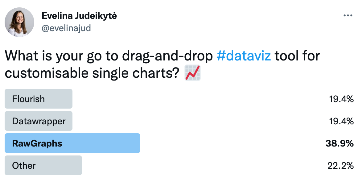
At the beginning of the week, I asked the Twitter community what they use in this scenario.

As you can see from the poll above, RawGraphs got the most votes. Kudos to them! Today I want to talk to you about a less popular open-source tool I think we should use more often.
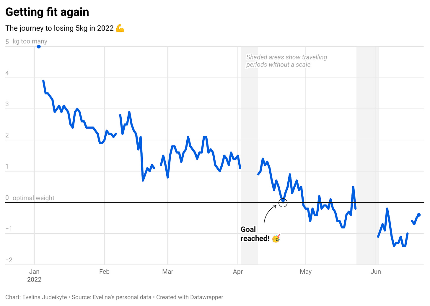
Datawrapper allows you to create beautiful charts and maps and tailor them to your liking quite a bit. I’ll use a personal example to illustrate some of its coolest features. At the beginning of 2022, I challenged myself to lose 5kg (be gone, Covid weight!). I tracked my progress every day since January 1st and visualised it using Datawrapper. The result is a pretty simple line chart with three custom touches to it. Let’s unpack them one by one.
1. Customising an axis
Chart axes are important for understanding what’s going on, but let’s be honest — most tools make them look uninspiring. Which is why I love that Datawrapper allows you to refine the frequency of the axis ticks, and even place the values above the gridlines for a more compact look!
You can see how I adjusted the vertical axis of the fitness chart in the GIF below.
2. Highlighting a point
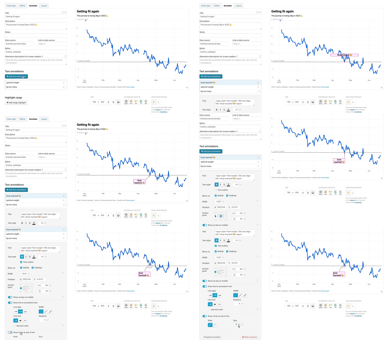
Adding text comments to visualisations is my favourite discrete way of providing additional context to the readers. But I don’t always want to open Illustrator just to write some text. Datawrapper has solved that pain point — it allows you to add as many annotations as you’d like and format them. The process is (almost) hassle free! In the chart below, I added a shout out for the day I reached my weight goal.
Extra tip: Did you notice that I also used the annotation function to add explanations to the 0 and 5 values on the vertical axis?

3. Highlighting a time period
Annotations are great for calling out single points in time. But sometimes we also want to highlight longer periods — to draw the reader’s attention to missing data or forecasts, for example. Yes, you’ve guessed it, Datawrapper has that feature too! You can select the area to highlight and adjust its colour. In the fitness chart we’re looking at today, I highlighted the missing data — the weeks during which I didn’t have access to a scale.
These are just some of the fun features Datawrapper has to offer. If you’re intrigued, you can check their academy page to learn more (it’s free!).
If you typically use BI tools to create explanatory charts, I dare you to try out Datawrapper next time! If you’re already a user of the tool, what is your favourite functionality? Let us know in the comments. 🙂
Thanks for reading The Plot!
See you in two weeks,
Evelina


Not a functionality, but DataWrapper' blog, by Lisa Charlotte Muth, a is gold mine of information!