Three ways to choose colours for your designs
Some of the best tips from Lisa Charlotte Muth's workshop on colour at ISVIS 2022.
Hi!
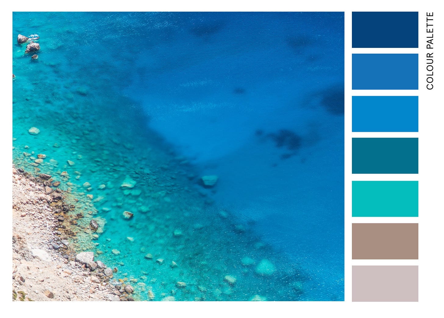
This week I’m writing to you from the Greek island of Amorgos (which also explains why this newsletter is a few days late 😉). Amorgos is known for the film the Big Blue. The Big Blue contains lots of sea views and was partly filmed here, which makes sense — the colour of the water in this island is truly striking!

When we create data designs, we also want to use beautiful colours. But it’s easier said than done, right?! The good news is that we can turn to experts for guidance. A few weeks ago, I attended a great workshop on colours in dataviz animated by Lisa Charlotte Muth. Lisa shared many tips with us, and today I’ll recap three techniques on choosing good colours that stuck with me.
1. Pictures
Have you ever marvelled at your surroundings thinking wow, this is beautiful? Sometimes you need to look no further for a good colour palette. I’ve extracted seven colours from that stunning capture of the Aegean sea, which you can see below.
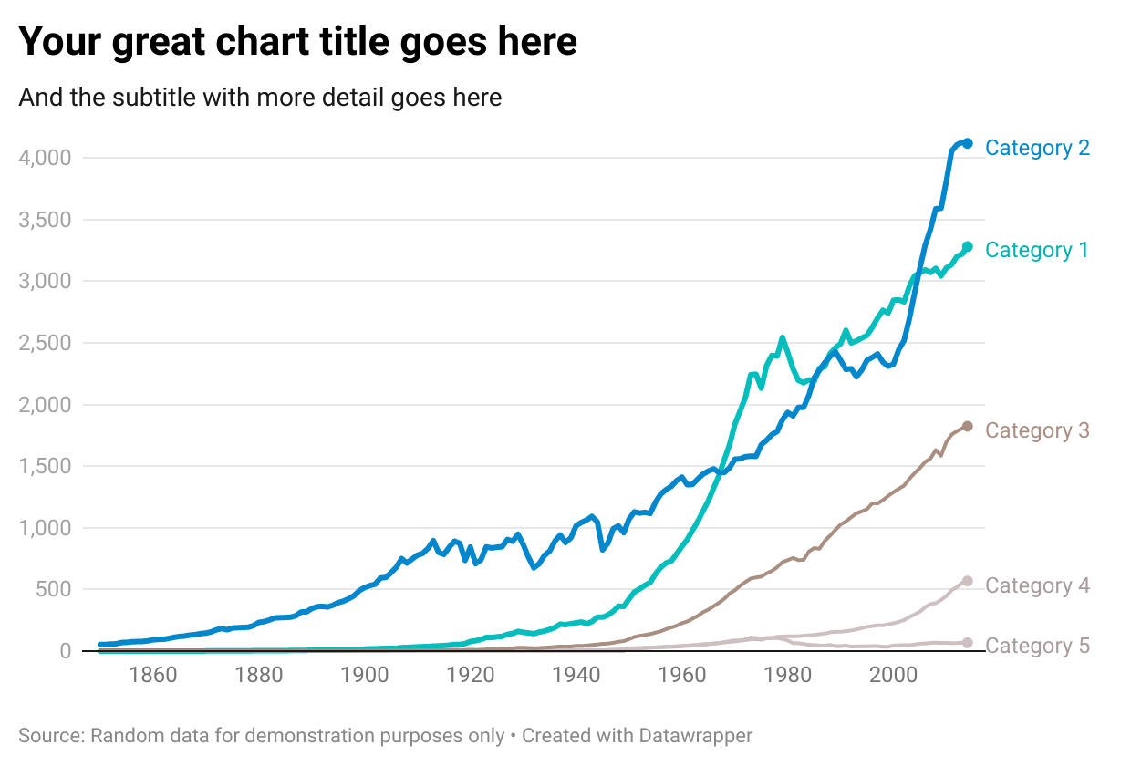
Even though the image captures the sea, you can apply the colours for other topics too. I used the above palette on a sample Datawrapper line chart, and I think it works!

So how can you extract a colour palette from a picture yourself? In three simple steps:
Visit Unsplash — or any other stock photo website — and type in keywords related to your project.
Download the picture (beware of licencing!).
Import the picture into a design tool and use colour picker to extract as many hues as you’d like. If you don’t have a design tool at hand, try out Coolor’s picture function.
2. Gradients
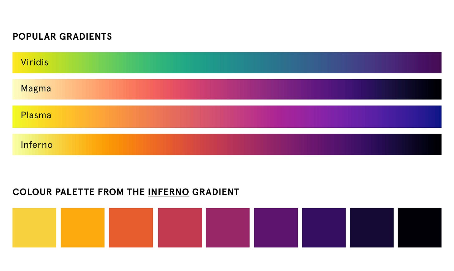
When real-world pictures don’t inspire you, you can extract a colour palette from a gradient. Below are four well-known gradients you can use for this purpose. I’ve pulled nine colours from one of them as an example. So simple and effective!
Below is what these colours look like on that same line chart:
If you don’t like the gradients above, check out the ColorBrewer palettes here.
3. Colour wheel
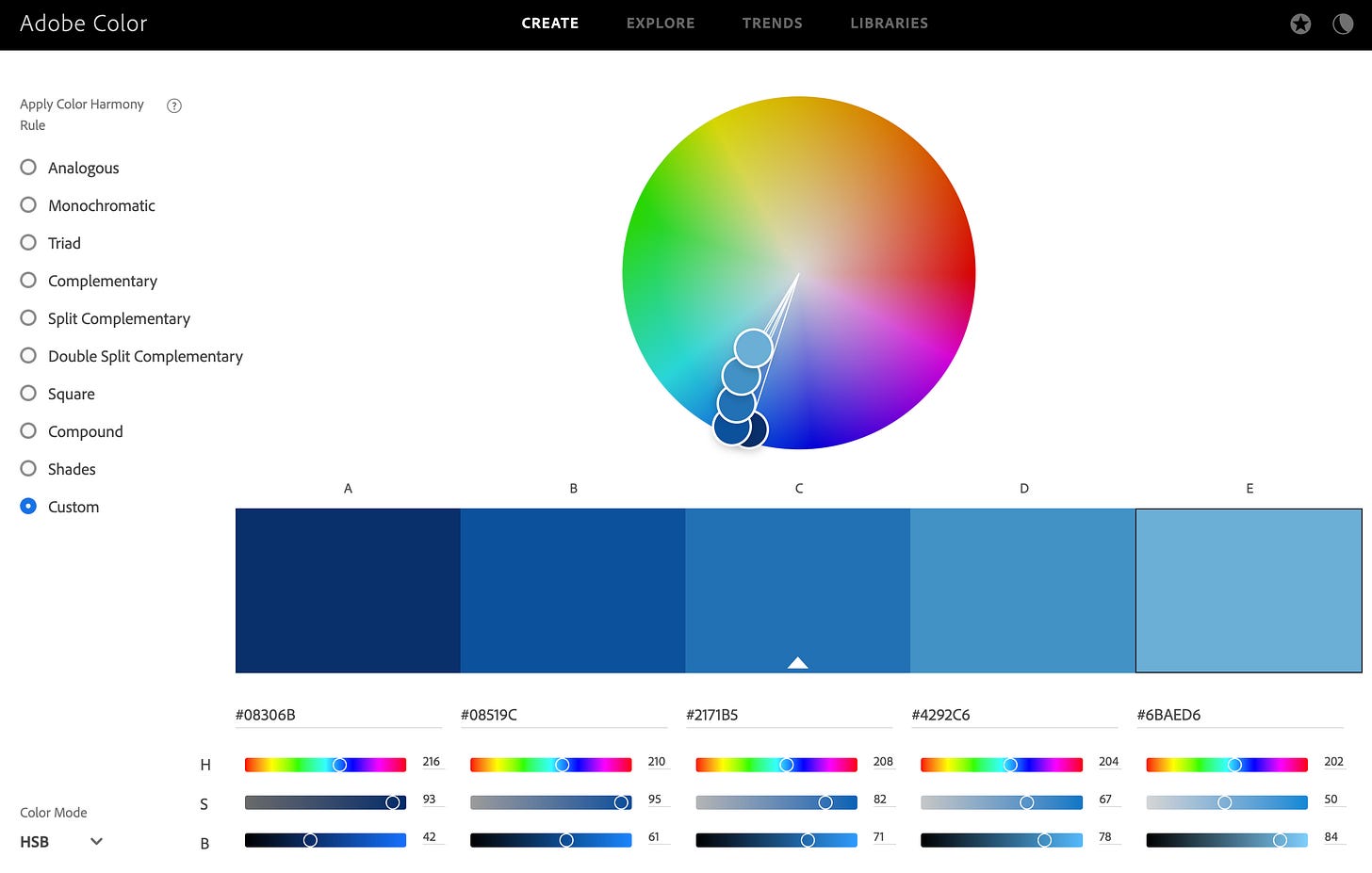
The third, and a bit more complex, way to choose colours is by using a colour wheel. To do so, follow these steps:
Visit the Adobe colour wheel web page.
Select the custom harmony rule.
Change colour mode to HSB.
Play around with colours until you think they work.
Below is an example of a blue palette inspired by ColorBrewer scales and created on the colour wheel. You can also use the wheel to design a colour scheme from scratch. In that case, follow Lisa’s advice and play around not only with hue but also with saturation and brightness of the colours! Use the S and B scales at the bottom of the page for that. Once you’re happy, save and export!

This is only a fraction of the tips Lisa shared with us at the workshop. For more, you can read her long-form articles here, and stay tuned for her upcoming book!
Thanks for reading the sunny edition of the The Plot 🌞
See you next week,
Evelina


I sometimes find colour inspiration just looking at stuff.... One of my wilting plants has leaves that turn a perfect gradient (resembling one used for maps). Does anyone else just pick colours up from everyday life?