
Three new typefaces for your next project
Ever heard of Sporting Grotesque, Ginto or Figtree? See what they look like and how you can use them.

Typography can make or a break a design.
I often hear this slightly dramatic statement from other designers and I think they’re right. Typography is super important. Knowing this, however, puts quite a lot of pressure on us — there are tens of thousands of font types out there. Some are widely used and trendy, while others are hiding in type foundries only a few know about. It can hence be very time consuming to pick the right type for your design. So today I’ll share three great font families I’ve recently discovered; may they inspire your next dataviz design project!
Sporting Grotesque
A web developer I work with, François Parrou, introduced me to Sporting Grotesque a few months ago. It’s a nice, wide display font that has a lot of character! Its curves and slightly cut out letters make designs stand out. We use Sporting Grotesque for our client Vinotracker’s website and infographics. It looks great — see below! Huge bonus: it’s free to download from the Velvetyne Type Foundry, in both regular and bold weights.

Ginto
When you’re feeling bold, the Ginto typeface can be a unique choice. It’s used by Discord and has a modern, catchy look. You can choose from multiple versions — Normal, Nord and Nord Condensed — and even more weights. I’ve recently used it for the slides of a talk, and will definitely keep exploring it in my future designs! Do note that you’ll need to purchase a licence for this type, although you can try it out beforehand.
Figtree
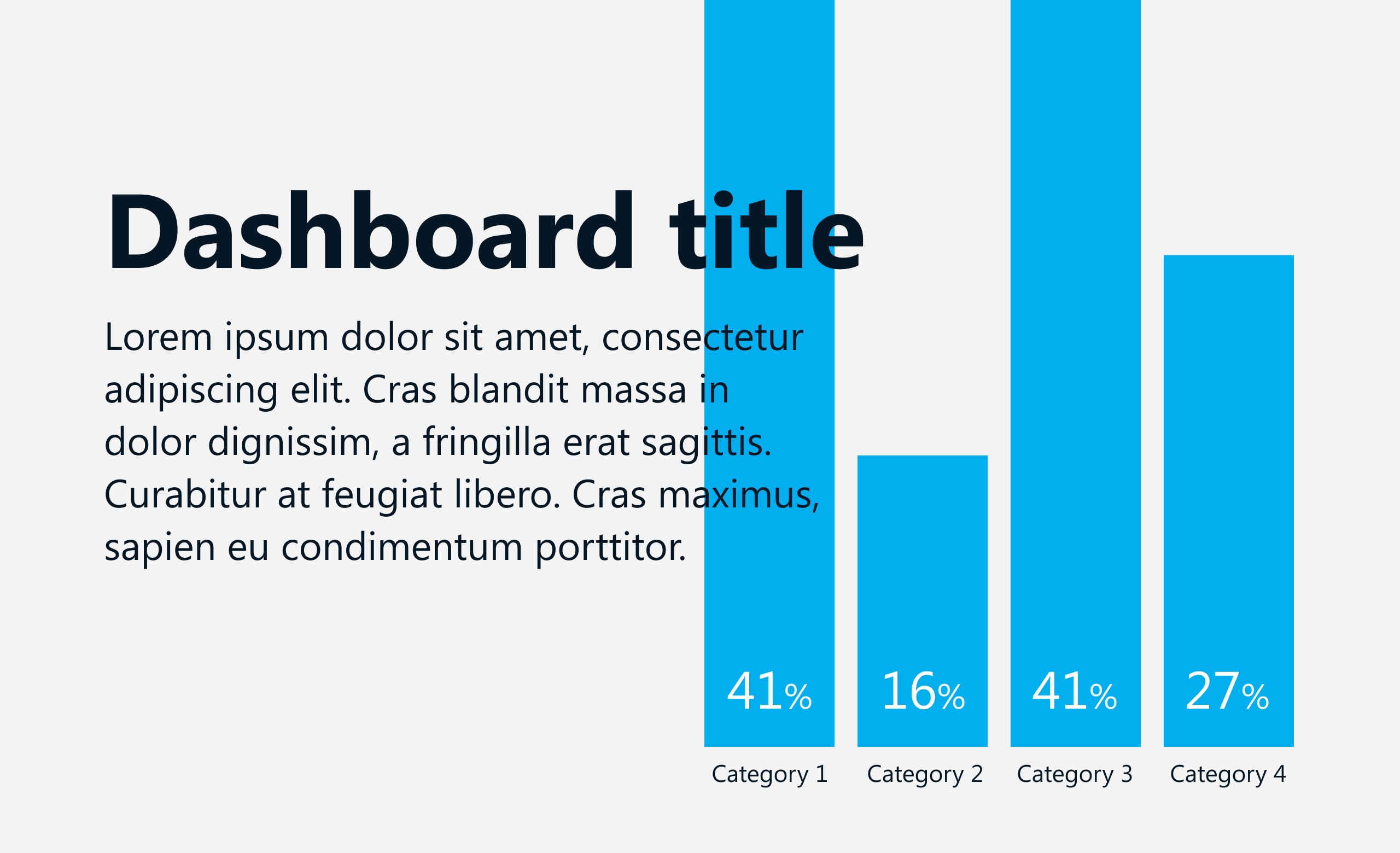
Many designers like having a generic font for prototyping — something that looks neat and beautiful, without too much character. I’ve recently discovered the Figtree typeface thanks to this Twitter thread that seems to be perfect for this purpose! It looks great both as a bold title and regular text — I’ve designed an example for you below. It also wins bonus points for being a free Google font!
Can’t use any of these? You’re not alone
If can’t use any of the above fun typefaces because of project or tool constraints, don’t get discouraged just yet. Let’s look at one more font family — Segoe UI. It’s a Microsoft font that can comes in handy if you’re working in a Windows environment. I’m currently designing a dashboard that will be developed in Power BI and Segoe UI is our font of choice. It looks quite good, and could save your next Power BI or Excel project!

To learn more about the use of typography and its design, I strongly recommend you browse through Viktor Baltus’ resources in Type Design Class.
As always, thanks so much for reading The Plot!
See you in two weeks,
Evelina