

At Parabole, we often help our clients make impact reports. Our secret sauce? Analysing dozens of examples, both captivating and less so, to extract what works. And we’ve just turned our lessons learned into a framework anyone can use. Let’s take a look.
The framework
The Impact Report Scorecard is a self-evaluation sheet with two parts, three criteria in each. The plot (narrative, numbers, nuance) is the content of your report. The production (direction, depth, dissemination) is how that content reaches your readers. Each criterion gets one of three honest answers: yes, partly, no. Easy enough, right?
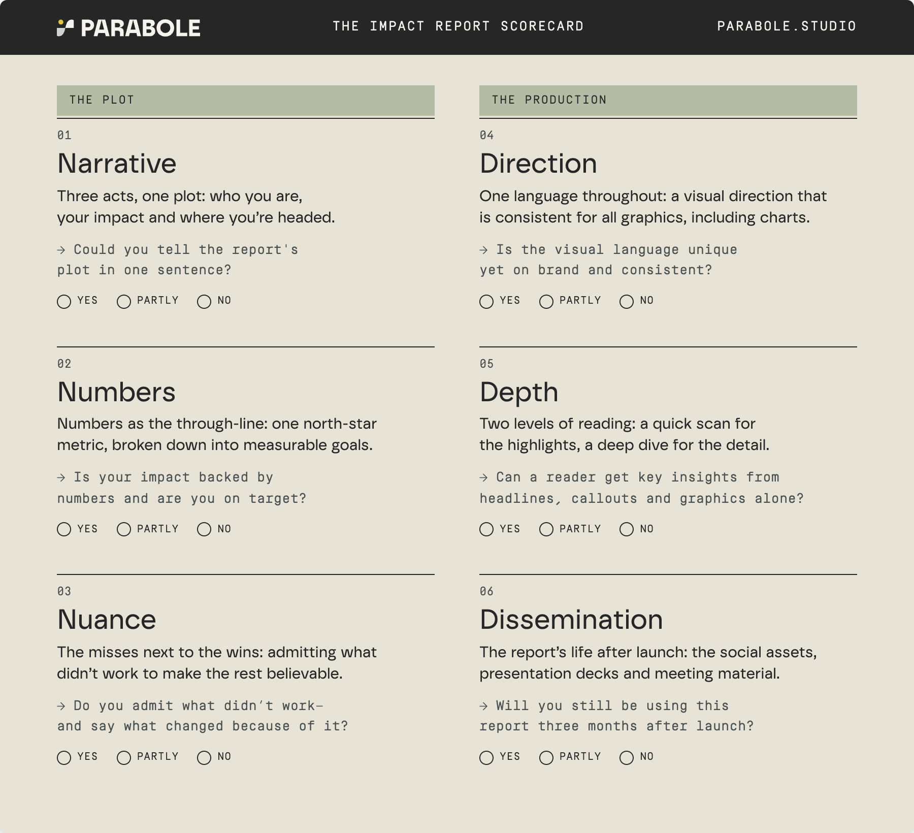
Download the scorecard and keep reading for more details on the narrative, numbers and direction.
1. Give it a plot
If you open a typical impact report, you'll find a list of items: programmes, locations, financials, community, each with its own section. What's often missing is the storyline that connects them (yes, your report should tell a story!). Every story is built on a narrative arc. And a solid narrative arc has three acts.
Act 1 sets the stakes. That’s the problem you exist to change, and your strategy on how change happens. Act 2 is the proof. What you said you'd do, what happened and what it changed for people. Your data belongs here, and so do the human stories. Finally, Act 3 draws the consequences. Because of what we learned this year, here is what’s coming next year.
If you’re unsure you’ve got a solid narrative arc, here’s a quick test: imagine shuffling your chapters. If nobody would notice, the plot is not there yet.
I love how the storyline is built in the latest Goalkeepers report. Notice the titles that are narrative-driven, not descriptive, and how they connect to each other. And the navigation is a nice bonus (on the side in the online version, at the top in the PDF), letting the readers know where they are at all times.


2. Make data the spine
Impact reports rarely lack data. They lack organisation and filtering: consciously chosen figures rather than an exhaustive coverage of all datapoints collected that year. The fix? Treat data as the through-line of the report.
First, choose your north star: the one number your organisation actually lives by. Then, break it into smaller goals, each with a target and a deadline. You’ll report against them in the end: goals reached, missed, or on the way. Keep the same metrics from one year to the next, so readers can follow progress between reports rather than starting over each year.
Gavi, the Vaccine Alliance, is a champion of setting goals and tracking their progress publicly.


3. Design in one language
Design is the report's first impression and often its biggest budget line, but it rarely gets the right level of effort. A common issue we’ve noticed is inconsistency (five chart styles, three colour palettes, one report: were designers even involved in the process?).
To avoid that, your report should follow a strong design direction. That includes a creative throughline which is on-brand but also unique to the report. A variety of chart options chosen to fit your data (pies and tables are allowed, but did you also consider treemaps and alluvials?). And consistency across everything: one type system, one colour logic, one way of labelling.
Pro tip: do hire external data visualisation experts if your team lacks experience in the field (there’s no shame in that; most orgs need it!).
Vinted has a great brand and uses it creatively in their reports.

Which is why we leveraged that brand to create strong graphics for their DEI publication last year. Consistent, creative and varied.



Those are the three criteria from the scorecard you should think about first. Then, venture to add nuance, consider depth and plan for dissemination.
And when your next report is drafted, score it. Count the PARTLYs. If you get two or fewer, publish it proudly (and send it my way, I collect the captivating ones!). If you get three or more, you know where to find us.