
Starting with numbers
Gentle ways to add data to your org’s communications

Everyone says you should “tell stories with your data”. Easier said than done, isn’t it? Your mental picture of data storytelling may be a long-form New York Times article with interactive charts and scrollytelling elements. So if your organisation doesn’t have thousands of $ and multiple complex spreadsheets to produce just that, you may feel stuck.
But communicating with data doesn’t need to be daunting. You can take baby steps and start with some simple numbers.
Tell them who you are
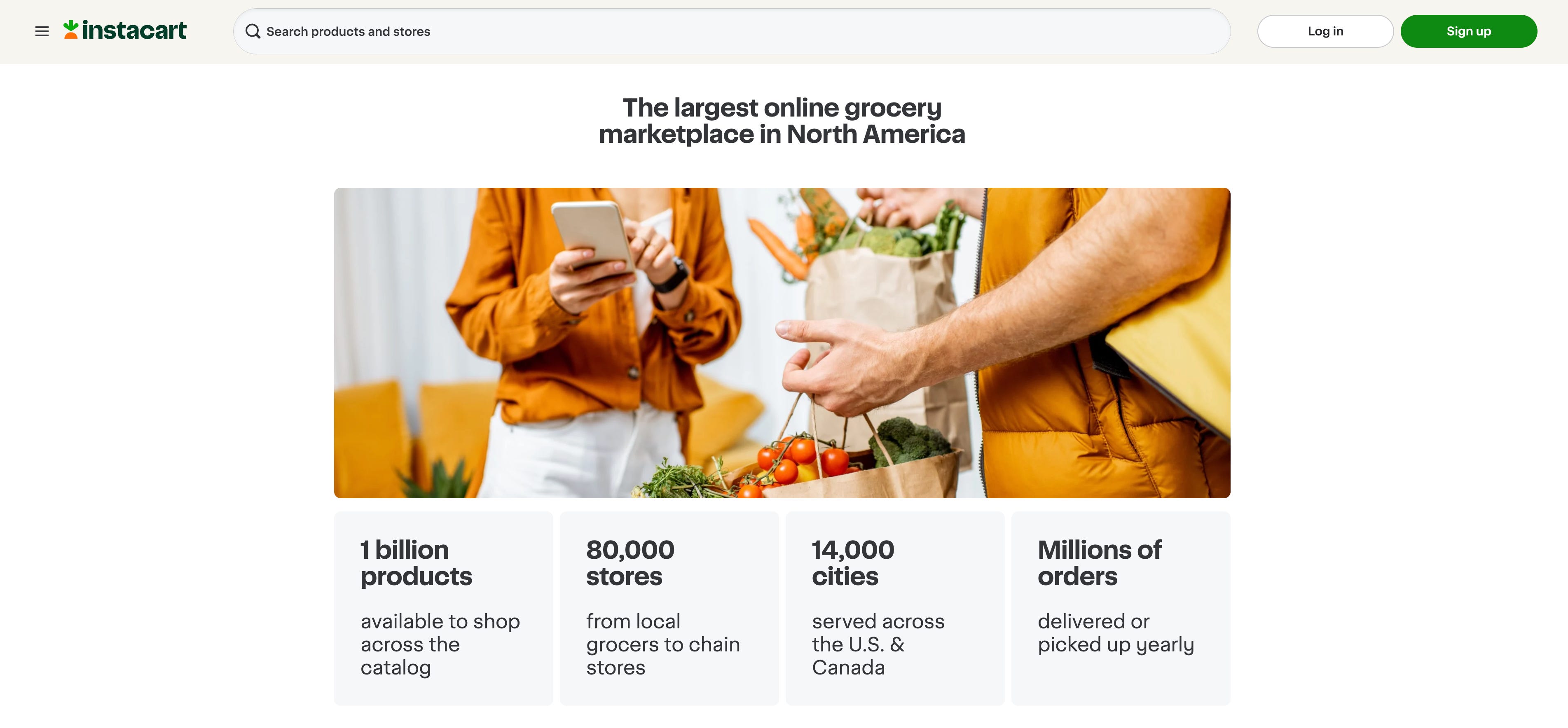
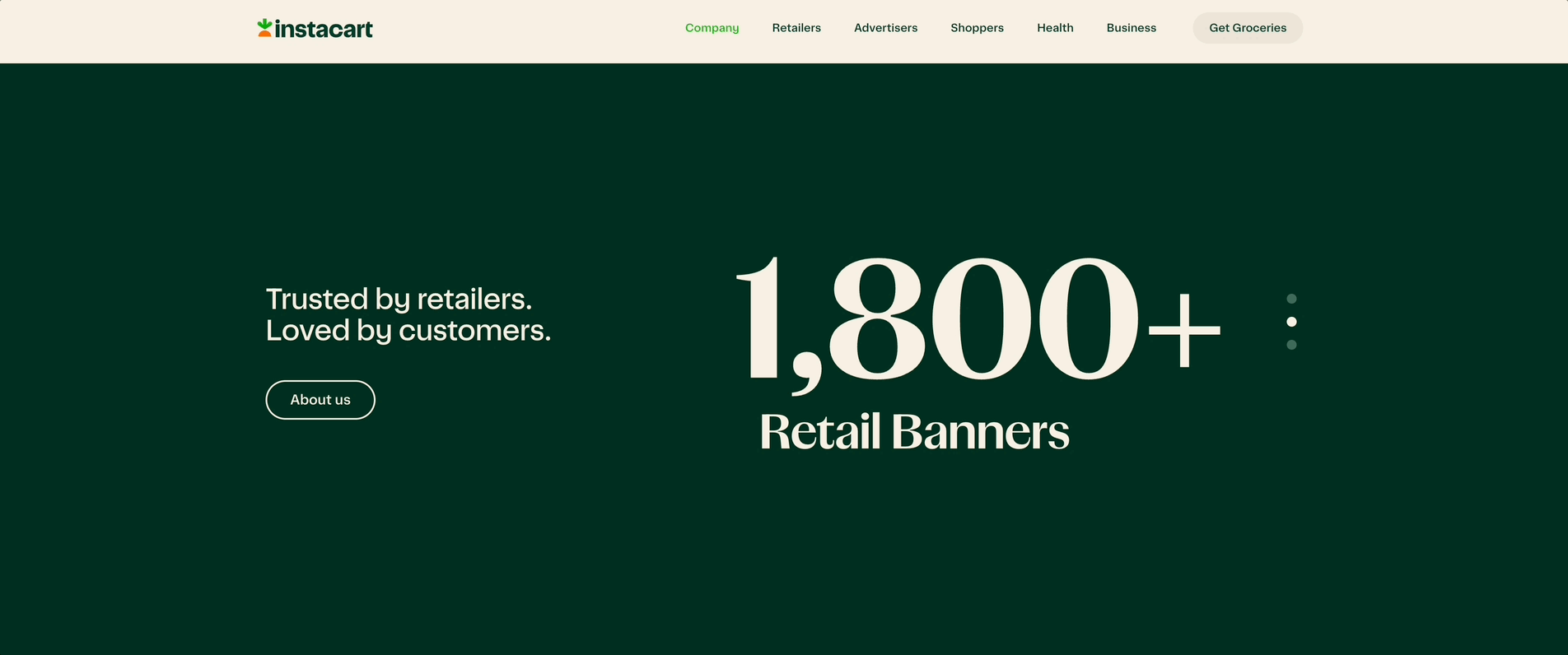
Help your audience grasp how big your organisation, where to find it and what you do exactly. Simple sentences will do the trick: “6,412 students trained”, “Stores in 25 countries”, “2.3 million meals distributed since launch.” Place these figures where people meet you—website home page, newsletter intro or social bio.
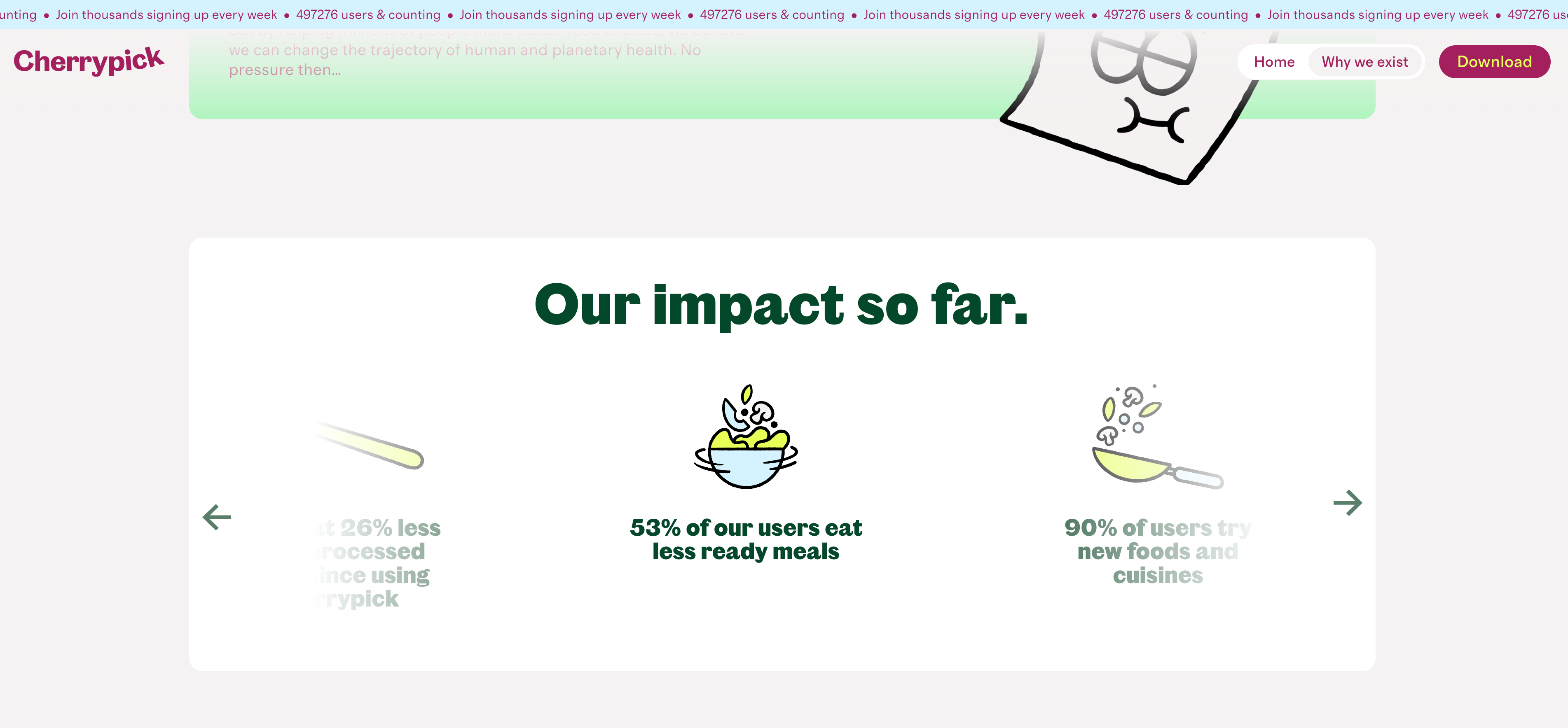
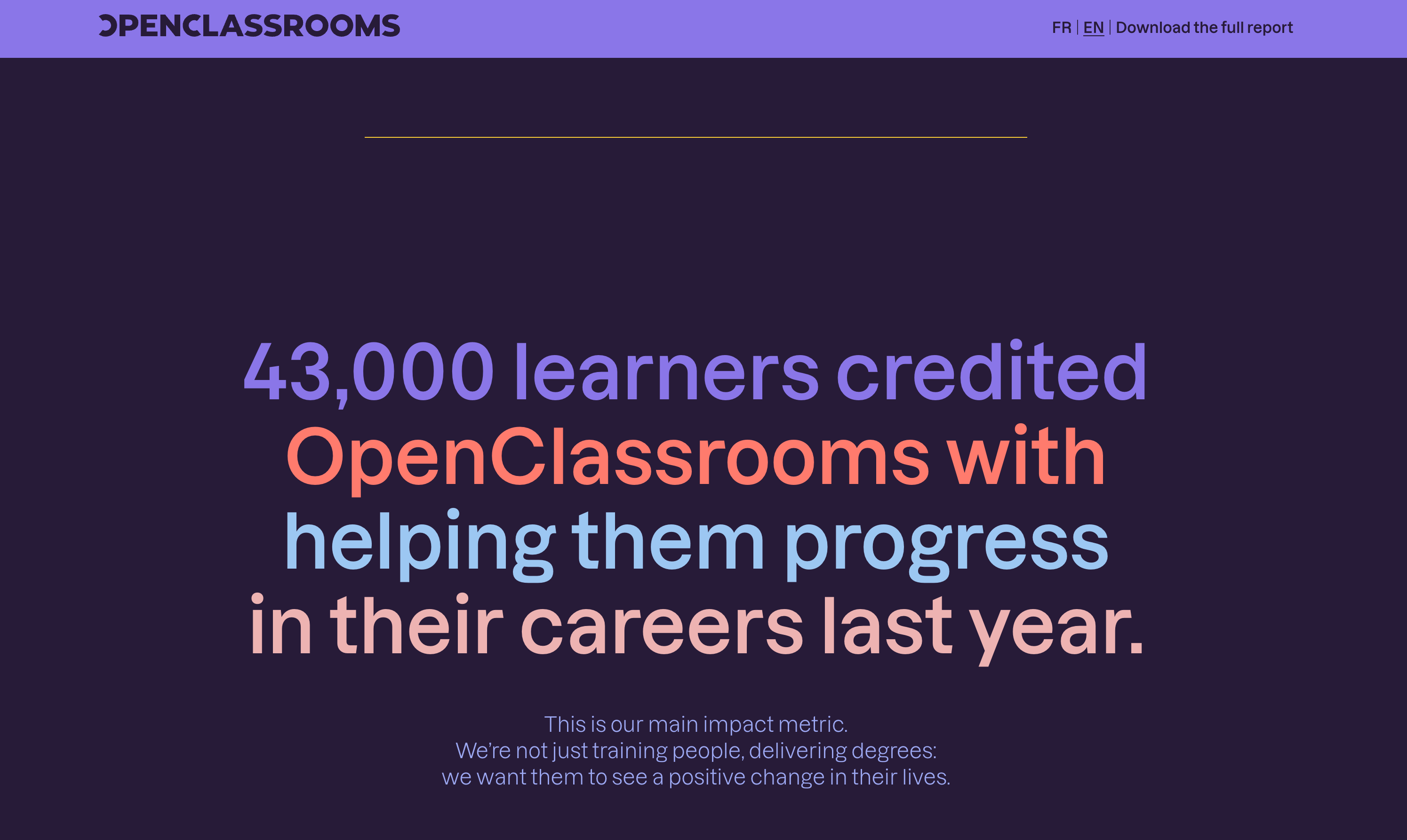
Tell them what you’ve achieved
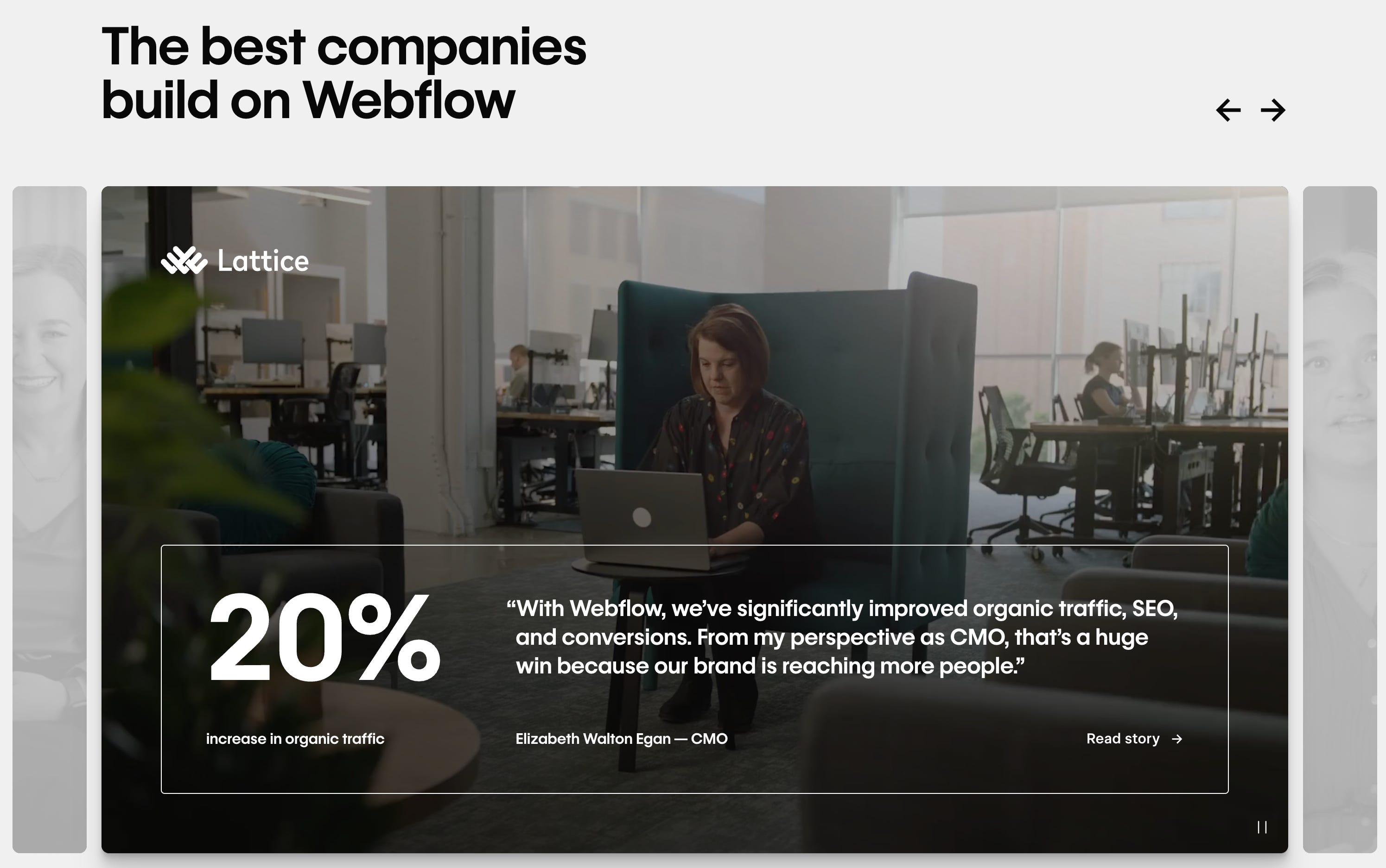
You can also go a bit deeper and show your target clients what to expect from your product or service. If you track outcomes, let them shine: “Onboarding time reduced from 14 days to 10”, “$2m saved across 48 clients”, “Exam pass rate up 18 percentage points year on year”. One short sentence of context—who benefited and how—turns the number into a tangible benefit.
Tell them where you’re headed
For the more ambitious among us, north-star metrics are a great way to enrich your communications with data. Share a goal your organisation is aiming towards and the progress you’ve made: “Goal: house 1,000 people by Dec 2026. Current: 742. This month: +42 thanks to the X partnership.” Regular updates will show you’re committed and transparent (and create easy content opportunities as a bonus!).

These examples show that data storytelling doesn’t need to be a huge endeavour right off the bat. Yes, you need data to be build trust with your audience, but you can start with small narrative elements. Pick the best figures that show your reach and impact and reuse them across different formats—website, newsletter, socials or slide decks.
Start today!
More in two weeks,
—Evelina