
Repeat yourself
How repetition strengthens your data communication

On a recent episode of the StoryBrand podcast, negotiation expert Kwame Christian shared a story about his wife. She told him she wished he’d say “I love you” more often. His response? “It’s obvious that I love you. If I flood the market with this commodity, doesn’t that lower its value?”
She informed him that was stupid.
He adjusted. Now he says it all the time. Did the sentence lose its value? Quite the opposite, in fact.
When it comes to persuasion, we often underestimate the power of repetition. The more you say something, the more real it becomes. So in this edition of The Plot, I’ll argue that you should repeat yourself more often.
Repeat yourself in prose
I have a dream. I have a dream that one day…
You know what I’m referring to. One of the most famous speeches in history. The most striking detail about it isn’t what Martin Luther King Jr. said—it’s that he said it with the same structure, over and over. He started multiple paragraphs with the exact same words. On purpose. And it’s why we still remember the speech today.
This trick is called anaphora: a rhetorical device where the beginning of a sentence is repeated multiple times. It’s been used by writers and speakers since Ancient Greece.
How could you use it in data communication? A few examples:
The UNFPA Peru campaign employs anaphora in the story of Maribel: “To reclaim her dreams. To decide about her own future.” The repetition of “To” at the start reinforces the importance of the goal.
Hans Rosling used a spoken version of anaphora constantly in his presentations. He’d repeat “And this country…” while pointing to different bubbles on his charts, building momentum one nation at a time.
For chart titles in a series: “Who’s most at risk? / Who’s investing? / Who’s falling behind?” Repeating the structure across consecutive slides can create rhythm and anticipation.
If you feel like anaphora is a bit much, you can also reach for one of her cousins. Epistrophe repeats a word at the end of successive clauses—“government of the people, by the people, for the people.” Epanalepsis begins and ends a sentence with the same word—“the king is dead, long live the king.”
An even easier to use repetition-based rhetorical device is alliteration. Here, instead of repeating a part of the sentence, you repeat just some letters: “Small steps, significant shifts” or “The cost of complacency.”
These are just a few examples to start with. While we don't fully understand why repetition is so pleasing to our brain, it simply is. Great writers, including Shakespeare, realised this ages ago and used it to their advantage. So should you. Just make sure you don't overdo it, like in Thomas De Quincey's infamous line: "After exchanging a few partial words, and a few final or farewell of farewells with my faithful female friend…"
If you’d like to learn more about rhetorical devices, I strongly recommend Mark Forsyth’s The Elements of Eloquence. It’s the most fun rhetoric book out there.
Repeat yourself in charts
While repetition in text might feel new, here’s another idea: repeating yourself in data design can be strategic, too. According to recent research, redundancy in visualisations helps people grasp the main trends, and improves both recognition and recall. You can approach it in two ways.
Data redundancy is when you encode the same data point through multiple visual channels. Instead of relying on a single element to carry the information, you reinforce it with a second one. Think of it as giving your reader two chances to see the same thing. Some examples:
Repeating the legend in both the subtitle and as an annotation to the chart, by Nadieh Bremer

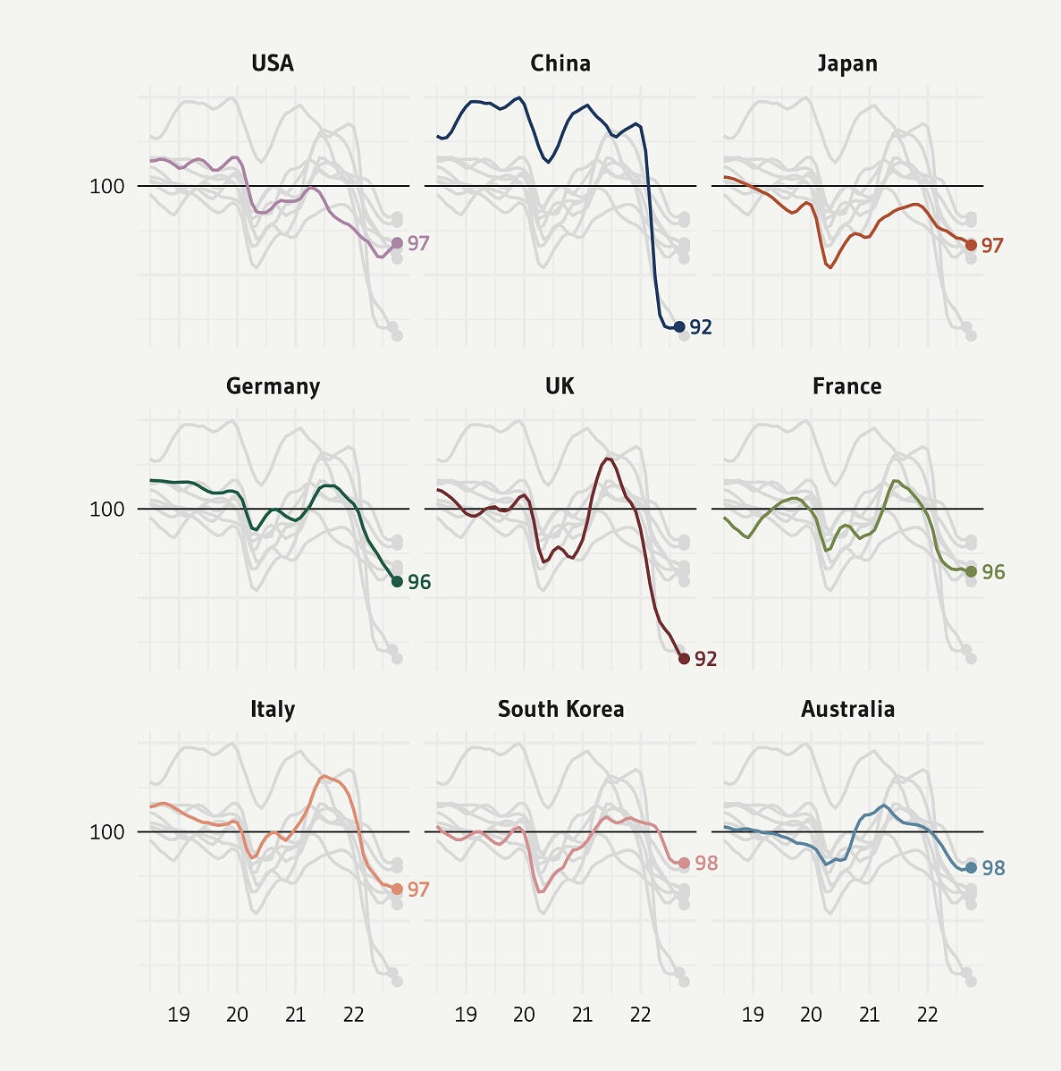
Repeating the categories in grey for context across small multiples, by Gilbert Fontana

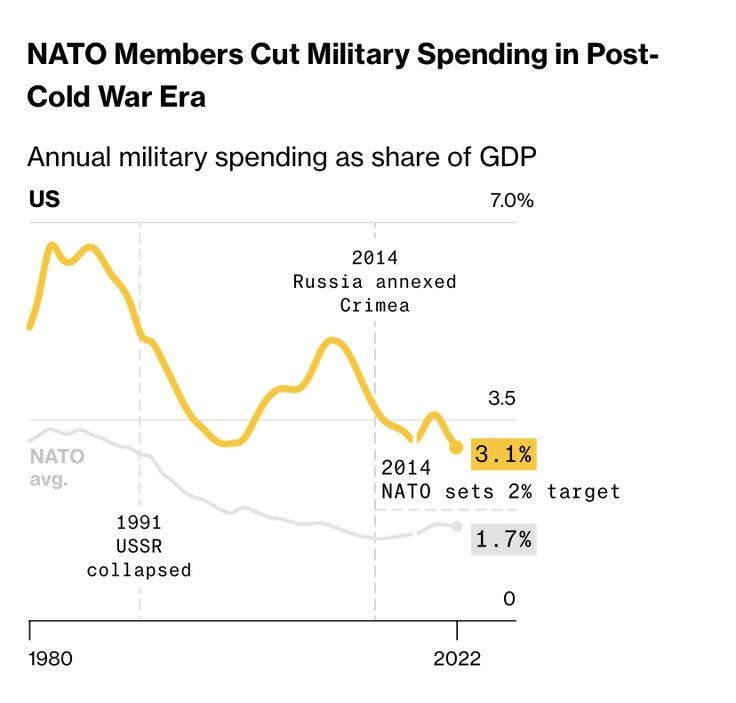
Repeating both the data labels and the axis values, by Bloomberg


Message redundancy is when you state the same takeaway in multiple places within the visualisation. The insight appears in the title and in the chart itself, so the reader encounters your point whether they’re scanning or reading closely. Some examples:
Takeaway in the title and in the annotations, by the Guardian


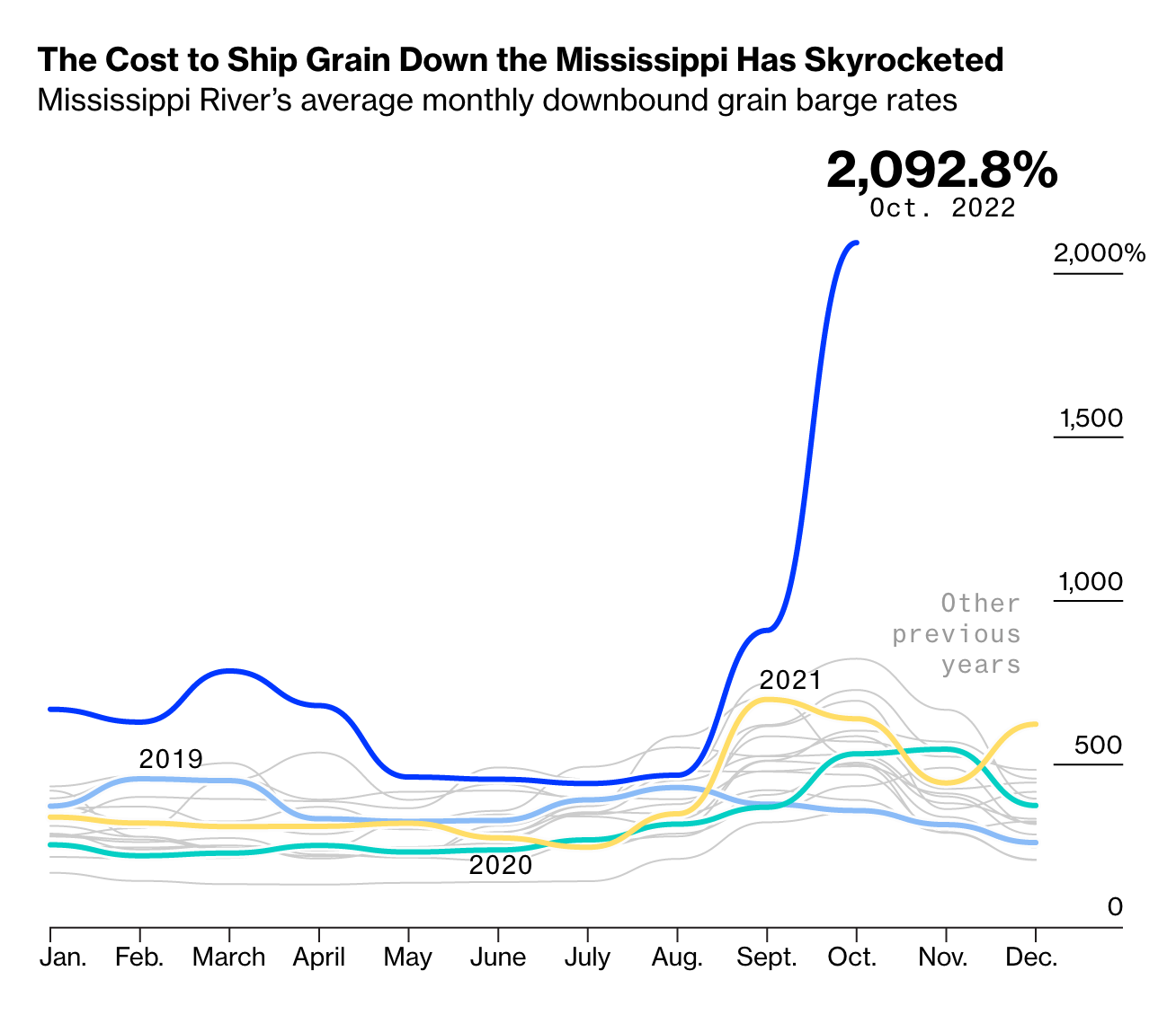
Takeaway in the title and on the lines themselves, by Bloomberg

While the above examples show that redundancy can be powerful in charts, every repeated element takes up space and cognitive load; use them mindfully.

Whether you’re writing a headline, presenting to a room full of stakeholders or preparing taglines for a campaign: don’t be afraid to repeat yourself. Repetition isn't a sign that you've run out of ideas. It's a sign that you know which idea matters most. And it can help you stand out in the age of AI where everything sounds the same.
Thanks for reading!
See you next month,
—Evelina