“Arriver comme un cheveu sur la soupe” is a fun French saying. Literally, it means “fall like a hair in soup”. Figuratively, it describes an object that feels out of place. The English equivalent could be “coming totally out of left field”.
It’s how I regularly feel about icons in information design. More often than not, pictographic symbols look like a forced visual element rather than an intrinsic piece of design. Now, to be fair, I’m not talking about iconography in unit charts; those are much easier to pull off. I’m referring to illustrative icons that are meant to make the design nicer to look at.
When I hear “could you add an icon here, please?”, I cringe a little. Trying to seamlessly integrate pictorial symbols with the rest of the graphic and data design has given me many headaches over the years. Perhaps it’s just me. But if you’ve ever felt that your icons were like hair in soup, here are my three best tips to avoid eating that hair.
Identity
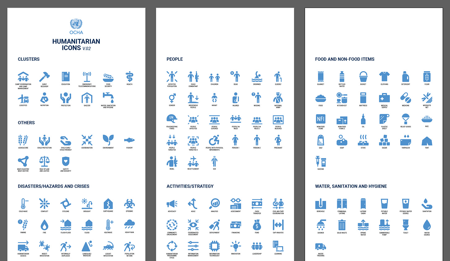
Whenever possible, use your organisation’s or client’s icon bank. They don’t always look the way you’d like, nor do they always include the exact shapes you’re looking for. But the trade-off will be worth it. You’ll save many painful hours of searching for the perfect icon in a public database. And most importantly, you’ll ensure brand and design consistency across all your outputs.
We’ve recently started using the below icons for the UN projects I’m working on. Are they the most beautiful visual shapes I’ve ever seen? No. Are the choices limited? Yes, especially since this visual identity is still in beta. But even with these constraints, the overall result looks much better than it would with publicly available icons (I’ll show you soon!).

Consistency
Keep icon style the same at all times. That can mean a couple of things. First off, choose between solid and line-style design and stick with your choice. In some icon databases, like The Noun Project which I use regularly, you can get the same icons in both solid and line styles.
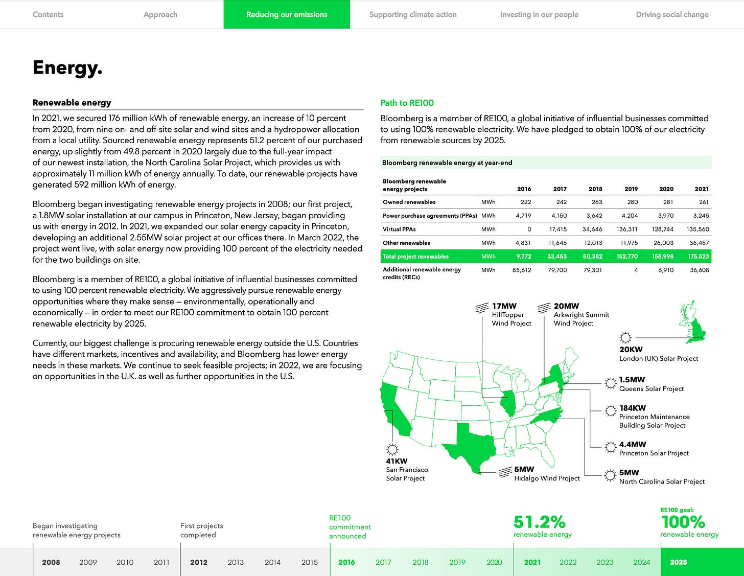
Second, keep pictograph sizing consistent. While this tip may sound too obvious, achieving this in reality can be tricky: depending on the shape of the icon, the same width and height can result in a different look. So you may need to do some creative math or take out your ruler. But the resulting consistent, professional look will be worth it—like in the Bloomberg example below.

Meaning
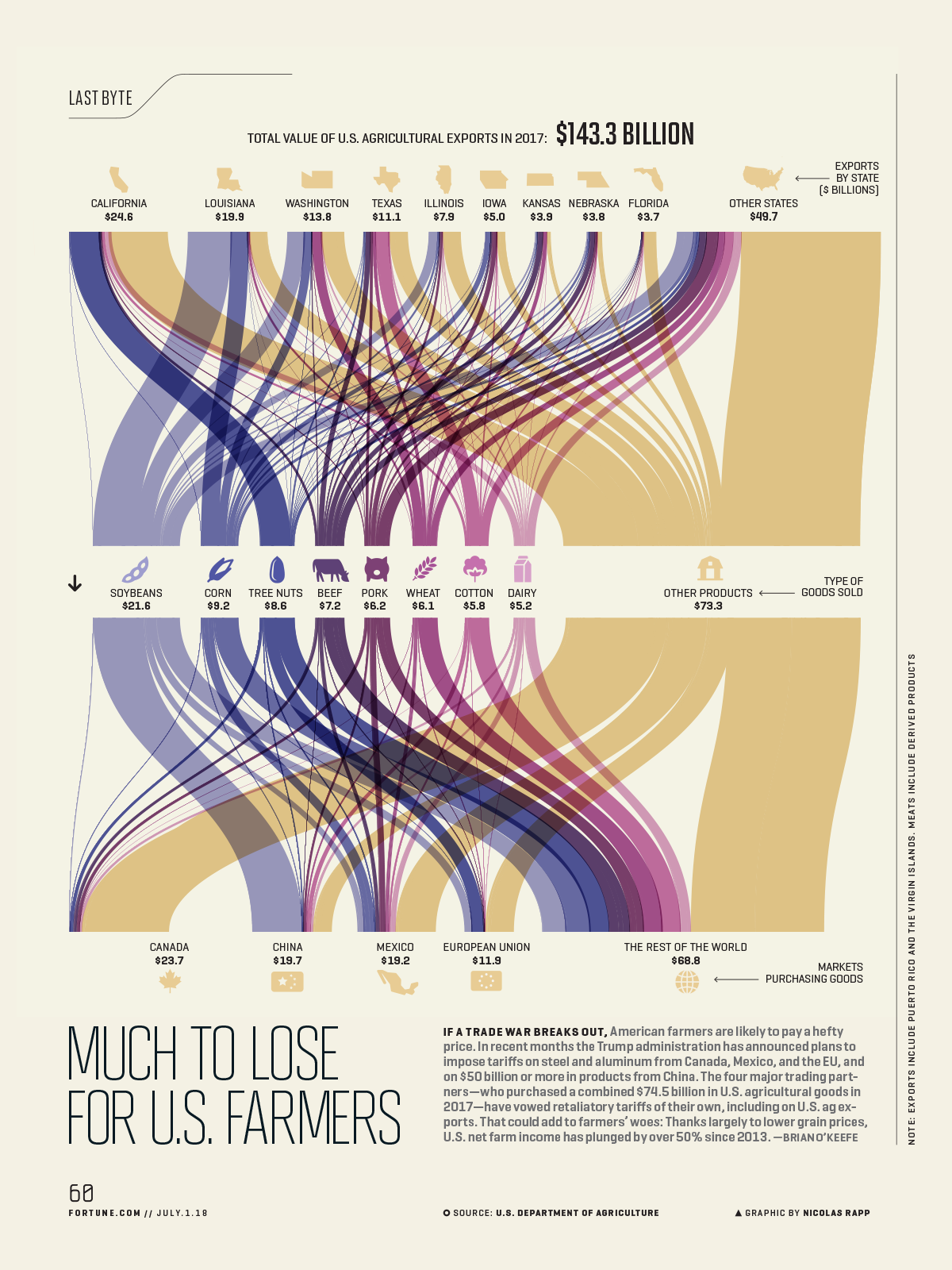
I kept the hardest one for the end. Ideally, you’d use icons in instances where their meaning is easy to understand. Instances where, even without reading the text, you would know what that little pictograph represents. The infographic below is a great example of this: soybean is illustrated with a soybean drawing, dairy with a bottle of milk, beef with a cow, etc.

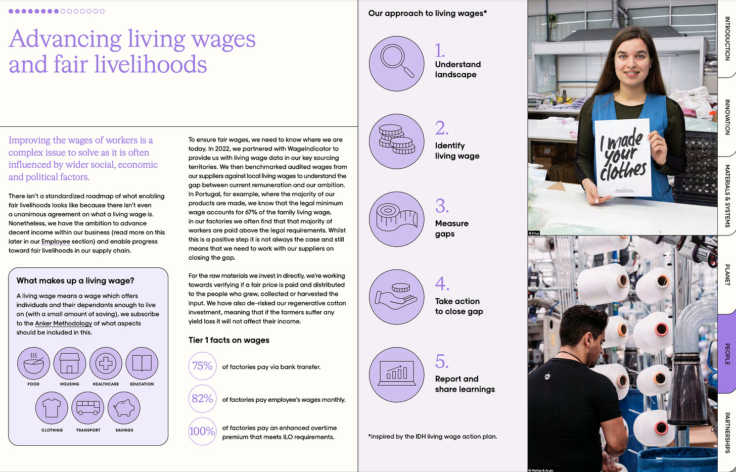
Unfortunately, designing with pictographs won’t always be this straightforward. Sometimes, we’re tasked to add icons along blocks of text that have multiple meanings—a sentence without a clear visual equivalent or an entire paragraph with more than one idea. In such cases, see if you can come up with a consistent visual system. Perhaps you can create a box or a shape to put the icons in and repeat the pattern throughout the entire design—like in Pangaia’s impact report shown below.

What would you add? How do you make icons look elegant and consistent?
As always, thanks for reading The Plot. 👩🏻🦱
See you next week,
—Evelina
Want to learn data storytelling?
Here are three upcoming trainings with me you can join:
🇫🇷 One-day data storytelling course in Paris on March 26. Read this article to learn more.
🏴 Two-day data storytelling course in Utrecht on April 16-17.
🏴 Data storytelling bootcamp online starting May 27 (new cohort!). As a reader of The Plot, you get 10% off with the code THEPLOT10.
Any questions? Reply to this email and I’ll be happy to chat.
Enjoyed this post? Share it with a friend!
When you refer The Plot to a friend or colleague, you become eligible for the following rewards:
⭐️ 5 referrals: chart review
⭐️⭐️ 10 referrals: 30min 1:1 session
⭐️⭐️⭐️ 30 referrals: 1hour 1:1 session + project review


