
Good news, bad news
A storytelling technique that will add rhythm to your communications

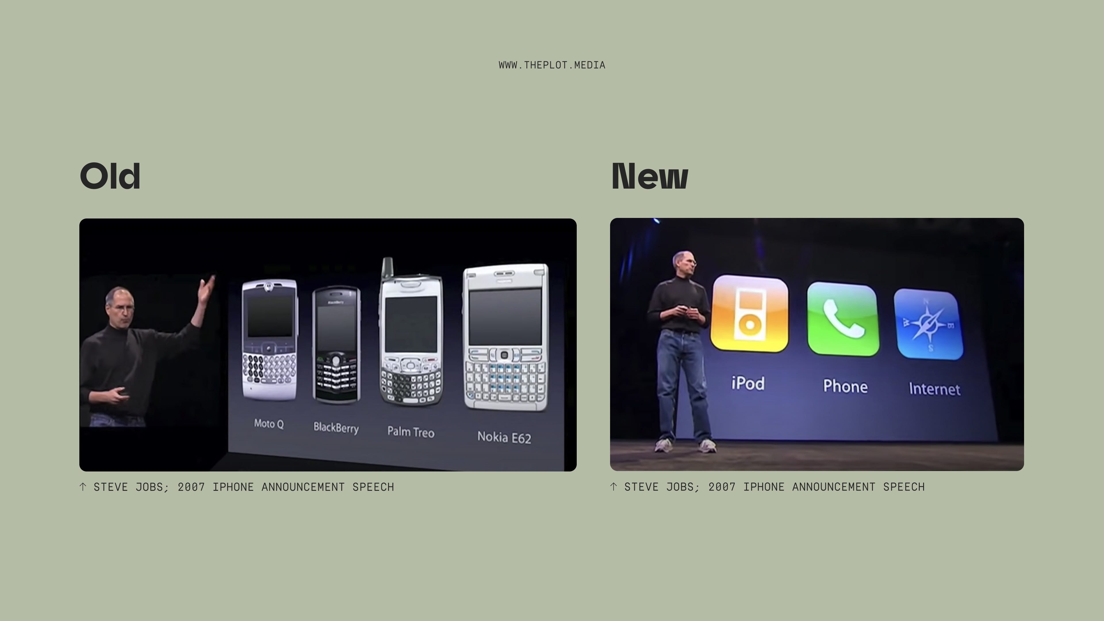
In his 2007 iPhone launch speech, Steve Jobs kept alternating between two realities. He spent quite some time showcasing a new powerful device—a phone, a web browser and an iPod all in one. Every once in a while, he’d contrast this invention with the current state of the smartphone. Think clunky, slow and cumbersome Blackberries and Nokias. This superposition allowed him to highlight the impressive and innovative nature of Apple’s new product.
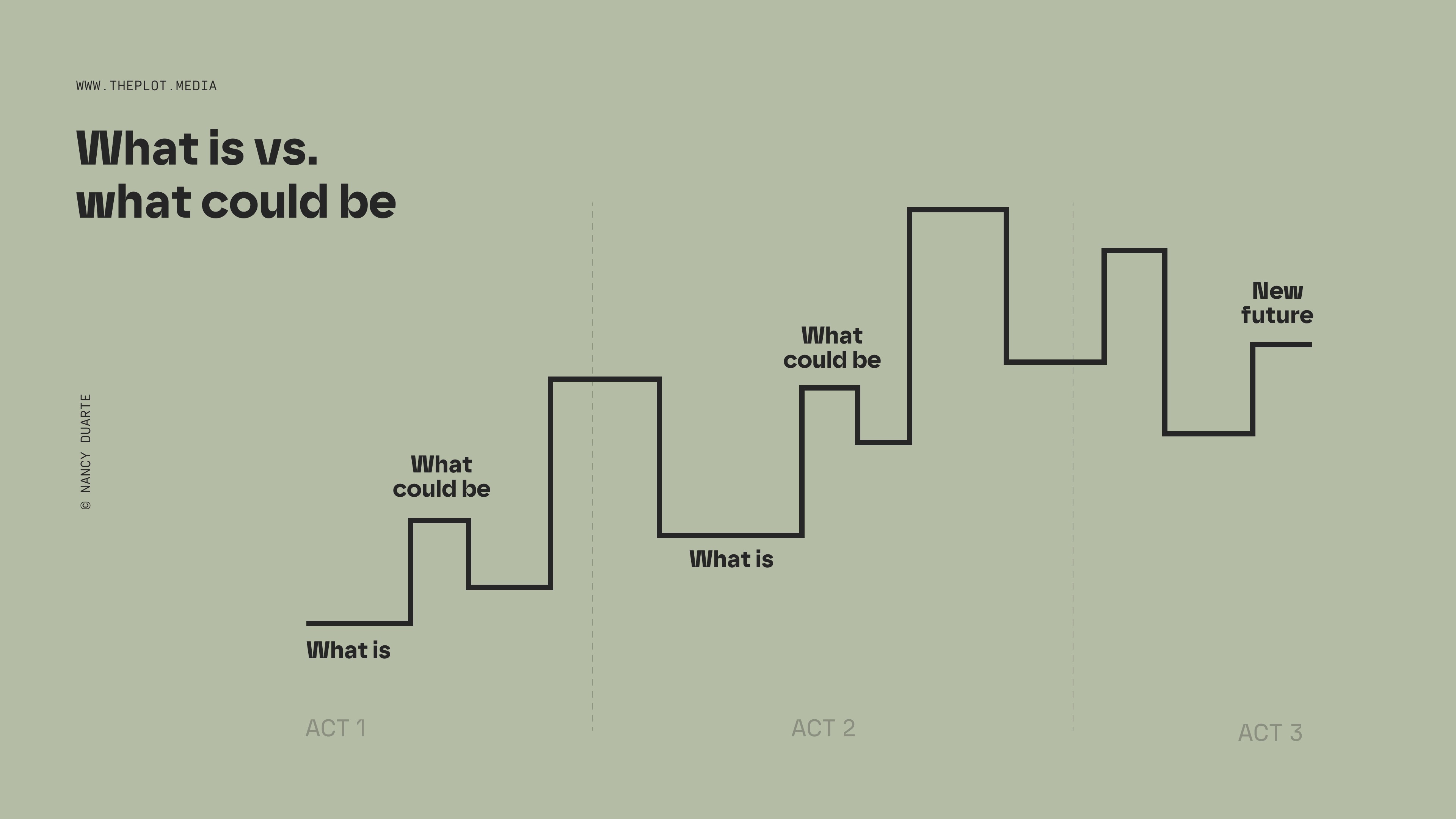
This technique is centuries old. Formalised by Nancy Duarte, it’s what the best speeches in history—from Martin Luther King Jr. to Gandhi to Steve Jobs—have in common. She calls it the what is vs. what could be method: to captivate our audience, you regularly switch between the status quo and a possible better future. It’s a great framework to add rhythm to your communications and keep the audience on their toes. I’ve used it in written products, too; see if you can differentiate the what is vs. what could be moments in this article on internet access in Ethiopia.
Even though I’ve been implementing and teaching this method for a while now, I’ve only recently realised it can be particularly useful in two use cases.
Don’t shoot the messenger
When working with data, more often than not, you’ll have to present insights that your audience won’t be pleased about. Perhaps your marketing campaign didn’t hit its targets or your user journey has more dropoff points than planned. Delivering bad news can be scary—no one wants to be the messenger who takes the blame.
Even more importantly, keeping your audience’s attention throughout an entire communication that is solely negative can be daunting. This is how I often feel about climate-related articles: it’s a crucial topic and action must be taken, but reading only about the earth burning makes me anxious instead of motivated to act.
That can be fixed by introducing some what could be moments. Even if your general message is considered bad news, the world is never simply black and white. Perhaps there are avenues for progress you can put forward? Or maybe another department in your organisation is doing better and you can learn from them? Breaking up the what is line to introduce some nuance and hope can make a huge difference.
Anecdotes aren’t just anecdotal
I frequently get asked how to effectively integrate qualitative data points in data communication—stories, quotes, initiatives, etc. On their own, they can sound like meaningless anecdotes that don’t hold solid value. But without them, communication may feel lifeless. The what is vs. what could be method can help you find the right balance. Your quantitative data can live in the what is portion of the communication. You would then contrast it with qualitative information to illustrate possible futures (what could be).
A few months ago I consulted a mission-driven company on the structure of their yearly diversity report. They had lots of data to show they were moving towards their targets but hadn’t achieved them just yet. It’s not the end of the world—hitting diversity targets takes a while! But to add a human touch to the story, we mentioned promising initiatives—community groups, collaborations and events—that were appreciated by employees.

These are just two use cases in which the what is vs. what could be rhythm can be especially powerful. Once you get familiar with it, see when it works best for you.
Thanks for reading,
—Evelina
This newsletter is now bi-weekly. 📆
By popular demand (see poll in the last edition of The Plot), I’ll now be writing twice a month instead of every week. This will allow me to publish more in-depth pieces on a manageable schedule. Don’t worry though, the articles will remain about the same length.
