What's the plot of your data story?
What a data story is and where to begin when crafting one.
It rains cats and dogs once a day.
Squirrel monkeys steal sugar from a restaurant table.
Iguanas sunbathe next to the road.
Breakfast consists of delicious rice, eggs and plantains.
You try to speak Spanish but sound French.
Storytelling, again
The scattered sentences above are small beats of my holiday story in Costa Rica. I’ve been traveling in this stunning country for almost a month now, and while I took a break from publishing newsletters during this time, I’ve been thinking about storytelling a lot.
Data storytelling is a term I hear almost every day. Companies and individuals often say that they tell stories with data. But what does telling a story really mean, in our line of work? I’ve come to think that our definition of a story is a little different than the common one. A traditional story — told for entertainment between friends, in a movie or in a book — has characters and includes lots of emotions. A data story is often much simpler than that.
In its bare form, a story in the data design world includes a list of elements — charts, illustrations, text — that are sequenced in an engaging way. But how do you know which elements to choose? You need to define your core message first. So in this first letter in the storytelling series here at The Plot, let’s explore why a core message is important and how to write one.
What’s the plot?
A core message is the one takeaway you want your audience to go home with. We often hear TED speakers say “if you were to only remember one thing from this talk, let it be this…” In journalism, the key message is often in the headline. In theatre, there’s a concept called a through-line — one idea that runs through the entire piece. Pixar creatives call it the moral of the story, or the answer to the question “why are you telling me this?”.
OK, so you get it. But defining a short and clear message can be surprisingly difficult, so let’s look at some examples.
Defining a message for a long form piece…
I read a data article on how the climate is getting hot enough to kill by Bloomberg last week. It’s a great (albeit terrifying) example of clear messaging. From the very title of the piece, we understand that hotter temperatures can be fatal in humid environments. All the elements in the article — both data and testimonies — support this claim. The authors explain how wet bulb-conditions occur, what they mean for people’s health, which regions are the most affected and more. So even though the story includes different types of content, it’s easy to follow and digest because the takeaway is very clear throughout.

…for a dashboard…
Identifying a core message for a dashboard may seem much harder compared to a long form story, especially if you’re working with live data. It’s still feasible though, and can make your work stand out. In the picture below, you can see an extract from a product dashboard I recently designed for a startup called Aktio. Aktio helps companies measure their carbon footprint and take action to reduce it. In this view, the emission numbers are broken down by category, scope and entity.

Even though the result of the dashboard for each of Aktio’s clients will be different, the message is the same: we want to draw attention to the biggest contributors to a company’s carbon footprint. This is why only the biggest categories are highlighted in the treemaps, for example, and the following screens are also designed around this idea.
…and for a single chart
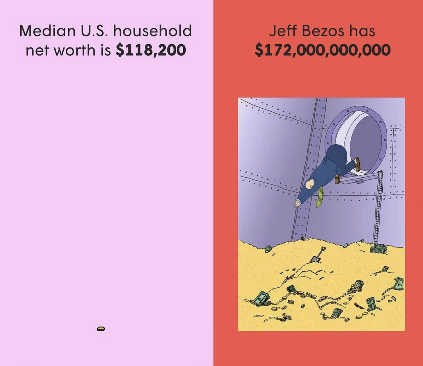
Last but not least, can and should a single visual also have a key takeaway? Absolutely! Mona Chalabi’s work is a great example of this in action. Take a look at the illustration below on Jeff Bezos’ wealth. The message here is straightforward — Bezos’ net worth is 1.5M times higher than that of a median U.S household. So how did having a core message help? I’m convinced it helped the designer choose just the right amount of content to get the idea across. No clutter, just the key info!

Your turn
For your next data project, try to define a core message — or the plot 😉 — right from the start. Why are you showing this data to the audience? What do you want them to remember?
When you’re crafting that message, make sure it:
Is one sentence long (about 15-20 words);
Includes a learning and/or insight for the audience;
Is your guiding star when you choose the content to include in the project!
Is there anything else you would add to the list above?
Thanks for reading the storytelling edition of The Plot!
I’ll be back in France next week so you will hear from me again within the usual timeframe.
Pura vida,
Evelina


