Two years ago, I bought an Oura ring. An Oura ring is a small device that tracks my sleep and fitness goals. It’s considered to be one of the best mainstream technologies for sleep tracking—it covers length, quality and variations over time. After the first 6 months with the ring, I started receiving progress reports. The first ones included summary figures like the ones below.
Looking at these screens, I was perplexed. Is 1,500 hours good or bad? What period are we talking about again? How does this figure translate to my daily habits? Standalone numbers were of no use to me unless I did some further calculations myself. And who wants to do that when they’re already paying for a tracking app?!
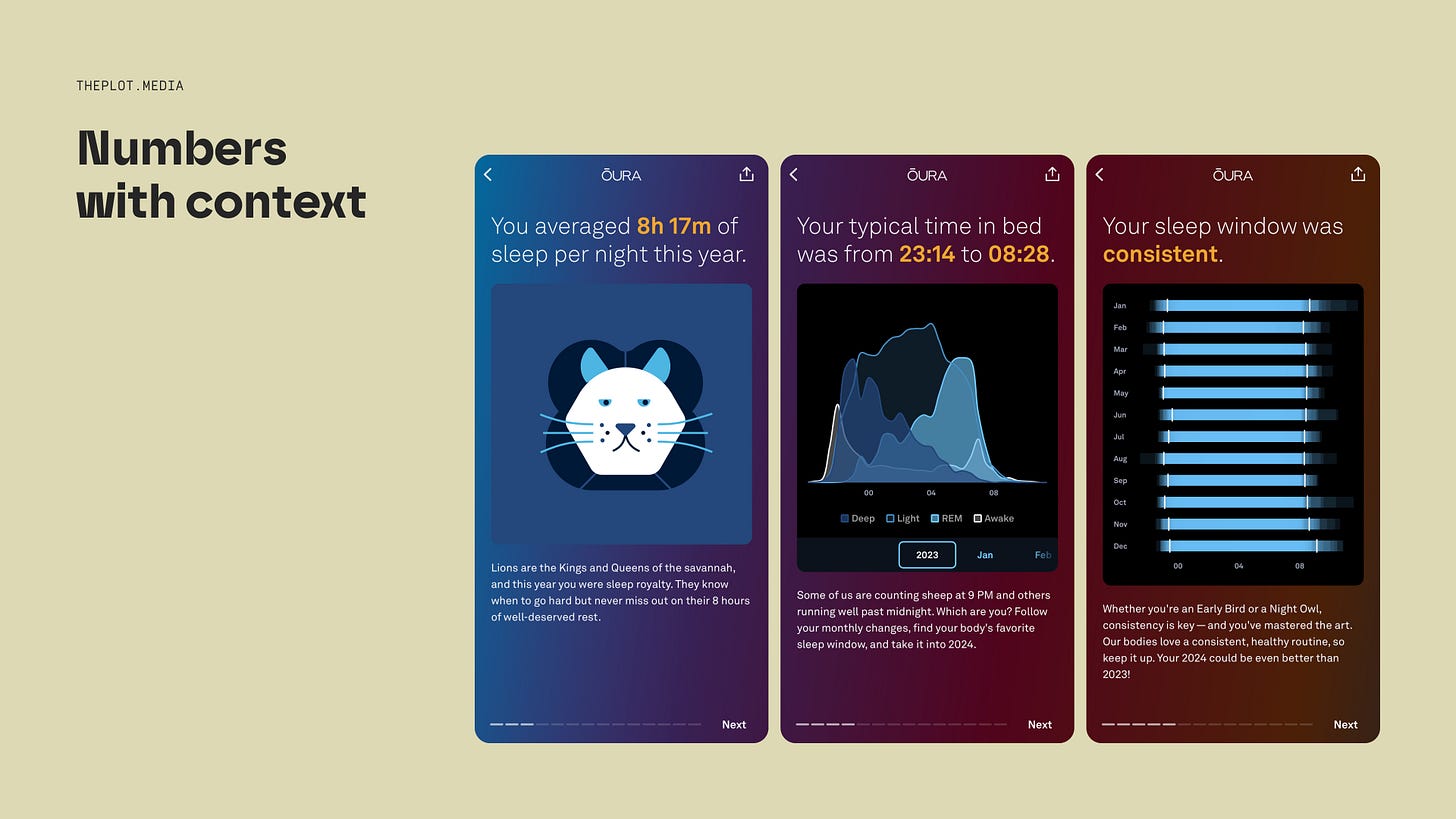
Over time, the format of the reports changed. The Oura team realised they needed to provide their users with context: showing daily hours, different points in time, zooming in and out, etc. The following reports included graphics and analyses like these:
This example brings us to a fundamental challenge in data storytelling: how detailed should our insights be?
In a classic data story structure, the middle part is the longest. That’s the second act—or climax—where most of your data lives. But the mere fact of having the insights doesn’t help you decide how to structure them. Should you include just one number like the 1,500? Should you dive into more detail? If yes, how much more?
These questions can get so tricky that some people call the second act in storytelling the messy middle.
In my experience, the answers come naturally to some people. But if that’s not you, no need to panic. Having a framework can help; after all, that’s why you’re reading this newsletter, isn’t it? The main question you need to answer with your data is: compared to what? How does the figure you’re communicating relate to similar items? Can you compare different points in time for better understanding? Are there any outliers?
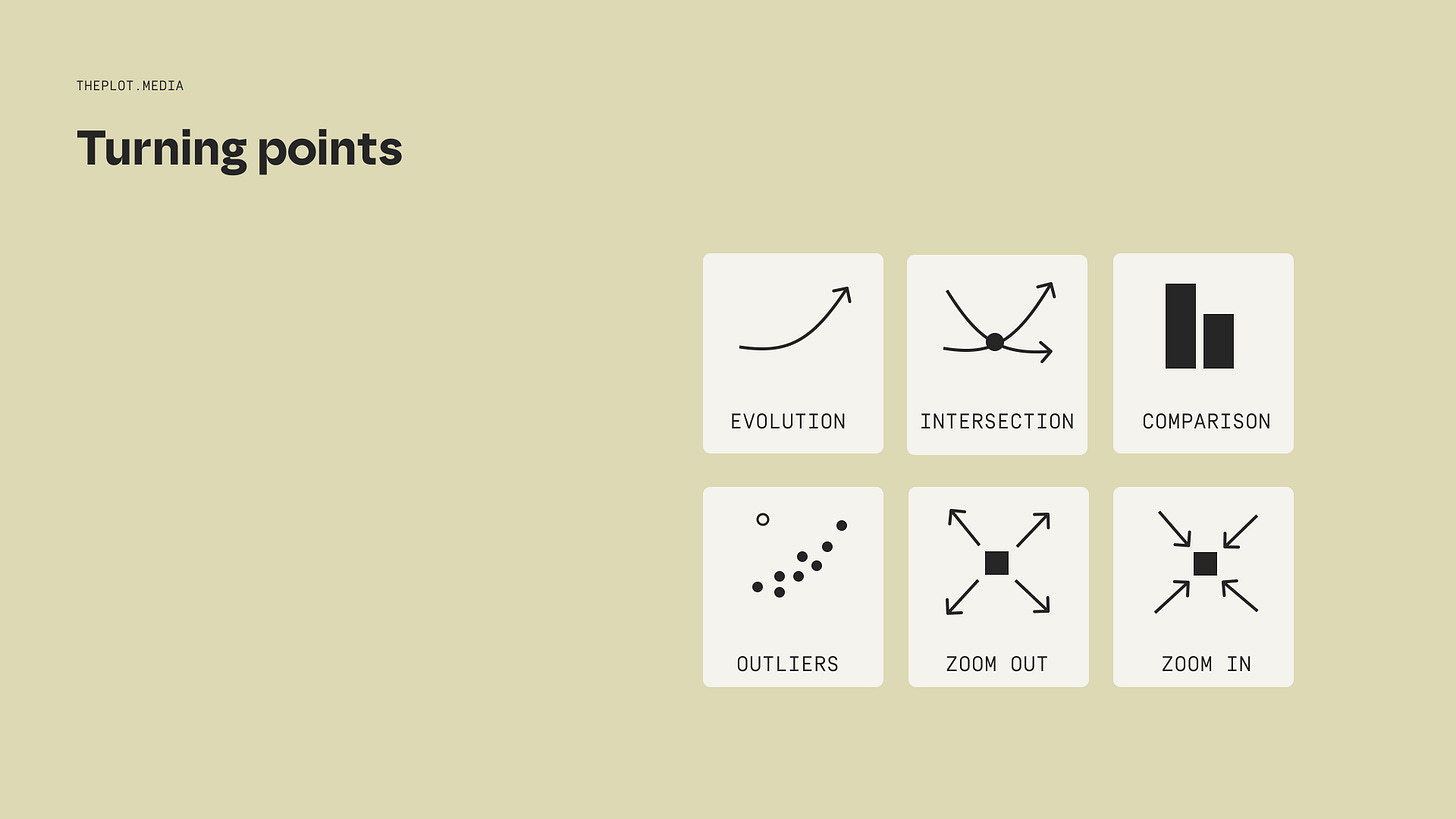
The list below includes some suggestions for structuring your messy middle—inspired by a chapter in Brent Dykes’ Effective Data Storytelling.
You don’t need to use them all at once.
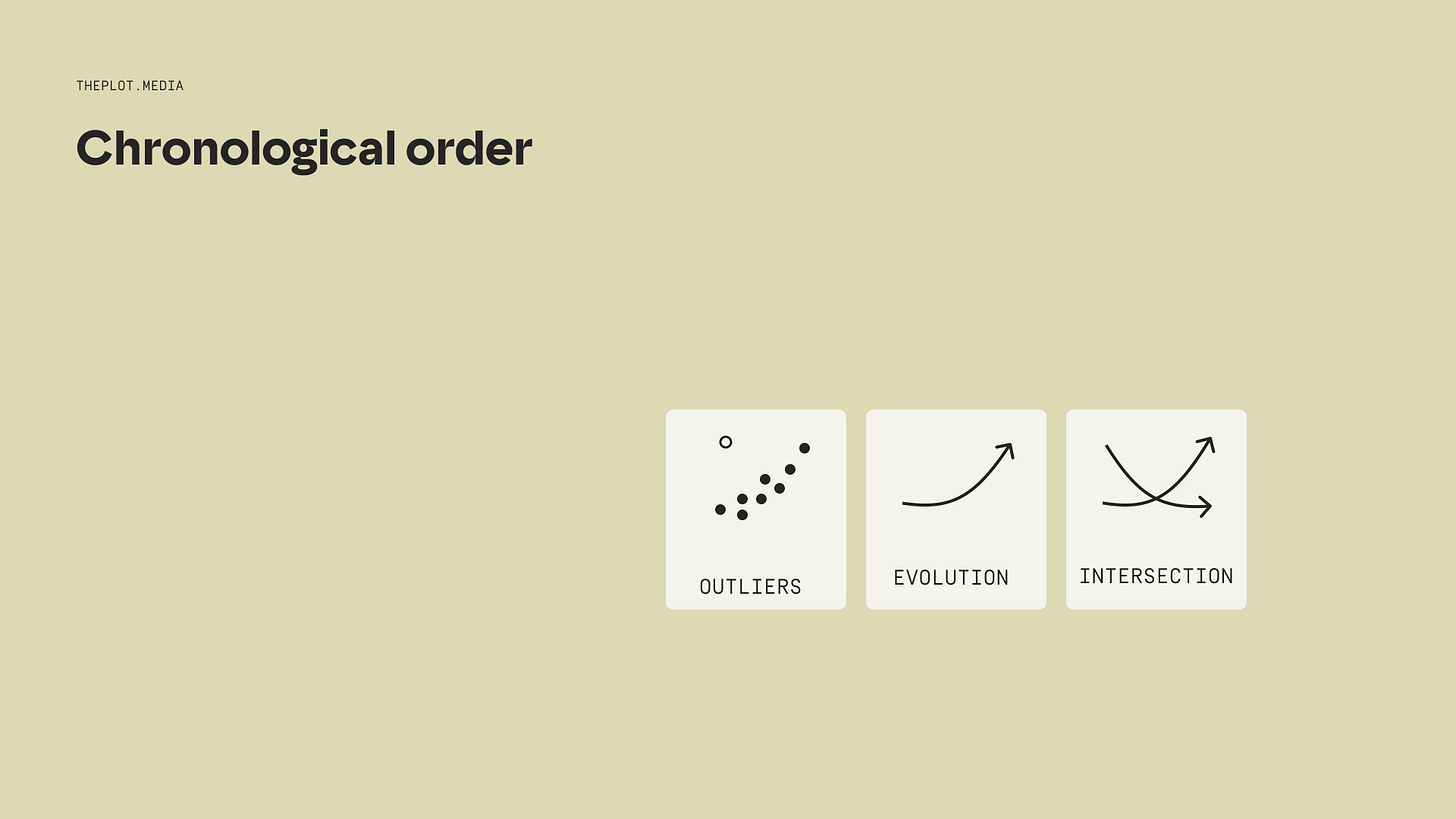
Perhaps showing the evolution over time can add context to your key figures?
Or perhaps you need to alternate between a bird’s-eye view and a detailed view?
You can play around with the different items above and add your own. Just make sure you’re not throwing meaningless numbers at your audience. Understanding comes from context.
Let us know in the comments if you have some tricks of your own on structuring the climax. And thanks for reading today’s edition of The Plot!
See you next week,
—Evelina
“The course was very insightful: Evelina was a great teacher and adapted well to the students. The learning materials were of brilliant quality, and the presentation brought great examples. I recommend it to anyone who wants to discover and practice data storytelling.”
What are we talking about? My three-week online data storytelling bootcamp! The bootcamp has a 4.8/5 ⭐️ rating and is worth your time.
The next cohort starts in ten days. Use the code THEPLOT10 for your exclusive 10% discount. Only 3 spots left!


