A picture is worth a thousand words.
Do you believe in the above sentence? You probably do. So do I. But I also believe that visuals and words are not mutually exclusive. While a picture—ahem, a graphic—goes a long way in communicating information effectively, it can become even more powerful when text accompanies it. Annotations were also one of the suggested remedies to chart struggles in this recent article that caused a bit of online debate.
Let’s look at three ways to provide valuable annotations, with examples from the HRFN report I designed earlier this year.
Make it obvious.
In its most basic form, an annotation can explain what’s happening in the chart. But we often shy away from text explanations that seem too obvious—after all, our readers are not stupid. They will figure it out, right? Well, I’m here to tell you that your charts may not be as easy to read as you think. In the HRFN report, we added many obvious annotations to help people grasp what we were showing. So far, no one has complained that we were treating them as stupid.
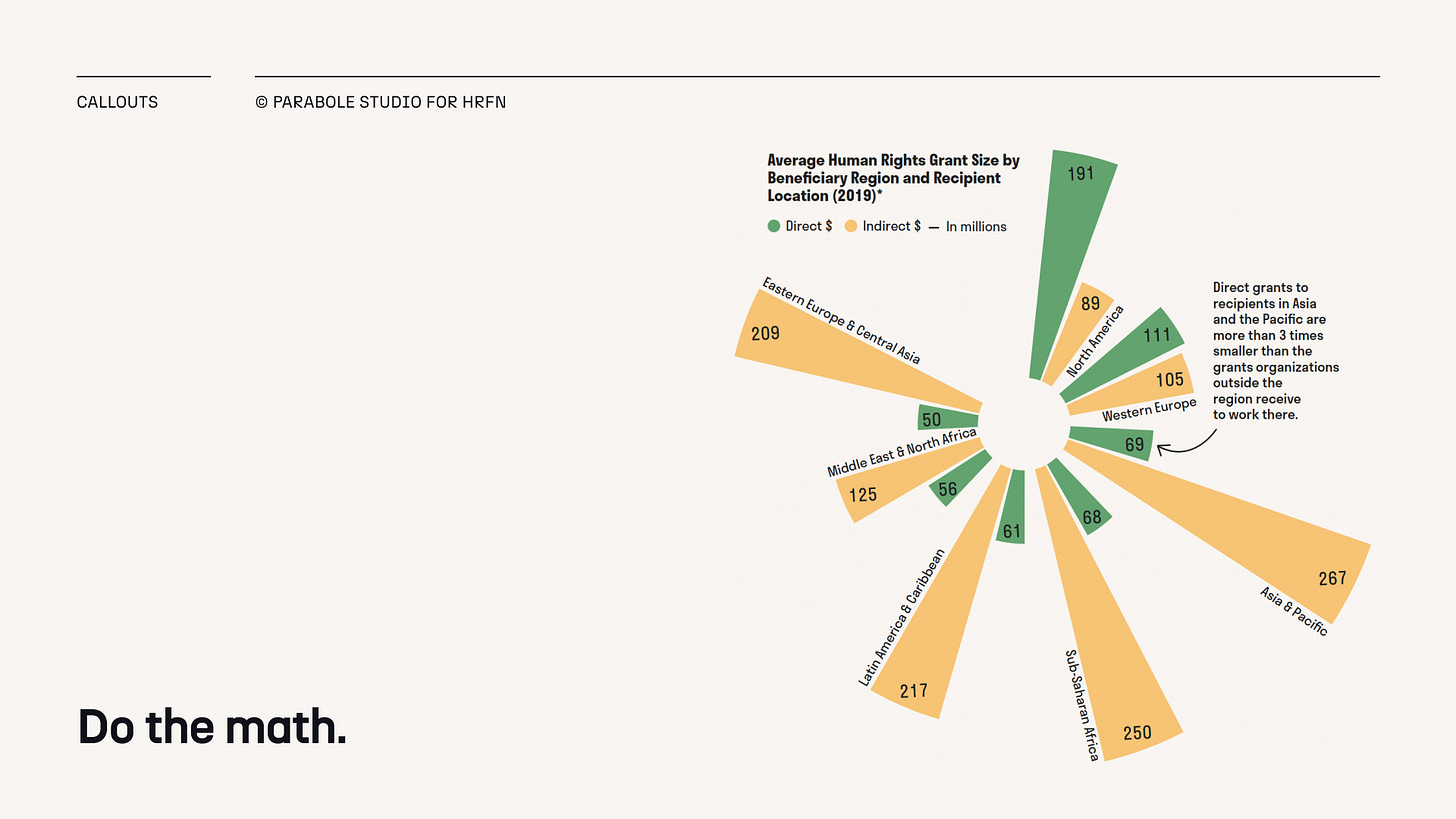
Do the math.
Who wants to do math in their spare time? Almost no one. It’s already courageous enough to be reading charts! So do the math for your readers. Use annotations to divide, multiply, and sum things up. Is one category twice as big as the other? Or a third smaller? Point to it. Thank me later.
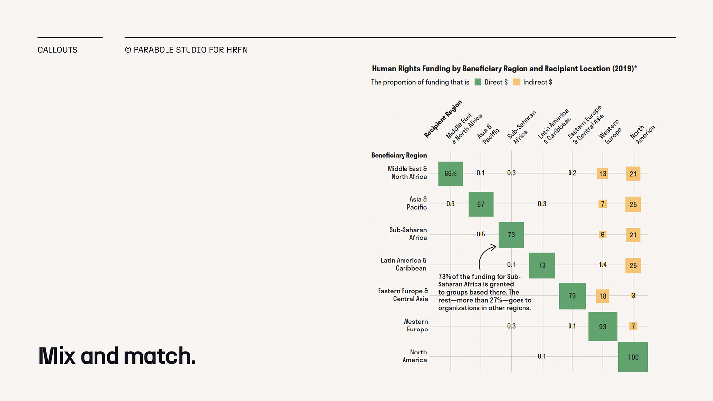
Mix and match.
The two suggestions above are by no means a strict recipe on how annotations should be crafted. You should play around with them based on your data and audience. You can mix and match multiple approaches—perhaps sneak in some math on a seemingly obvious note?
***
What are your go-to annotation types? One more I haven’t mentioned above is providing context. You know, the arrow that points to a specific moment in time on a line chart to tell you why that inflection point happened. What else? Share your best examples in the chat.
As always, thanks for reading The Plot, and don’t forget to add text to your images! 🎞️
See you next week.
—Evelina
⭐ New project
Climate Finance Files. I had the absolute pleasure of working on the visual storytelling of this important piece (released just this morning!). Do take a look—the data may just blow your mind.
👩🏼🏫 New course cohort
The next round of my data storytelling bootcamp will kick off on January 29. We’ve just sold quite a few spots during the Maven Monday sale, but you can still get yours if you don’t wait too long! Join us today.


